Netball...

Posted:
Fri Sep 23, 2011 5:32 pmby Remorhaz
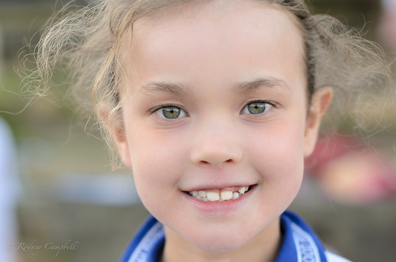
I'd finally managed to take a half decent close portrait of one of my daughters which I thought I'd like to share.
I've taken literally hundreds of very nice portraits of other peoples children (school events and so forth and many unfortunately nicer than this) but getting something I "rated" at all of my own children was proving a challenge

My daughter plays Netball and this was taken late one afternoon with the sun nearly setting just before their game, with my favourite portrait lens (that I own) - the Sigma 50/1.4

Re: Netball...

Posted:
Fri Sep 23, 2011 7:11 pmby zafra52
Lovely portrait. I like her clean eyes
and frank smile. Well done!
Re: Netball...

Posted:
Fri Sep 23, 2011 7:57 pmby Raskill
Lovely image. Nice DOF and good catchlights in her eyes.

Re: Netball...

Posted:
Sat Sep 24, 2011 3:36 pmby Marvin
I agree - a nice image with great eye contact and pleasing bokeh.
Re: Netball...

Posted:
Sun Sep 25, 2011 10:46 amby Remorhaz
Thanks guys - I do love this lens for people shots and the feel I get with them - and I don't think it's just that it can go to 1.4 (I shot the above at f/2
btw).
I'd love something like the 85/1.4 or 135/2 (double drool...) - perhaps one day...
Re: Netball...

Posted:
Sun Sep 25, 2011 11:37 amby gstark
Good subject isolation here.
I'd like to see the wb or saturation nudged just a little bit more. I think it's just a touch too cool.
Re: Netball...

Posted:
Sun Sep 25, 2011 3:33 pmby Matt. K
If I could make just 1 suggestion on how this image might have been a little improved....This image was lit, (lighted?), with soft frontal lighting. Soft frontal lighting reduces both texture and form, (roundness), and is preferable for older people portraits because it makes wrinkles less prominant. It is also very ideal for portraits of people with long noses or prominant , pointy chins, as it reduces the impact of these features. Had you turned your daughter around about 45 degrees so that the light came from the side then you would have achieved more roundness, or form, in the portrait. This would also have given more emphasis to the eye lashes and eye lids. Note the flatness of her nose and the general lack of visual roundness to her cheeks. It can all be dramatically changed with a change in the direction of the illuminating light.
Still a lovely image but perhaps something to play with next time you get the camera out.


