Page 1 of 1

Chicken Run

PostPosted: Mon Mar 28, 2005 10:11 pm
by yeocsa
Image
D70 + kit lens.

PostPosted: Fri Apr 01, 2005 3:48 pm
by mchampio
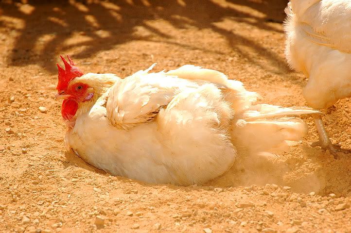
I like the eye contact with the chicken.

IMHO it might need some PP to get more contrast between the chicken and the background, or just some darkening to bring back detail in the wing feathers

Hi

PostPosted: Fri Apr 01, 2005 4:46 pm
by yeocsa
mchampio wrote:I like the eye contact with the chicken.

IMHO it might need some PP to get more contrast between the chicken and the background, or just some darkening to bring back detail in the wing feathers


Hi

Can't agree with you more. It's burn out highlights. Didn't notice it cos our eyes adapt so very effectively.

regards,

Arthur

PostPosted: Fri Apr 01, 2005 4:48 pm
by PiroStitch
Great pic :) Was the ambient light orange or was the chicken brown/orange the whites look orange on my screen :S

PostPosted: Fri Apr 01, 2005 4:50 pm
by Manta
I'll have fries with that... :lol:

I like the shot but agree with the highlights problem. It's something that I always manage to do in my photos as well. I think I'll have to spot-meter more areas before deciding on the exposure.

PostPosted: Fri Apr 01, 2005 4:53 pm
by sirhc55
There is certainly a cast in this pic and would suggest using selective colour in PS (image - adjustments - selective colour). Select white and adjust Cyan, Magenta and yellow to 0. See how it looks.

Hi

PostPosted: Fri Apr 01, 2005 9:35 pm
by yeocsa
sirhc55 wrote:There is certainly a cast in this pic and would suggest using selective colour in PS (image - adjustments - selective colour). Select white and adjust Cyan, Magenta and yellow to 0. See how it looks.


It was this colour cast that I saw that made me took the picture. The mood that I was trying to convey was the warm, hot spa (soil bath) that it was enjoying.

regards,

Arthur

PostPosted: Fri Apr 01, 2005 10:43 pm
by SoCal Steve
You can take one big step in the right direction by simply using PS Auto Color. Image>Adjustments>Auto Color. It doesn't make the color perfect in this case, but it certainly does push this image in the right direction with an absolute minimum of fuss. The KISS principle, you know.