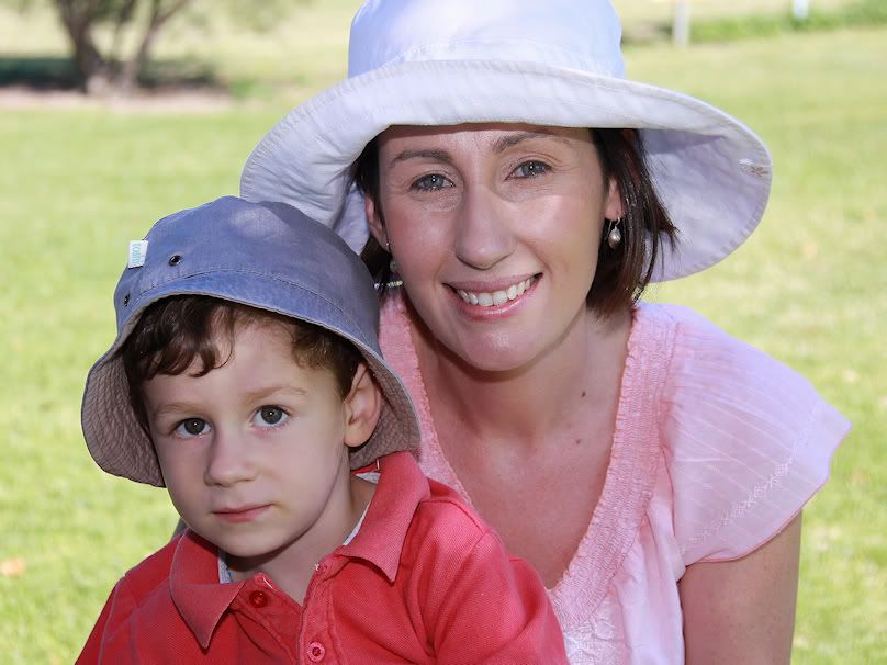
Mum & sonModerators: Greg B, Nnnnsic, Geoff, Glen, gstark, Moderators
Forum rules
Please note that image critiquing is a matter of give and take: if you post images for critique, and you then expect to receive criticism, then it is also reasonable, fair and appropriate that, in return, you post your critique of the images of other members here as a matter of courtesy. So please do offer your critique of the images of others; your opinion is important, and will help everyone here enjoy their visit to far greater extent. Also please note that, unless you state something to the contrary, other members might attempt to repost your image with their own post processing applied. We see this as an acceptable form of critique, but should you prefer that others not modify your work, this is perfectly ok, and you should state this, either within your post, or within your signature. Images posted here should conform with the general forum guidelines. Image sizes should not exceed 950 pixels along the largest side (height or width) and typically no more than four images per post or thread. Please also ensure that you have a meaningful location included in your profile. Please refer to the FAQ for details of what "meaningful" is.
Previous topic • Next topic
7 posts
• Page 1 of 1
Re: Mum & sonIts a nice image which invokes some thoughts about the two, the little boy looks like he's thinking ('what the hell is this clown doing?!') but the mum looks proud relaxed and happy.
I would be interested in seeing the original colour version and/or a more contrasty BW (not much more just a bit more). I am not a fan of vignetting when it is immediately obvious, as it is with this image, try applying vignetting in a more random fashion (ie vary intensity depending on the BG in that corner) on each corner and adjust the feathering, i find this often helps reducing the notice-ability of it. A slightly tighter crop would also suit here too, really lock the viewer in and particularly shut out that top left corner... gerry's photography journey
No amount of processing will fix bad composition - trust me i have tried.
Re: Mum & sonThanks gerry and agree with your comments.
Redone b&w plus the colour version, which i didn't mind, just thought the portrait might suit b&w.  
Re: Mum & sonI prefer the original image and think that the processing was just fine. What I like about the image is that the photographer allowed the subject to speak for itself.....and when it comes to poeple pics that's all that is required. People are intrinsically interesting.
Regards
Matt. K
Re: Mum & sonI too prefer the original. I like the colour and
the relaxed attitude of the subjects. It is visibly a posed photograph, not a candid one.
Re: Mum & sonI much prefer the cropped colour version
 For me, in this case, the colour version gives the scene more warmth and character (if thats possible) which is more fitting for the two people in the frame. A BW conversion here, for me, feels tacky and a wannabe fine art portrait, whereas it is simply a good solid family shot and should be portrayed as such. gerry's photography journey
No amount of processing will fix bad composition - trust me i have tried.
Re: Mum & sonTanks people. My apologies for incorrectly labelling the shot a candid. It's actually a 'May i quickly get a shot of yourself and your son while your sitting on the edge of the fairway in the cool shade of a tree and enjoying the community outing?' shot.

Previous topic • Next topic
7 posts
• Page 1 of 1
|

