Monochrome Lavender...
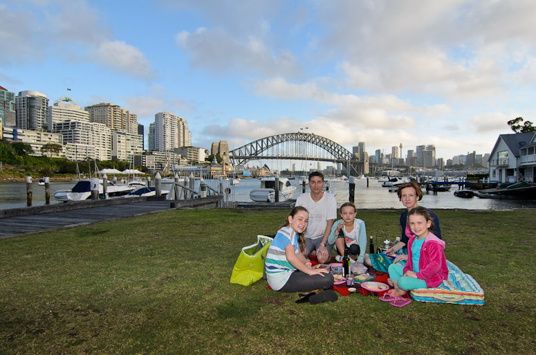
On Christmas evening my girls and I went for a picnic down on Sydney Harbour.
We first parked under the bridge and went for a walk in Bradfield park under the bridge itself and along the boardwalks next to Luna Park. It was a little windy here for a picnic so we drove a little further around to Lavender Bay for our picnic dinner. It was a very quiet evening with very few people around so it was just a relaxing time with the kids.
Never one to miss an opportunity I'd also packed photographic essentials
A picnic at Lavender Bay

NIKON D7000 + 12.0-24.0 mm f/4.0 @ 12 mm, 1/200 sec at f/6.3, ISO 100
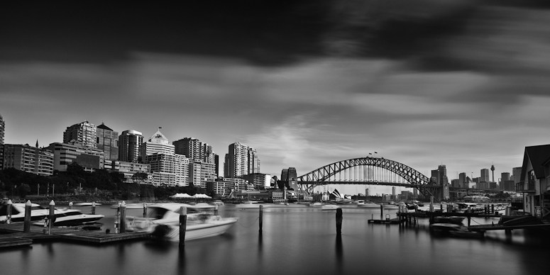
This last was taken with my ten stop ND filter for some nice cloud movement and then processed to monochrome for some really moody skies - feedback on this second one welcomed...
Monochromatic Lavender

NIKON D7000 + 12.0-24.0 mm f/4.0 @ 12 mm, 42 sec at f/9, ISO 100
We first parked under the bridge and went for a walk in Bradfield park under the bridge itself and along the boardwalks next to Luna Park. It was a little windy here for a picnic so we drove a little further around to Lavender Bay for our picnic dinner. It was a very quiet evening with very few people around so it was just a relaxing time with the kids.
Never one to miss an opportunity I'd also packed photographic essentials
A picnic at Lavender Bay

NIKON D7000 + 12.0-24.0 mm f/4.0 @ 12 mm, 1/200 sec at f/6.3, ISO 100
This last was taken with my ten stop ND filter for some nice cloud movement and then processed to monochrome for some really moody skies - feedback on this second one welcomed...
Monochromatic Lavender

NIKON D7000 + 12.0-24.0 mm f/4.0 @ 12 mm, 42 sec at f/9, ISO 100