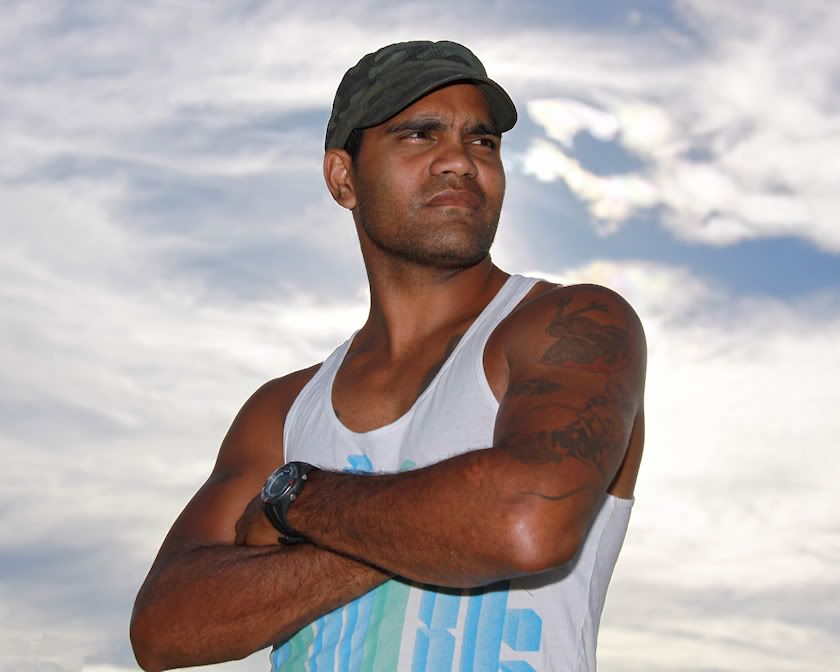
surenj wrote:Nice and low perspective to enhance his power.
I think you can still improve by darkening the sky and using some good old dodge, burn on the skin to make it more sculpted etc.
Also slightest bit of desat to make it look like a advert/movie poster.
Down on my knees to gain a stand over, intimidating stance and have all sky as the background. Yes, agree and have darkened the sky a smidgen in the original. I tried a grey scale copy and it lends itself very well.
gstark wrote:Great image. Did you perchance get one of him looking into the lens?
Thanks. No, i didn't. I asked him to look at the camera and it appeared unnatural, so, other than the arms folded, I just let him do what felt best. I wanted the arrogant, 'bugga you' look anyway, so it didn't really matter in the end. He was actually a very natural
model but he's played for his country in differing forms of the game so is pretty relaxed around attention even though he's a quiet bloke.
Remorhaz wrote:From the EXIF data it looks like you shot this using high speed sync (1/4000) so I'm wondering why the sky wasn't dark anyway - must have been nuclear bright - shot into the sun?
Nicely crisply separated from the background - almost cutout - and looks pretty sculpted to me

Given there's no background with troubles to separate you probably could have shot more stopped down to both get a tad more dof (the face is sharp as but that front arm is a little oof) and darken the background
Yes, high speed sync flash @ +2 and -1 exposure comp. I positioned him with the sun directly behind the nape of his neck to get the look you describe. Given more time, i did only 4 shots at various settings before he excused himself to join training, I'd have stopped down the ambient a touch further and increased the flash output.
the foto fanatic wrote:Great job on the skin tones. I don't see any need to do anything more with the subject, but I would like to see the sky a little darker (not much).
One way the pros do this is to shoot with tungsten WB and a gel on the flash, but I don't know how that setup would work with darker skin tones like you have here.
I like the composition and having the subject looking off-camera gives him a more dominant air.
Thanks. Yes, dark skin tones are difficult and I'd be lost without fill flash. It's a bugga to gain detail with shadows and actions shots when a flash isn't practical.
biggerry wrote:nice one, I think this would also work as a portrait orientation.
I reckon this is a good shot of a good role
model


Thanks Jerry. Agree and have done it in both.
PiroStitch wrote:Great concept and execution. Just a few nitpicky details, some have already been mentioned. Darken the sky a bit more to create more mood, try cropping to a portrait orientation and do you have one where his right elbow isn't chopped off. The elbow is a very small thing but once I noticed it, I can't ignore it.
Yep, I know what you mean. Like an itch that has be scratched.


