Page 1 of 1

Yet More Boring SHB & SOH Images :)...

PostPosted: Mon Feb 13, 2012 7:43 pm
by Remorhaz
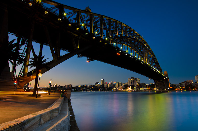
Went on a photowalk with some other enthusiasts on the weekend and as we were down on the harbour under the bridge at twilight figured I might as well do the unthinkable and have another go at butchering the icons...

SHB
Image

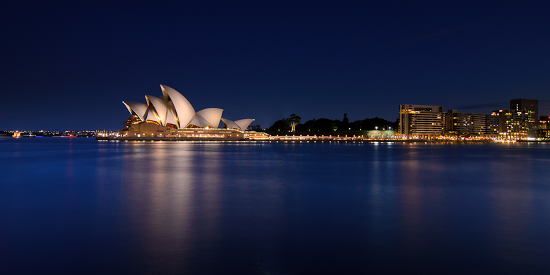
SOH
Image

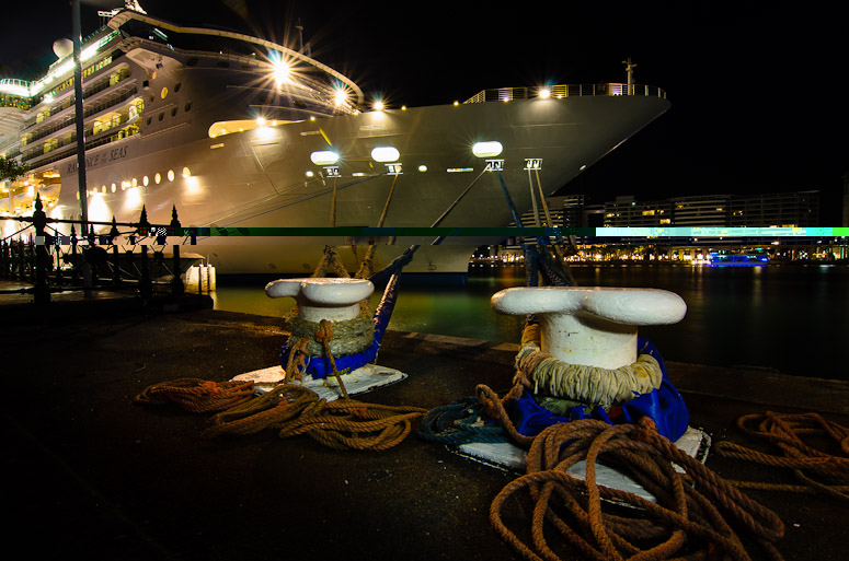
and to end the night to keep with the acronym theme - up close and personal with the massive cruise ship docked at the OPT
Image

(the last my first edit with Lightroom 4 to locally WB adjust the colour cast from the cold LED lightpainting of the bollards and mooring lines)

Re: Yet More Boring SHB & SOH Images :)...

PostPosted: Mon Feb 13, 2012 9:04 pm
by aim54x
Icons butchered!! Seriously, these are pretty well done technically, but I am unsure about your physical vantage point used for the first.

Re: Yet More Boring SHB & SOH Images :)...

PostPosted: Mon Feb 13, 2012 9:54 pm
by Matt. K
I actually like the first image very much. It drags the eye in and it shows a slightly different view from the run of the mill postcards shots. All very nice technically though the Opera House suffers from the empty foreground syndrome.

Re: Yet More Boring SHB & SOH Images :)...

PostPosted: Tue Feb 14, 2012 8:55 am
by Remorhaz
aim54x wrote:Icons butchered!! Seriously, these are pretty well done technically, but I am unsure about your physical vantage point used for the first.


Thanks Cam - I think It's more that it's nearly impossible to do something interesting/different with them. I was on safe and solid ground I assure you :)

Matt. K wrote:I actually like the first image very much. It drags the eye in and it shows a slightly different view from the run of the mill postcards shots. All very nice technically though the Opera House suffers from the empty foreground syndrome.


:) - should have pushed someone in maybe to get them in the foreground? :) they'd have to hold still for sixty seconds of course...

Re: Yet More Boring SHB & SOH Images :)...

PostPosted: Tue Feb 14, 2012 9:05 am
by aim54x
Remorhaz wrote:I was on safe and solid ground I assure you :)


That may have been the problem..... :cheers:

Matt. K wrote:I actually like the first image very much. It drags the eye in and it shows a slightly different view from the run of the mill postcards shots. All very nice technically though the Opera House suffers from the empty foreground syndrome.


:) - should have pushed someone in maybe to get them in the foreground? :)


That may solve the empty foreground problem........not sure if you will be liked for it though

Re: Yet More Boring SHB & SOH Images :)...

PostPosted: Tue Feb 14, 2012 1:47 pm
by ian.bertram
The first is lovely with the great reflections. What about pp and straightening the wide angle spread of the bridge and buildings?
Ian

Re: Yet More Boring SHB & SOH Images :)...

PostPosted: Sat Feb 18, 2012 8:19 am
by Remorhaz
ian.bertram wrote:The first is lovely with the great reflections. What about pp and straightening the wide angle spread of the bridge and buildings?


Thanks Ian - do you mean straightening up the buildings on the far shore? Because I shot upwards and at an angle I'm not sure this will work well since the distortions will be uneven across the frame.