Page 1 of 1

Sydney University Architectural photography thingy..

PostPosted: Sun Feb 19, 2012 10:49 pm
by biggerry
No sunrise action here - it was a shame I could not hang around for the PP session on these images since I was keen to see what you chaps would produce and how.

Nonetheless, no reason why we cannot follow on teh discussion here. I really did not have any pre-conceived ideas other than lining up a few of teh buildings that I thought may work well, ie old geology, old med and main quad.

I varying set of images, I am interested in critique and comments - good, bad, ugly or plain old indifferent.

curse the clown who put a dent in those two panels.. ruined me shot.

Image

I know there are several crop variations hiding in this one, just not sure which would work better, starburst at the top 3rd?

Image


some grass stuff that the gardeners would be proud of..

Image

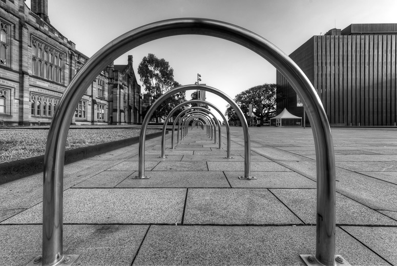
being such a green unversity there is now a plethora of unused bicycle chainup rings, i reckon they are more for looks than functionality ;)

Image

Re: Sydney University Architectural photography thingy..

PostPosted: Mon Feb 20, 2012 12:13 am
by surenj
Gerry,
#1 I hope you are kidding and since this was a PP meetup,...

Image
GJB_3897_8_9_tonemapped-v2 by http://www.flickr.com/people/surenj/, on Flickr

Re: Sydney University Architectural photography thingy..

PostPosted: Mon Feb 20, 2012 12:17 am
by surenj
Crop? [blue = Feng Shui]

Image

Re: Sydney University Architectural photography thingy..

PostPosted: Mon Feb 20, 2012 2:14 pm
by biggerry
surenj wrote:Gerry,
#1 I hope you are kidding and since this was a PP meetup,...


nice, a little content aware filler?

surenj wrote:Crop? [blue = Feng Shui]


yeah i had something similar in mind but with some more room on the LHS.

Re: Sydney University Architectural photography thingy..

PostPosted: Mon Feb 20, 2012 8:57 pm
by Remorhaz
biggerry wrote:it was a shame I could not hang around for the PP session on these images since I was keen to see what you chaps would produce and how


Yeah we didn't get any PP done - we did go to Broadway with that intention but Suren had a problem getting his images onto his computer. We mostly spent the time talking about our workflow and PP techniques (specifically in Lightroom since we both use that) - which I think was still a very useful discussion.

#1 - I think this one may look a little too HDR'd (mostly in the pavers - which are tough because it makes them look too coloured/glossy/tiled?). It's a minor thing but correcting for the vertical of the left hand edge of the building.

#2 Suren's crop may be a tad tight I reckon - I'm not sure I can recommend a better crop - perhaps a square crop of the lhs?

#3 85 with the f -> 1.4 :)

#4 - I didn't realise you also took an image of these rings :) Suren and I were obviously still playing with compositions of the old Geo building - I'm not sure your's is working for me - for that matter I'm not sure mine is either but here it is...

Image

Re: Sydney University Architectural photography thingy..

PostPosted: Tue Feb 21, 2012 9:56 pm
by biggerry
Remorhaz wrote:Yeah we didn't get any PP done - we did go to Broadway with that intention but Suren had a problem getting his images onto his computer. We mostly spent the time talking about our workflow and PP techniques (specifically in Lightroom since we both use that) - which I think was still a very useful discussion.


:up:

Remorhaz wrote:#1 - I think this one may look a little too HDR'd (mostly in the pavers - which are tough because it makes them look too coloured/glossy/tiled?). It's a minor thing but correcting for the vertical of the left hand edge of the building.


straightening does help. I am not overly concerned with the HDR look, maybe dialling it back a bit may help, i am a bit ambivalent on these now.

Remorhaz wrote:#2 Suren's crop may be a tad tight I reckon - I'm not sure I can recommend a better crop - perhaps a square crop of the lhs?


yeah see below


Remorhaz wrote:#4 - I didn't realise you also took an image of these rings Suren and I were obviously still playing with compositions of the old Geo building - I'm not sure your's is working for me - for that matter I'm not sure mine is either but here it is...


i was going for a internal ring shot after I took these ones however opted against it to try and maintain some originality :cheers:


Image


and a another BW of the main quad.

Image

Re: Sydney University Architectural photography thingy..

PostPosted: Wed Feb 22, 2012 9:05 am
by Remorhaz
That second version of the modern building still isn't working for me - and I don't think I like the horizontals and verticals going everywhere but straight - it's only marginally off which I think is the problem - if it was way off I'm sure it would be fine but it's only slightly slanted everywhere.

That last shot however is the bomb - nicely seen (I should have done that :)). I don't even mind the slight tilt upward on this one and the processing is good. It is maybe a little flat (from being HDR'd I expect?) and maybe even slightly green tinged on my monitor? but I still love the image.

I'm finally going to post up some of mine in a bit :)

Re: Sydney University Architectural photography thingy..

PostPosted: Wed Feb 22, 2012 1:47 pm
by biggerry
Remorhaz wrote:That second version of the modern building still isn't working for me - and I don't think I like the horizontals and verticals going everywhere but straight - it's only marginally off which I think is the problem - if it was way off I'm sure it would be fine but it's only slightly slanted everywhere.


yeah,. i think that POV just makes it all a bit off - lookign back I think Surens crop may actually be the best.


Remorhaz wrote:That last shot however is the bomb - nicely seen (I should have done that :)). I don't even mind the slight tilt upward on this one and the processing is good. It is maybe a little flat (from being HDR'd I expect?) and maybe even slightly green tinged on my monitor? but I still love the image.


was going for the mirrored look - i am interested in this green tinge you speak of. I do not see it on any monitors..anyone else see it :?:

Re: Sydney University Architectural photography thingy..

PostPosted: Wed Feb 22, 2012 4:51 pm
by Mr Darcy
biggerry wrote: i am interested in this green tinge you speak of. I do not see it on any monitors..anyone else see it

I think it may be the envy filter kicking in :mrgreen: