Page 1 of 1

Rodney's Sydney University Architectural...

PostPosted: Wed Feb 22, 2012 9:19 am
by Remorhaz
Here are some of my images from our morning exercise at Sydney Uni...

All feedback, criticism, critique, etc gratefully accepted...

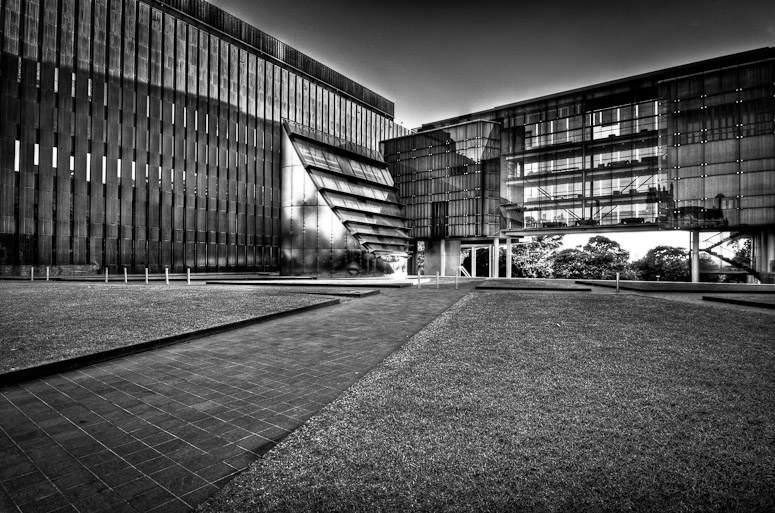
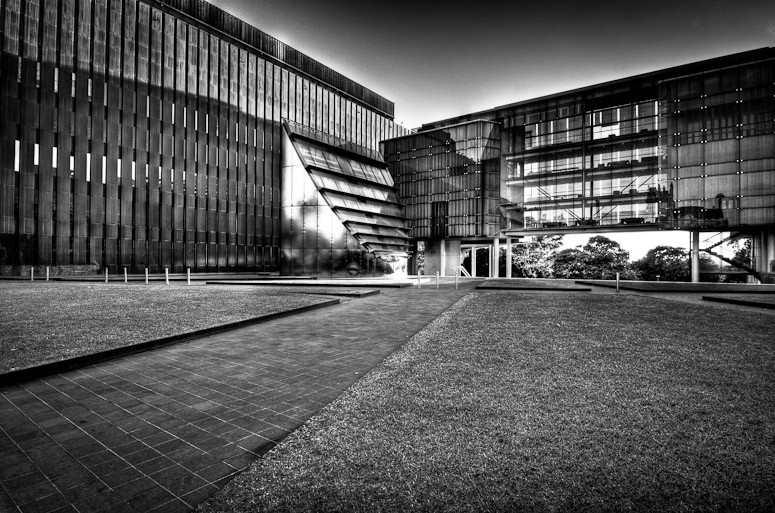
My take on a stark monochrome rendition of one of the modern structures
Image

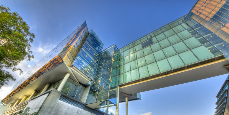
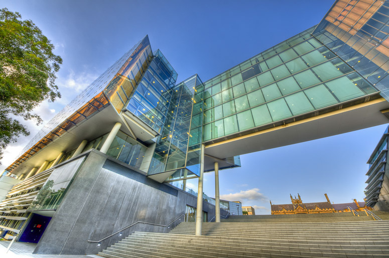
and from the other side and below with an extremely wide view - I'm not entirely happy with this image - it's got the very distorted hard angular view I was going for and the diagonal from bottom left to top right - but it isn't gelling for me and I don't know why...
Image

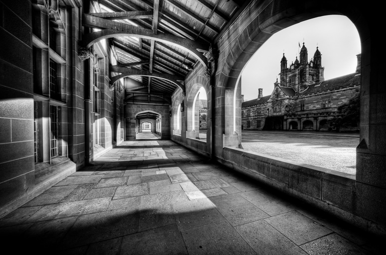
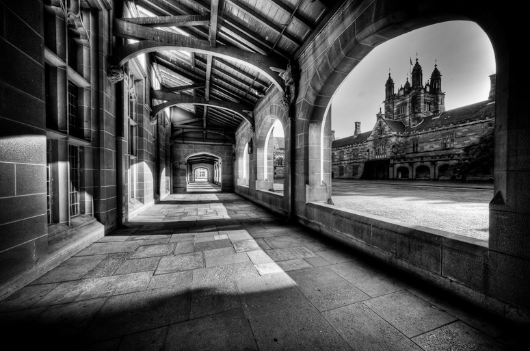
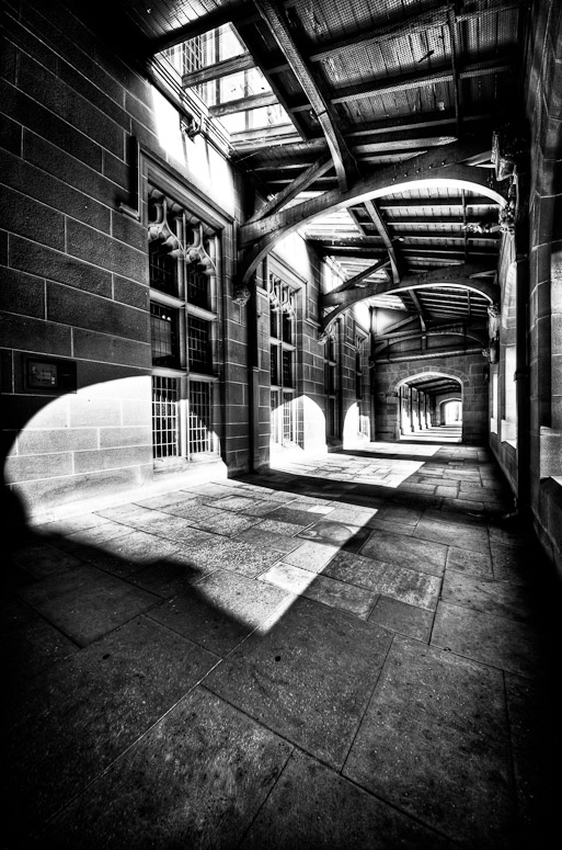
Two views of the corridors of Hogwarts :)
Image

Image

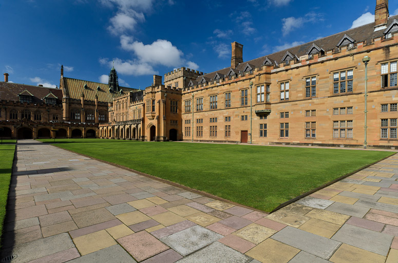
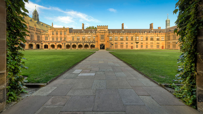
and a colour view of the interior of the main quad - HDR question of the day: is it or isn't it (no cheating :))?

Image

Re: Rodney's Sydney University Architectural...

PostPosted: Wed Feb 22, 2012 10:34 am
by photohiker
Corridor 1 is the pick for me.

Image 2, the one 'not gelling' - HDR? Ghosting is distracting and the overhead walkway doesn't appear to have enough support on the right of the image. It looks better (IMO) if the bottom is cropped so that the lower edge of the walkway just intersects the bottom of the image.

Re: Rodney's Sydney University Architectural...

PostPosted: Wed Feb 22, 2012 1:40 pm
by biggerry
#1, I like the BW processing, it maybe a little contrasty and stark for me, but I know thats how you like it :) The halo/glow on top of teh buildings is a little off but not a show stopper, the composition is ok but does not make me fall out my chair. :D I guess i say that since there does not feel to be a definitive focal point, plety of lines but not a hard location to lock the viewer in. The funky tower is blended into teh scene too much to work as the primary focus point.

#2 nah does not do anything for me, I have a similar one from closer up and I like the details and depth in the glass that the HDR brings but as a wide angle I find yours and also mine pretty uninspiring. I think this part of teh building could work better with a nice tight view on the corner section coupled with teh right angle.

#3 Probably the best composition of teh lot imo. the vanishing point of teh corridor and the main quad tower in teh 3rd intersection coupel nicely together. The BW is not too intense and sits nicely for me. The only downer from my view is the greyed/haloed sky, I think making the sky a consist shade would work better, whether that be white or grey.

#4 a bit too stark? missing another element? dunno.

#5 HDR? sure it is, just depends on your definition of HDR :wink:

Re: Rodney's Sydney University Architectural...

PostPosted: Wed Feb 22, 2012 9:53 pm
by Remorhaz
photohiker wrote:Corridor 1 is the pick for me.


Thanks - good to know :)

Image 2, the one 'not gelling' - HDR? Ghosting is distracting and the overhead walkway doesn't appear to have enough support on the right of the image. It looks better (IMO) if the bottom is cropped so that the lower edge of the walkway just intersects the bottom of the image.


Yeah I think the crop could look better but I'm still feeling like it's a lost cause :(

biggerry wrote:#1, I like the BW processing, it maybe a little contrasty and stark for me, but I know thats how you like it


:)

#2 nah does not do anything for me


:)

#3 Probably the best composition of teh lot imo. the vanishing point of teh corridor and the main quad tower in teh 3rd intersection coupel nicely together. The BW is not too intense and sits nicely for me. The only downer from my view is the greyed/haloed sky, I think making the sky a consist shade would work better, whether that be white or grey.


Thanks Gerry - I was trying to preserve a smidge of detail in the sky when I should have just let it go :cheers:

#4 a bit too stark? missing another element? dunno.


Not sure - personally somehow I liked this one (heavier B&W processing maybe) perhaps even more than #3

#5 HDR? sure it is, just depends on your definition of HDR


Aw now thats cheating - you know what I mean :)

Redefined question: is this multiple images/exposures either tonemapped or even just exposure blended or layer blended?

Thanks for the feedback :up:

Re: Rodney's Sydney University Architectural...

PostPosted: Thu Feb 23, 2012 8:55 am
by PiroStitch
While I like the contrast from the black and white, I can't say I'm liking the HDR treatment but I've always been biased against HDR.

Re: Rodney's Sydney University Architectural...

PostPosted: Thu Feb 23, 2012 6:21 pm
by stubbsy
Rodney

#3 is stellar, made more so by your smart composition with the large hole on the right framing another view of the surrounding buildings. Superb.

Re: Rodney's Sydney University Architectural...

PostPosted: Fri Feb 24, 2012 5:43 pm
by Remorhaz
PiroStitch wrote:While I like the contrast from the black and white, I can't say I'm liking the HDR treatment but I've always been biased against HDR.


Thanks Piro - I also like contrasty black and white - I am finding however that for some images if I HDR them first and then convert to black and white I get a better end result.

stubbsy wrote:#3 is stellar, made more so by your smart composition with the large hole on the right framing another view of the surrounding buildings. Superb.


Thanks Peter :)

Re: Rodney's Sydney University Architectural...

PostPosted: Sun Feb 26, 2012 9:25 am
by Remorhaz
I reworked a few of the images based on suggestions so...

For the first I tried to even out the sky and reduce the spread of haloing around the buildings, in the second I cropped and tried to even out the sky and reduce the haloing on the lhs and in the third took Gerry's advice and let the sky go :)

Image

Image

Image

Re: Rodney's Sydney University Architectural...

PostPosted: Wed Feb 29, 2012 10:29 pm
by biggerry
Remorhaz wrote:in the third took Gerry's advice and let the sky go :)


looks shitloads better imo.

The crop on the glass building does look better too.

Re: Rodney's Sydney University Architectural...

PostPosted: Thu Mar 01, 2012 11:32 pm
by surenj
Remorhaz wrote:Two views of the corridors of Hogwarts
To echo other peoples' comments, the compo here is superb. I don't feel inspired by the HDR though. I think it would be more 'art print like' and subtle if you just dodged and burnt or manually blended various exposures...

Remorhaz wrote:HDR question of the day: is it or isn't it (no cheating )?

I got alot of shots with similar color saturation SOOC with the polariser. So I vote no HDR.

Remorhaz wrote: I'm not entirely happy with this image - it's got the very distorted hard angular view I was going for and the diagonal from bottom left to top right - but it isn't gelling for me and I don't know why...

Yeah I agree. Hit delete from disk [and from backup]

Re: Rodney's Sydney University Architectural...

PostPosted: Fri Mar 02, 2012 10:54 am
by Remorhaz
surenj wrote:To echo other peoples' comments, the compo here is superb. I don't feel inspired by the HDR though. I think it would be more 'art print like' and subtle if you just dodged and burnt or manually blended various exposures...


Thanks Suren. omg! photoshop!! - I'm not sure I can do that :) - however I believe I will try just processing the single 0EV image in Lightroom and see what I can do.

I got alot of shots with similar color saturation SOOC with the polariser. So I vote no HDR.


and we have a winner (incl CPL). I actually took brackets for almost everything we shot (incl this) but found I liked just some minor PP on the 0EV image in this case.

FYI for comparison what about this one...

Image

Yeah I agree. Hit delete from disk [and from backup]


... harsh :)