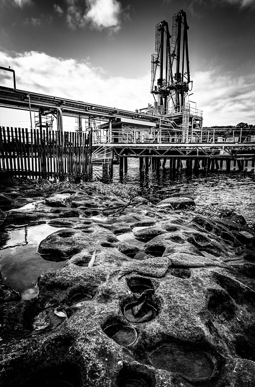
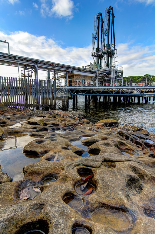
PiroStitch wrote:I do like the first image as there's lots of detail there to see... Not sure about the vignette or burning the top edge though, as it seems to have darkened one of the towers slightly.
Thanks for the tip - I'd burnt down the area on and around those two towers because it was too light for me - I've toned that down

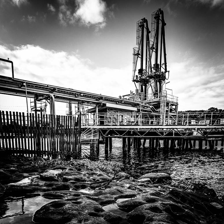
The second image is great with the lower viewpoint. A bit more contrast and vibrancy in the sky will finish the image off nicely.
Done

biggerry wrote:The BW one feels flat and as Piro mentioned this is probably due to the high level of detail, the compo is good and i would be interested in seeing it in colour.
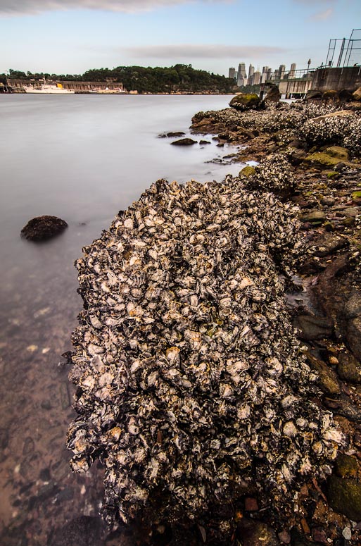
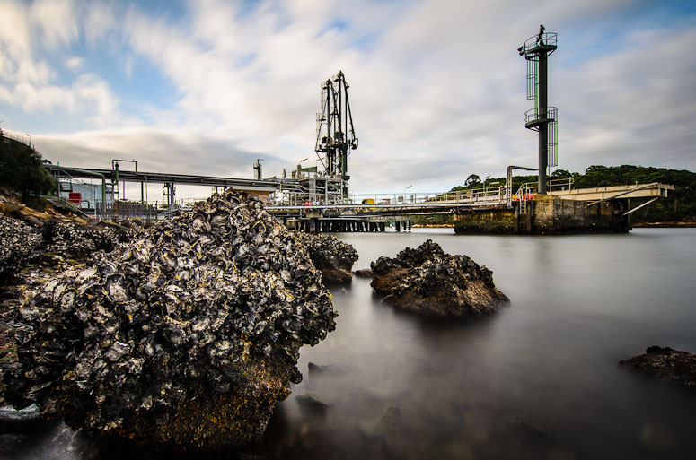
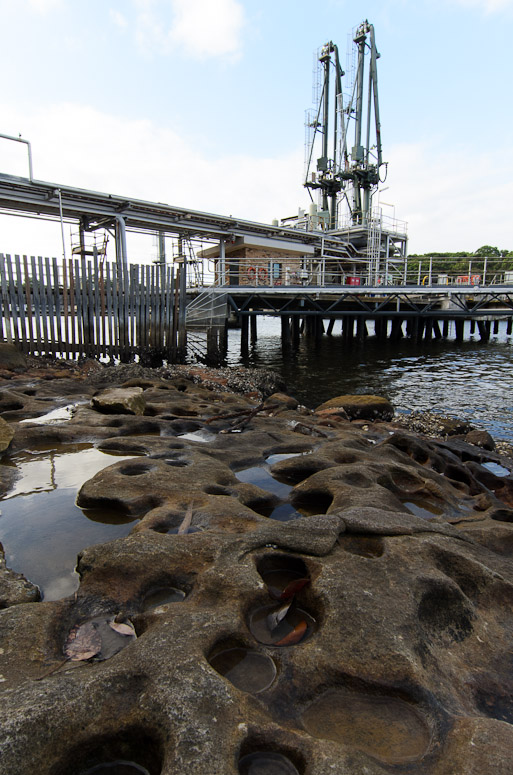
and here we have - firstly the original 0EV image - untouched except for rotation - and then the colour HDR I created (actually it's not tonemapped - it's an exposure fusion) - which probably explains some of the flatness you see


The second image is quite nice, it has that classic warmed contrast look from the bigstopper which i like. I reckon this could have been a candidate for the 8-16, a bit more water around the oyster rock would have isolated it a bit more and brought it into teh thirds which imo could have it moreso of the anchor point.
Yep - I agree - I did have the 8-16 with me but unfortunately it's not filter (and thus bigstopper) friendly

nice location too, i suppose asio were watching you

Actually... I essentially just stumbled across this place - but the warning signs at the front did say it's under constant video surveillance, etc

gstark wrote:I don't particularly care for the foreground in the first image; it's competing with the wharf and crane for attention as the primary subject of the image. I'd be cropping most of this out, and perhaps leaving just a little of the rocks in place, more as a framing feature than anything else.
Thanks Gary - although you know I was going for the whole lotsa rocks in the foreground using the ultra wide angle look...
That said here is a straight square crop of the top (which includes my rework of my burning over the towers that piro suggested)

With the second image, do you have one from a slightly higher point of view? The way that the central rock interrupts the view of the wharf disturbs me, and a higher PoV would relieve this issue.
Unfortunately no - I did take this one from a higher POV facing the other direction but my feelings on it are a bit meh...
