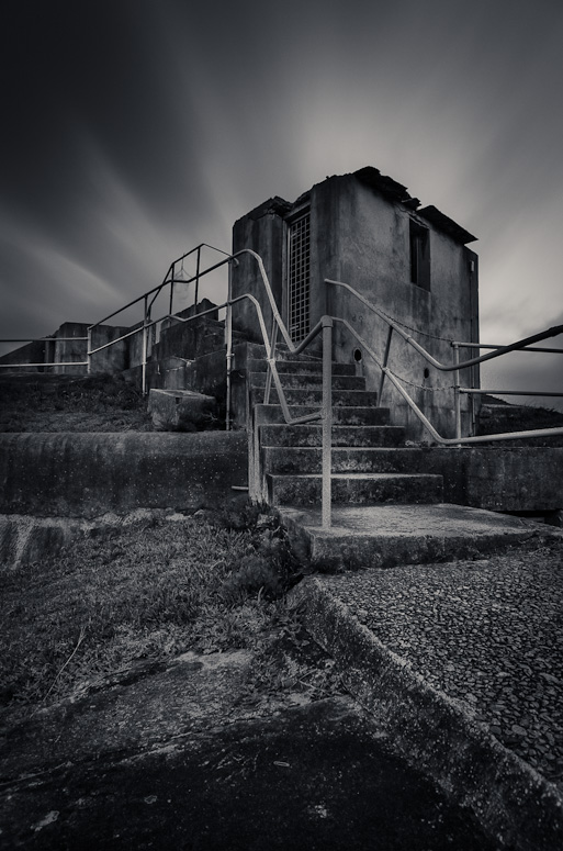
Geoff M wrote:The middle image is not working for me on two counts. First count is the fact that it is taller than the other two, I think it would be better if the height of all three images were consistent. The second count is the angular orientation of the wall do you have a shot where the wall runs parallel to the viewer?
Processing and conversion is very good with nice contrast and tonal range.
Cheers Geoff, the larger size was delibrate which I do not mind, however you are correct regarding the prominent wall with teh angle. I do have a few other images which I may try.
Matt. K wrote:Not quite working for me. A tryptich in contemporary terms would be a series of 3 images with a common or connecting theme....not just a common subject, or a landscape cut into 3. The historical definition is somewhat different, any 3 panels that are divided or fold out. The best tryptiches have a strong unifying element for example...a fertile paddock lush with wheat in panel 1.....the same paddock in drought and the third in flood. That's just a crude example. In truth I guess a tryptich can be whatever the author wants it to be....but to create one that stands out from the rest probably will require some conceptual planning. In your example if there was a chicken on the rock in #1....a carton of eggs on #2 and a frypan on #3 then for me I would get the series in a more satisfying way. Hope I'm making sense here. Hope it gives you food for thought. Incidentally....I admire the strong composition you have created with each image. Makes them interesting to look at individually.
I hear what you are saying matt and thanks for the feedback, I guess one aspect why I am trying triptych images after the fact is due to the fact I am not happy with the singular image or I am tryign to convey more of a certain scene than can be shown in a single frame.
Matt. K wrote:I admire the strong composition you have created with each image. Makes them interesting to look at individually.
hmm, maybe i will try and work with one of thge images by itself, cheers.
Remorhaz wrote:Hi Gerry - I don't mind the different size/shape panels - thats all good for me. I'm not really feeling the images themselves tho - probably particularly the centre one. I like the bold processing tho (it's the sort of think I tend to gravitate towards myself

).
surenj wrote:I;ve had a few looks at this set.
I don't think the individual images are strong enough. I think they are good (apart from the middle one) but not exceptional. Therefore the triptych is not that strong.
Each of the images are missing one element I reckon.
maybe a much stronger centre image could turn this around, standby.
surenj wrote:Re: BW conversions. I can see (or imagine) filter burn on the transition and that makes me think bad thoughts.
Not sure about this one Gerry. What were your thoughts? ARe there any other Triptychs to show??
there is some transitition there, i could remove it, however I can't be arsed.


