Page 1 of 1

Help Please - Pick One...

PostPosted: Mon Apr 23, 2012 9:48 pm
by Remorhaz
We had a better than average sunset tonight so on the way home from picking up my eldest from school band my girls and I stopped at one of the harbour foreshores nearby and took in the sunset.

As it happens I need an image which "is inspired by colours" and was hoping my esteemed friends here could help me choose one of the following three as the best image to fit the bill (or go home you're dreamin') - and of course any PP suggestions are most welcome.

All were taken with the 10 Stop ND + 3 Stop Hard Grad
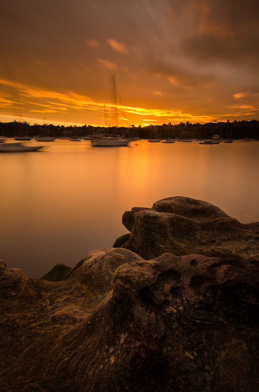
Image
NIKON D7000 + 12.0-24.0 mm f/4.0 @ 12 mm, 120 sec at f/8, ISO 100
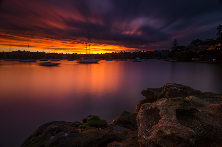
Image
NIKON D7000 + 12.0-24.0 mm f/4.0 @ 12 mm, 240 sec at f/9, ISO 200
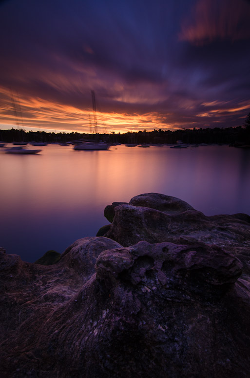
Image
NIKON D7000 + 12.0-24.0 mm f/4.0 @ 12 mm, 211 sec at f/11, ISO 200
Re: Help Please - Pick One...

PostPosted: Mon Apr 23, 2012 10:43 pm
by Mr Darcy
Of these I would pick number three

But if it was up against Gerry's
http://www.dslrusers.com/viewtopic.php?p=441587#p441587
I owuldn't bother

Re: Help Please - Pick One...

PostPosted: Mon Apr 23, 2012 11:11 pm
by aim54x
I prefer #2, but it would benefit with some experimentation in crops....there is an epic feel about the sky

Re: Help Please - Pick One...

PostPosted: Tue Apr 24, 2012 6:22 am
by TonyT
Number 2

Re: Help Please - Pick One...

PostPosted: Tue Apr 24, 2012 6:25 am
by TonyT
Number 2
"but it would benefit with some experimentation in crops" Maybe some off the bottom

Re: Help Please - Pick One...

PostPosted: Tue Apr 24, 2012 7:27 am
by Reschsmooth
TonyT wrote:Number 2
"but it would benefit with some experimentation in crops" Maybe some off the bottom


What tony said Cameron said. I think the movement of the boats, as unavoidable as it is, detracts from the images.

Re: Help Please - Pick One...

PostPosted: Tue Apr 24, 2012 9:15 am
by PiroStitch
Either the second or the third one, though the rocks need a bit more fill light in them. Not to the point that it has equal exposure to the rest of the image, but just enough to balance it out a bit.

Re: Help Please - Pick One...

PostPosted: Tue Apr 24, 2012 9:59 am
by sirhc55
#1 - all suffer from movement in the background but #1 has the best definition in the rocks + colour

Re: Help Please - Pick One...

PostPosted: Tue Apr 24, 2012 3:24 pm
by surenj
Hi Rodney,

Because the clouds AND the boats are moving, these pictures don't work for me. Do you by chance have any with a still sky + still boats? If so you could try combining those.

Perhaps just try one moving element to see whether it works; it might.

Re: Help Please - Pick One...

PostPosted: Tue Apr 24, 2012 7:01 pm
by zafra52
2 or 3 would be my piock, thought 1
is clearer in details

Re: Help Please - Pick One...

PostPosted: Tue Apr 24, 2012 11:34 pm
by Remorhaz
Mr Darcy wrote:Of these I would pick number three But if it was up against Gerry's I owuldn't bother


Yeah - I know :)

aim54x wrote:I prefer #2, but it would benefit with some experimentation in crops....there is an epic feel about the sky

TonyT wrote:Number 2 "but it would benefit with some experimentation in crops" Maybe some off the bottom


Thanks - I like the base of rocks at the bottom so I'll probably stick with it for now :)

PiroStitch wrote:Either the second or the third one, though the rocks need a bit more fill light in them. Not to the point that it has equal exposure to the rest of the image, but just enough to balance it out a bit.


Thanks - I'd already done mega shadow recovery at the bottom but I think the problem was it then lacked any contrast - no shadows at all to go with the lighter parts of the rock - it was all sort of equally dull - see below...

Reschsmooth wrote:What tony said Cameron said. I think the movement of the boats, as unavoidable as it is, detracts from the images.

sirhc55 wrote:#1 - all suffer from movement in the background but #1 has the best definition in the rocks + colour

zafra52 wrote:2 or 3 would be my piock, thought 1 is clearer in details

surenj wrote:Because the clouds AND the boats are moving, these pictures don't work for me. Do you by chance have any with a still sky + still boats? If so you could try combining those. Perhaps just try one moving element to see whether it works; it might.


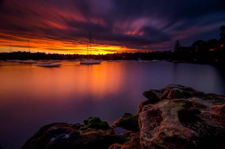
Bingo - I think.... here we go - as it happens I did have a few frames taken immediately after this compo (without the bigstopper) - 4 sec exposures so much less boat movement. So I've opened them both as layers and tried in my clumsy way to blend them together - taking the sharper (and lighter as it happens) boat body images from the 4 sec exposure and blending with just about everything else from the other. I also did some different work with the rocks at the bottom. Sort of lighter and darker which i think gives it more depth and solidity.

So Thankyou everyone for your input so far and here is the result to date - what do you think?

Image

Re: Help Please - Pick One...

PostPosted: Wed Apr 25, 2012 7:38 am
by Mr Darcy
Now that's beginning to look nice.

What I particularly liked about #3, given the "Colours" theme, were the blues coming through in that image.
Perhaps raise the luminance and/or saturation of the blue channel a tad to bring these out. Not too much or you'll wash them out.

Re: Help Please - Pick One...

PostPosted: Wed Apr 25, 2012 10:49 am
by surenj
Yet. Better.

Re: Help Please - Pick One...

PostPosted: Wed Apr 25, 2012 10:06 pm
by Mj
So my thoughts are... the last image is the one to work on. I think you should be able to get a little more detail from the foreground rocks but don't over do it. Then i would look at what i can do to highlight the rightmost boat to make it a focal point of the composition. Otherwise the image lacks purpose in my view... of course there may be other ways to get a similar outcome... but that's my first thought.

Re: Help Please - Pick One...

PostPosted: Thu Apr 26, 2012 10:38 am
by Remorhaz
Mr Darcy wrote:Now that's beginning to look nice. What I particularly liked about #3, given the "Colours" theme, were the blues coming through in that image. Perhaps raise the luminance and/or saturation of the blue channel a tad to bring these out. Not too much or you'll wash them out.


Thanks Greg - did you mean to try and bring more blue out in this last (landscape) image or the original #3? I tried with the last image but there just wasn't enough there to drag anything out (without just creating ugly noise and artifacts)

surenj wrote:Yet. Better.


:)

Mj wrote:So my thoughts are... the last image is the one to work on. I think you should be able to get a little more detail from the foreground rocks but don't over do it. Then i would look at what i can do to highlight the rightmost boat to make it a focal point of the composition. Otherwise the image lacks purpose in my view... of course there may be other ways to get a similar outcome... but that's my first thought.


Thanks Mj - by rightmost boat I assume you mean the large one just to the left of centre and not some miniscule thing on the far right? I should be able to highlight that centre one more fairly easily (since I originally burnt all those ones down quite a bit as they were too bright). I know it doesn't look like it in the web image but in my large full size image theres quite a bit more detail in the foreground rocks and they look brighter - not sure why the jpeg conversion is dulling that area down noticably.

Re: Help Please - Pick One...

PostPosted: Thu Apr 26, 2012 11:32 am
by Mr Darcy
Remorhaz wrote:Thanks Greg - did you mean to try and bring more blue out in this last (landscape) image or the original #3? I tried with the last image but there just wasn't enough there to drag anything out (without just creating ugly noise and artifacts)


I meant to bring the blues/violets out in the new image. But if there's nothing to work with. C'est la vie.

Remorhaz wrote:not sure why the jpeg conversion is dulling that area down noticably.

Could it be the conversion to sRGB?

Re: Help Please - Pick One...

PostPosted: Thu Apr 26, 2012 12:04 pm
by Reschsmooth
I think the rework works. I wouldn't touch the rocks too much as I think, as they are, they provide a nice frame for the real subject being the boats and colours.