Page 1 of 1

Wine Country...

PostPosted: Sat Apr 28, 2012 12:46 pm
by Remorhaz
We travelled through the back roads of wine country recently and never one to miss a photographic opportunity managed a few images on the way...

Comments/Feedback/Critique always welcomed :)

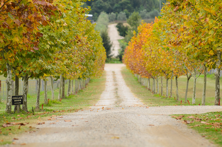
It's just starting to be fall colour time so I was lucky enough to get some of the turning leaves. A nice compressed landscape with the 70-200.

Autumn Rows
Image

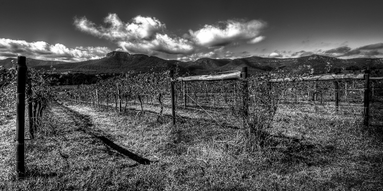
We stopped at this winery for a picnic lunch - this was our view from where we ate... This was a nine shot bracket HDR'd and then converted to monochrome. I'm not entirely happy with this image and I'm not sure what - I like the skies but... Perhaps I'm suffering Marcus's fate with the winery and vines :)

Vines and Skies

Image

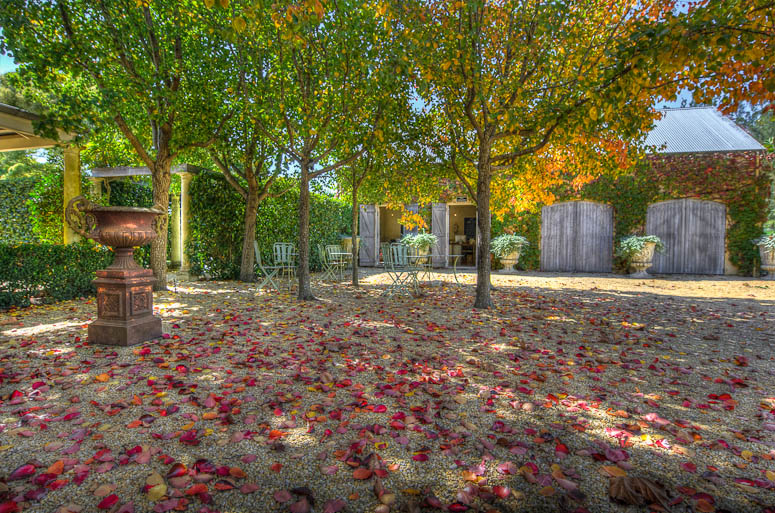
On the way home we also visited this winery which had an amazing grove of autumn trees in a lovely courtyard outside the tasting rooms and I couldn't resist a couple handheld HDR brackets whilst we were there. The colour of the red leaves on the pebbled ground along with the bright golden, orange and green leaves on the trees was vibrant and incredible.

Rose Coloured Fall
Image

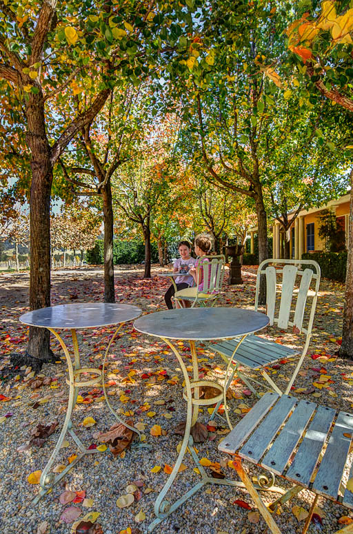
Tea for Two

Image

Re: Wine Country...

PostPosted: Mon Apr 30, 2012 12:17 pm
by Remorhaz
Just bumping because it vanished with the server crash - if anyone had already responded please feel free to do so again :)

and because it's got lots of HDR and wil polarise the audience :twisted:

Re: Wine Country...

PostPosted: Thu May 03, 2012 7:14 pm
by stubbsy
Rodney

#1 - big thumbs up - great use of perspective & lines (would be briulliant if there was something at the end of the road, but that's a nit pick). Greate colours too.

#3 - I like this despite the HDR of it if that makes any sense.

Other two are ho hum for me - #2 I just doesn't suit black and white - there's no interest there. #4 the composition bothers me - chop the top and the bottom to make a landscape shot and you have a winner

Re: Wine Country...

PostPosted: Thu May 03, 2012 7:50 pm
by Mj
#3 is the stand out here for me... a nice colourful autumnal feel.
#1 is well executed and classic in style but (sorry) done to death... would put it on a poster or an advert with no second thought.
#2 lacks definition... might have been better in colour maybe.
#4 is a happy snap... nothing wrong with that (I've plenty).

Re: Wine Country...

PostPosted: Fri May 04, 2012 1:29 am
by PiroStitch
#1 - needs another subject, whether it's a person or kangaroo to make it more interesting.

#2 - the clouds are a bit over done as it detracts from looking at the rest of details in the image

#3 - Probably the strongest out of the lot. Looks a bit like a Monet painting with the leaves on the ground.

Re: Wine Country...

PostPosted: Fri May 04, 2012 11:55 pm
by surenj
Hi Rodney,

#1 - Consider a bit of croppage from the bottom...

Re: Wine Country...

PostPosted: Sat May 05, 2012 6:50 am
by Reschsmooth
As with others, I like numbers 1 and 3 best. The first would be stronger with some human interest, like a wine maker walking across.

Re: Wine Country...

PostPosted: Sat May 05, 2012 10:09 am
by Remorhaz
stubbsy wrote:#1 - big thumbs up - great use of perspective & lines (would be briulliant if there was something at the end of the road, but that's a nit pick). Greate colours too.


Thanks Peter - yes - didn't have any of my kids with me when I too this one so I couldn't vene send one of them to run down the road for me :)

#3 - I like this despite the HDR of it if that makes any sense


It does - for me too :)

Mj wrote:#3 is the stand out here for me... a nice colourful autumnal feel.


Thanks Mj

#1 is well executed and classic in style but (sorry) done to death... would put it on a poster or an advert with no second thought.


All good and thanks for the honest feedback :)

#2 lacks definition... might have been better in colour maybe.


Yeah - don't know where I was going with #2 - I should have binned it at the start :)

Re: Wine Country...

PostPosted: Sat May 05, 2012 10:15 am
by Remorhaz
PiroStitch wrote:#1 - needs another subject, whether it's a person or kangaroo to make it more interesting.


Thanks Piro - I was here twice on different days so I should have thought about that in the interim...

#3 - Probably the strongest out of the lot. Looks a bit like a Monet painting with the leaves on the ground.


Ha now thats the description to use... hmm Monet you say...

surenj wrote:#1 - Consider a bit of croppage from the bottom...


Thanks Suren

Reschsmooth wrote:As with others, I like numbers 1 and 3 best. The first would be stronger with some human interest, like a wine maker walking across.


They had goats off to the right the second day I was there :(