Page 1 of 1

North Head Macro...

PostPosted: Tue Jun 26, 2012 1:22 pm
by Remorhaz
After our less than stellar sunrise at North Head we headed into the bushland there on the cliffs looking for macro and details.

Unfortunately I hadn't brought either my new LED macro ring light nor my flash and macro diffuser so I was somewhat limited on the lighting front for macro work. I opted to take some longer exposures on a tripod in the hopes of getting something half decent of some flowers - which wasn't easy in the windy conditions on the coast - trying to time a slow shutter inbetween wind gusts was like toying with frustration :)

Nothing much to write home about but here are a couple which turned out ok...
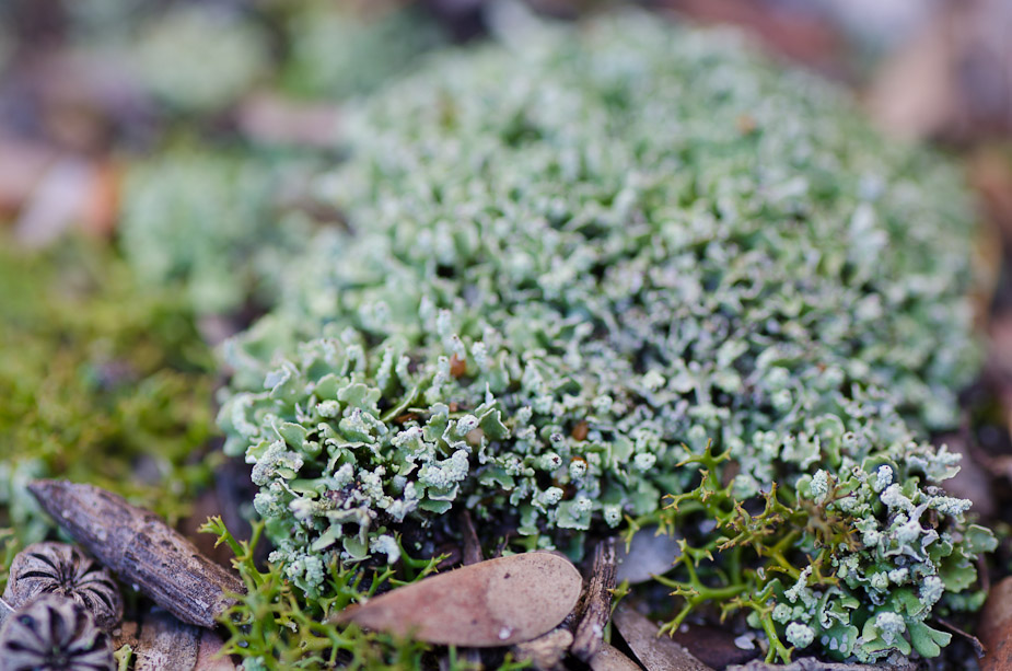
Image
NIKON D7000 + 90.0 mm f/2.8 @ 90 mm, 1/20 sec at f/8, ISO 100
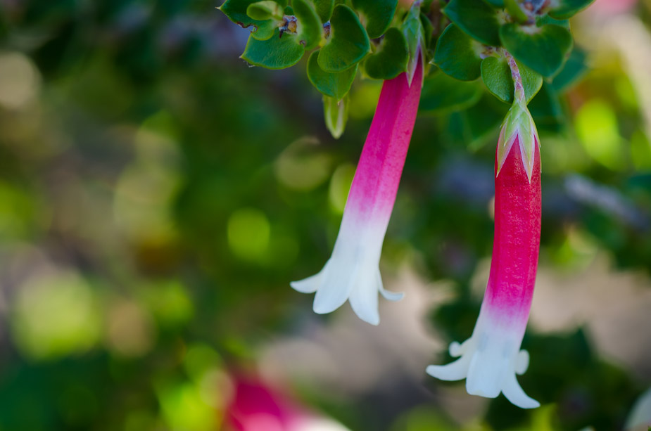
Image
NIKON D7000 + 90.0 mm f/2.8 @ 90 mm, 1/25 sec at f/11, ISO 100

Not a macro but it was a close focus shot with the ultrawide of some interesting textures covering the ground
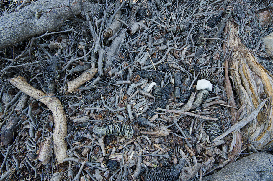
Image
NIKON D7000 + 8.0-16.0 mm f/4.5-5.6 @ 8 mm, 1/6 sec at f/9, ISO 100
Re: North Head Macro...

PostPosted: Tue Jun 26, 2012 9:47 pm
by biggerry
for some reason i always thought you were gonna do that last image in BW, seeing it in colour reinforces the fact that i think it should be in BW ;) The main focus is those textures and that chaos that is...or should i say ..was a tree. I reckon try the BW and just work on one primary element...the texture, remove all other distracting elements (like the colour) and possibly use something like a tonal contrast or something to accenutate the texture..even push it more towards a abstract that somethign that immediately identifies what it is.

Re: North Head Macro...

PostPosted: Wed Jun 27, 2012 7:16 pm
by surenj
Hey Rodney and Gerry,

I prefer the last in colour. I quite like those blue, yellow tones! Take out that white blob though. Sticks out. I think a bit of tonal contrast would be ok (clarity).

Better luck next time with the sun/clouds...

Suren

Re: North Head Macro...

PostPosted: Wed Jun 27, 2012 9:12 pm
by zafra52
The first one is a real challenge for my eyes. I guess that's
the reason I like it best.

Re: North Head Macro...

PostPosted: Wed Jun 27, 2012 11:39 pm
by Remorhaz
biggerry wrote:for some reason i always thought you were gonna do that last image in BW, seeing it in colour reinforces the fact that i think it should be in BW ;) The main focus is those textures and that chaos that is...or should i say ..was a tree. I reckon try the BW and just work on one primary element...the texture, remove all other distracting elements (like the colour) and possibly use something like a tonal contrast or something to accenutate the texture..even push it more towards a abstract that somethign that immediately identifies what it is.


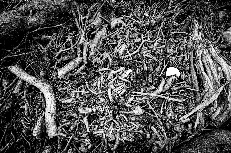
Thanks Gerry - here you go - a fairly aggressive monochrome processing with a heavy dose of tonal contrast (all in Lightroom I might add)

Image

surenj wrote:I prefer the last in colour. I quite like those blue, yellow tones! Take out that white blob though. Sticks out. I think a bit of tonal contrast would be ok (clarity).


:) - I liked the white blob (a white stone) - even included it sort of on purpose :)

Better luck next time with the sun/clouds...


Better luck next time getting out of bed on time :roll:

zafra52 wrote:The first one is a real challenge for my eyes. I guess that's the reason I like it best.


Thanks Zafra

If it matters my daughter likes the second the best :D

Re: North Head Macro...

PostPosted: Thu Jun 28, 2012 9:18 am
by biggerry
craploads better in my opinion - now i can't stop looking at that white blob... :|

Re: North Head Macro...

PostPosted: Thu Jun 28, 2012 1:16 pm
by zafra52
Although I find the last one doesn't seem
to have a main subject, but seems to be a
complex design of shapes and subtle colours,
I still find that colour is preferable for the eye.
In fact, I would advise you to use filters and
be creative and see what you come up with.