Page 1 of 1

A Night on the Rocks...

PostPosted: Tue Sep 11, 2012 10:41 am
by Remorhaz
I caught up with Cameron and Marcus down under the bridge for a little evenings shooting

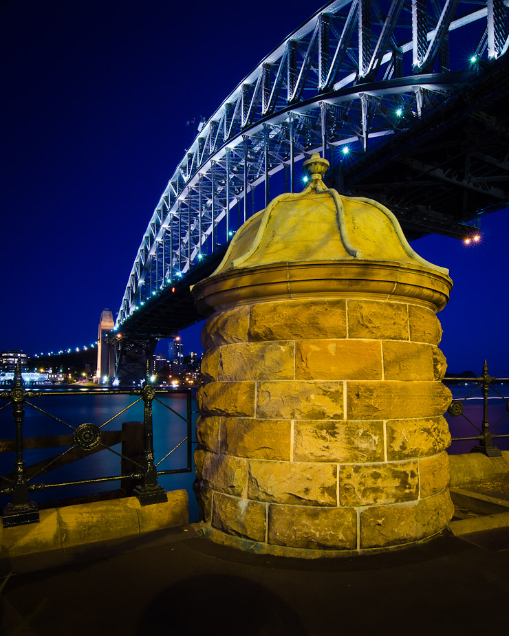
A little two minute long exposure right under the bridge towards the end of twilight (which I'm not feeling but my daughter likes)
Image

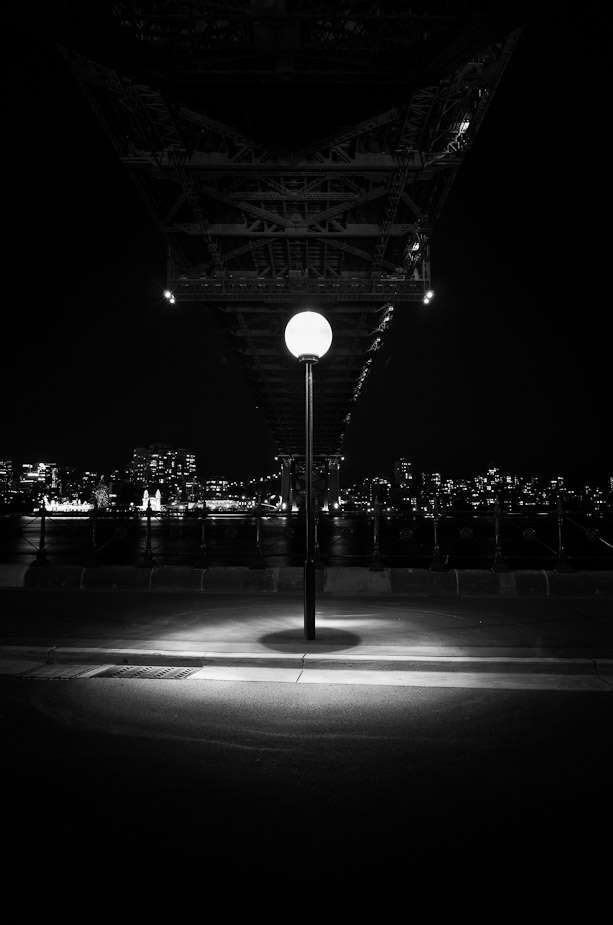
I fully stole the following idea from Marcus who'd shot something very similar just minutes before (admittedly he did his handheld at ISO 8000) - however it was too good a shot to pass up so here is a timeless moment and the best shot of the evening...
Image

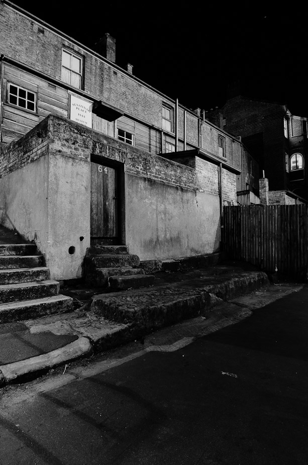
Finally as Cameron and I were wanding the back alleys of The Rocks area
Image

Re: A Night on the Rocks...

PostPosted: Tue Sep 11, 2012 3:15 pm
by biggerry
Rodney, the second image is hitting the right spots for me, the only improvement would be to crop some off the bottom just below the light spill from the lamp, this would then draw the viewer to the bright area than they would follow the post etc to the bridge, which is subtly nestled in the BG. Nicely done imo.

Re: A Night on the Rocks...

PostPosted: Tue Sep 11, 2012 10:36 pm
by aim54x
I really like that lamp post as well! You have really done well with it...my half-hearted attempts didn't make the cut.

Re: A Night on the Rocks...

PostPosted: Wed Sep 12, 2012 7:41 am
by CraigVTR
:agree: The lamp post.

In #1 I think the foreground element is just a little too dominant.

#3 does not really do anything for me.

Re: A Night on the Rocks...

PostPosted: Wed Sep 12, 2012 8:43 am
by Remorhaz
Well it looks like Marcus for the win - he gets all the credit

biggerry wrote:Rodney, the second image is hitting the right spots for me, the only improvement would be to crop some off the bottom just below the light spill from the lamp, this would then draw the viewer to the bright area than they would follow the post etc to the bridge, which is subtly nestled in the BG. Nicely done imo.


Thanks Gerry - I'll take a look

aim54x wrote:I really like that lamp post as well! You have really done well with it...my half-hearted attempts didn't make the cut.


It was the 12-24's fault I tell ya :)

CraigVTR wrote:The lamp post. In #1 I think the foreground element is just a little too dominant. #3 does not really do anything for me.


Thanks Craig - I hear you re #1 - I couldn't really back away enough to do what I wanted with this (lamp posts, tree, road and cars)