Page 1 of 1

Life's a Beach...

PostPosted: Mon Oct 01, 2012 12:10 am
by Remorhaz
We spent a week away travelling up to the Gold Coast for a little family holiday and visited some relatives on the way there and back.

The kids had a great time and of course enjoyed the beach (near Coffs Harbour)

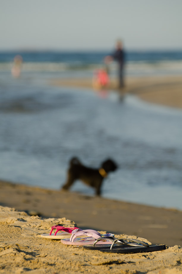
Waiting for Play to End
Image

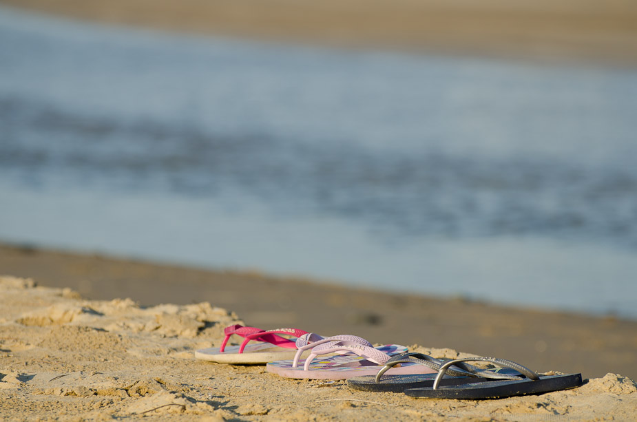
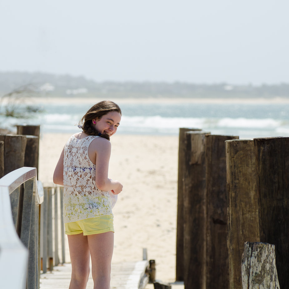
Simple Pleasures
Image

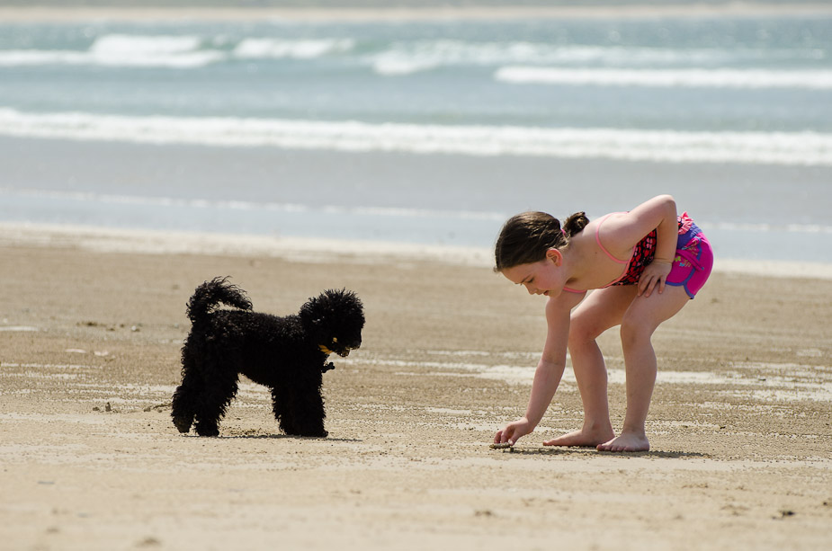
Fetch
Image

Feedback welcome...

Re: Life's a Beach...

PostPosted: Mon Oct 01, 2012 8:36 am
by Reschsmooth
I like the lines in the first. Overall, I think they need more 'pop' in the colours to give it a great holiday/summer vibe.

Re: Life's a Beach...

PostPosted: Mon Oct 01, 2012 1:20 pm
by Geoff M
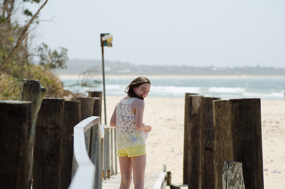
I like the lines in the first too. The second I would try a crop to remove the empty space on the RH side so that the post creates the frame, also crop from the top to keep the same aspect ratio. A nice family album shot in the third...is that a Spoodle? If so, I hope yours is not as scatty as ours!

Re: Life's a Beach...

PostPosted: Mon Oct 01, 2012 3:58 pm
by zafra52
I like the first one best. The other two are also
good, but have a family album feeling about them.

Re: Life's a Beach...

PostPosted: Mon Oct 01, 2012 5:20 pm
by Remorhaz
Reschsmooth wrote:I like the lines in the first. Overall, I think they need more 'pop' in the colours to give it a great holiday/summer vibe.


Thanks Patrick - I must admit to going with the softer bright look (with the later two which were taken the following day in the morning - full sun)

I took a look at adding quite a bit more contrast to the first and I think it's looking better

Geoff M wrote:I like the lines in the first too. The second I would try a crop to remove the empty space on the RH side so that the post creates the frame, also crop from the top to keep the same aspect ratio. A nice family album shot in the third...is that a Spoodle? If so, I hope yours is not as scatty as ours!


Thanks Geoff - crop looks good - I'm also thinking of cloning out that sign post on the left as well - but would have to go to PS for that - gasp!! :(

Not sure what sort of dog it was - maybe just a poodle - it's my sisters dog - and yes it was very energetic :)

zafra52 wrote:I like the first one best. The other two are also good, but have a family album feeling about them.


Thanks Zafra - definitely family snapshots :)

You could always go with this which takes a bit of both :)

Image

Re: Life's a Beach...

PostPosted: Mon Oct 01, 2012 5:57 pm
by zafra52
I still prefer the first one. It just looks planned
and arty. The blurred shapes in your last one
take away and give the impression you are having
problems with focusing, which we know for a
fact is not the case.

Now, lets consider the second one. I think that
you can crop it square putting the girl' s head on the
the top third removing much of what is on her left.
She has a very pleasant smile and deserves to be
more prominent in the photograph. Try it!

Re: Life's a Beach...

PostPosted: Tue Oct 02, 2012 10:12 am
by Remorhaz
zafra52 wrote:I still prefer the first one. It just looks planned and arty. The blurred shapes in your last one take away and give the impression you are having problems with focusing, which we know for a fact is not the case.


I wouldn't discount that possibility :)

Now, lets consider the second one. I think that you can crop it square putting the girl' s head on the the top third removing much of what is on her left. She has a very pleasant smile and deserves to be more prominent in the photograph. Try it!


Nice call :)

Image

Re: Life's a Beach...

PostPosted: Tue Oct 02, 2012 8:52 pm
by zafra52
NOw, I do like this version! Well done!
I hope you like it too.