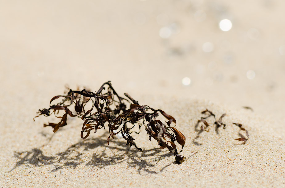
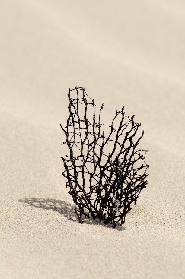
Geoff M wrote:A very nice set Rodney, altough I think that the orientation of all should be the same to make a 'set' or have two portrait and two landscape. My pick of the four is the fourth, a nice abstract. Exposure would have been challenging on a bright sandy beach.
Thanks Geoff - I shot all of these at -2/3rds of a stop and was all good. Unfortunately I didn't take a landscape version of the last (although I could probably crop one) - I might try a quadriptych and see how it looks - thanks.
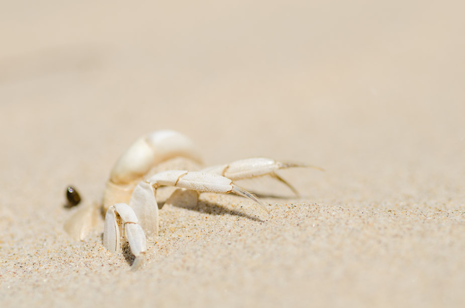
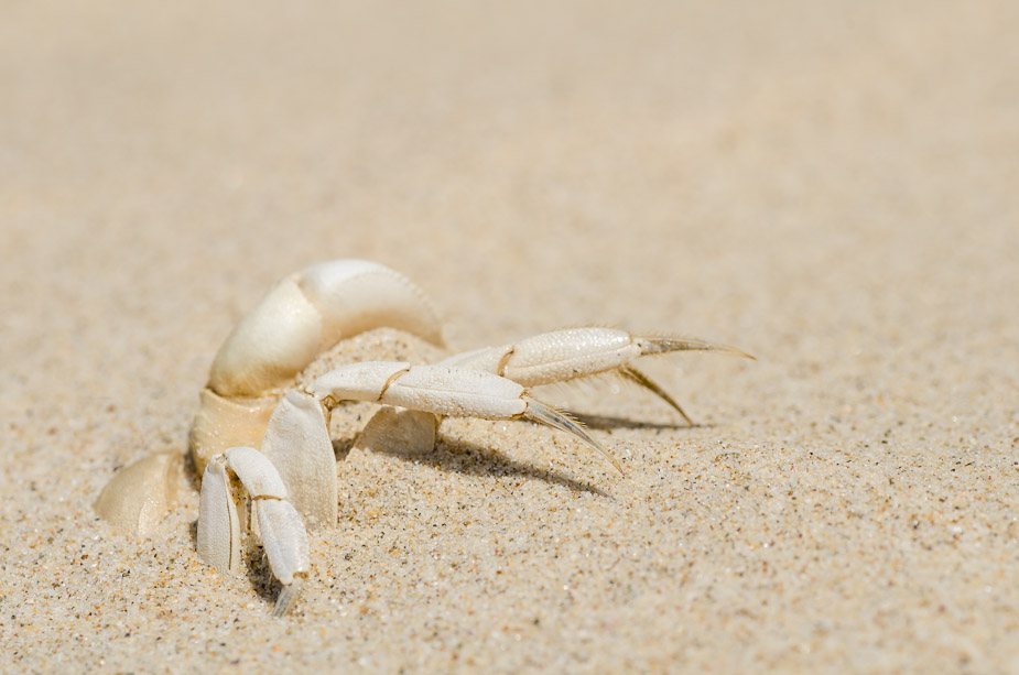
biggerry wrote:I am liking that first one Rodney, but needs more DOF and I really wanna see that dark thing in focus

zafra52 wrote:I like them all, but I agree the 1st one would benefit from more dof to bring the eye more into focus.
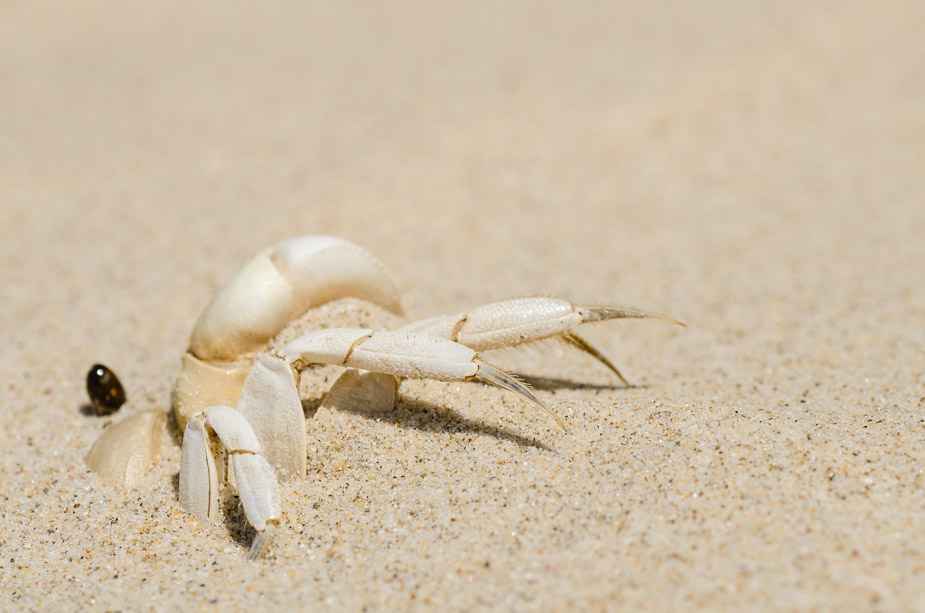
The dead (and pretty much empty) crab shell in the sand (NB I didn't set this up - this is as found

) - the dark thing was the eye - I did have a couple of shots at f/16 but even still the eye isn't really in the DoF and it makes the rest of the scene "messy" to my eye.
... I've edited one of the f/16 shots and cloned out the distracting crap in the background - thoughts?

biggerry wrote:The last is also nice and i think would suit a long vertical pano crop.
Thanks for the vertical pano crop idea with the last

 ) for some up close action at the seaside