Page 1 of 1

Sydney Lunchtime Rush... or not...

PostPosted: Fri Oct 19, 2012 6:11 pm
by Remorhaz
Weekday lunchtimes in the heart of the Sydney CBD are normally a crazy, jam packed affair with a sea of office workers milling through the streets. I headed out from the office with the new D600 and just the 85/1.8 with a view to capturing something which completely DIDN'T reflect this :)

C&C always appreciated...

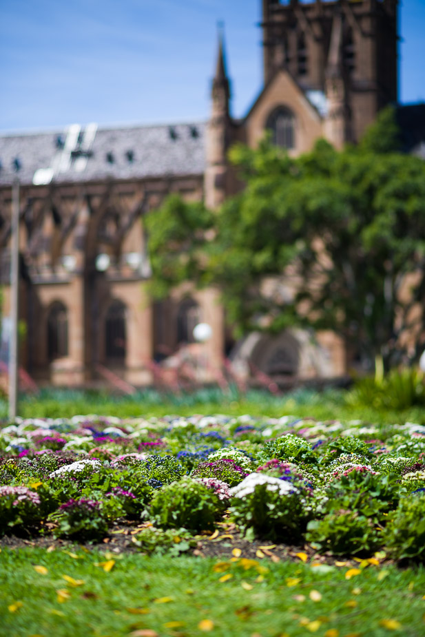
Hyde Park looking towards St Mary's Cathedral
Image

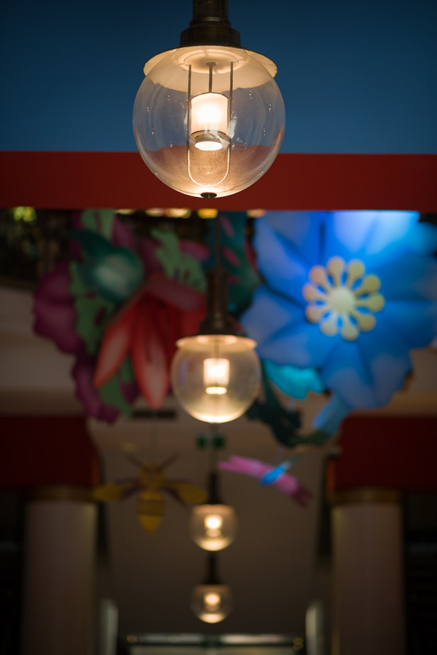
Actually this food court which lies underground at the Galleries Victoria was teeming with activity at the time (I'd just had lunch at the very nice Chat Thai - highly recommend it if you've never been)
Image

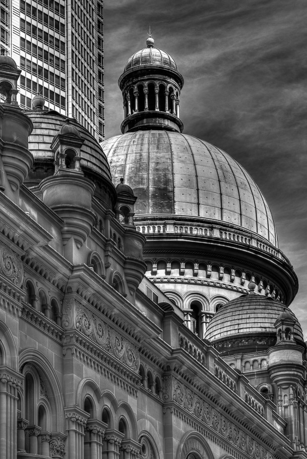
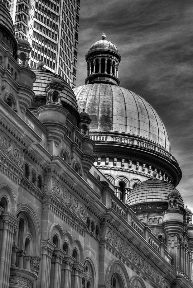
and of course you can't go past the ever present QVB... outside...

What's Old is New
Image

and in
Image

Re: Sydney Lunchtime Rush... or not...

PostPosted: Fri Oct 19, 2012 8:05 pm
by lightning
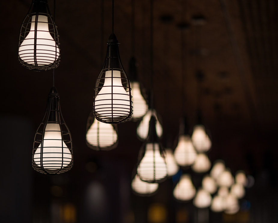
The first one I like and find quite humorous but I would crop out the lampost and to the top of the tree on the right, first lamps one I love and the building as well ( although it seems to be leaning to the right) 2nd lamps doesn't do it for me but I would think overall a really good lunch time shoot!

Re: Sydney Lunchtime Rush... or not...

PostPosted: Sat Oct 20, 2012 8:40 am
by aim54x
I really like the hanging lights (#2), and #3 would be better if you stopped that lean (quick put some supports on the QVB before it topples!)

Re: Sydney Lunchtime Rush... or not...

PostPosted: Sat Oct 20, 2012 10:19 am
by PiroStitch
The QVB image is tops. Ditto on the lean but it looks like it's more because of the tower behind it, than the building itself.

Re: Sydney Lunchtime Rush... or not...

PostPosted: Sat Oct 20, 2012 2:00 pm
by Remorhaz
lightning wrote:The first one I like and find quite humorous but I would crop out the lampost and to the top of the tree on the right, first lamps one I love and the building as well ( although it seems to be leaning to the right) 2nd lamps doesn't do it for me but I would think overall a really good lunch time shoot!

aim54x wrote:I really like the hanging lights (#2), and #3 would be better if you stopped that lean (quick put some supports on the QVB before it topples!)

PiroStitch wrote:The QVB image is tops. Ditto on the lean but it looks like it's more because of the tower behind it, than the building itself.


Thanks Fellas - with the lean - it was more a function of where I was standing for the things I wanted to include and since from that angle I wasn't going to get anything straight anyway I just went with it and let everything lean rather than try and have it straight.

I tried a little PP straightening just now and quite a lot ends up being cropped plus since I was pointing quite a bit up I still get converging verticals from both sides to try and fix - after a little LR love...

Image

Re: Sydney Lunchtime Rush... or not...

PostPosted: Sat Oct 20, 2012 6:30 pm
by phillipb
I wouldn't bother with the straightening, I would just clone the building out altogether. I really like the B&W conversion on it though.

Re: Sydney Lunchtime Rush... or not...

PostPosted: Sat Oct 20, 2012 8:13 pm
by Remorhaz
phillipb wrote:I wouldn't bother with the straightening, I would just clone the building out altogether. I really like the B&W conversion on it though.


Thanks Phillip - I assume you mean the modern one at the back? I purposely included it tho.