Page 1 of 1

Simple Floral Macro...

PostPosted: Sun Dec 30, 2012 8:39 am
by Remorhaz
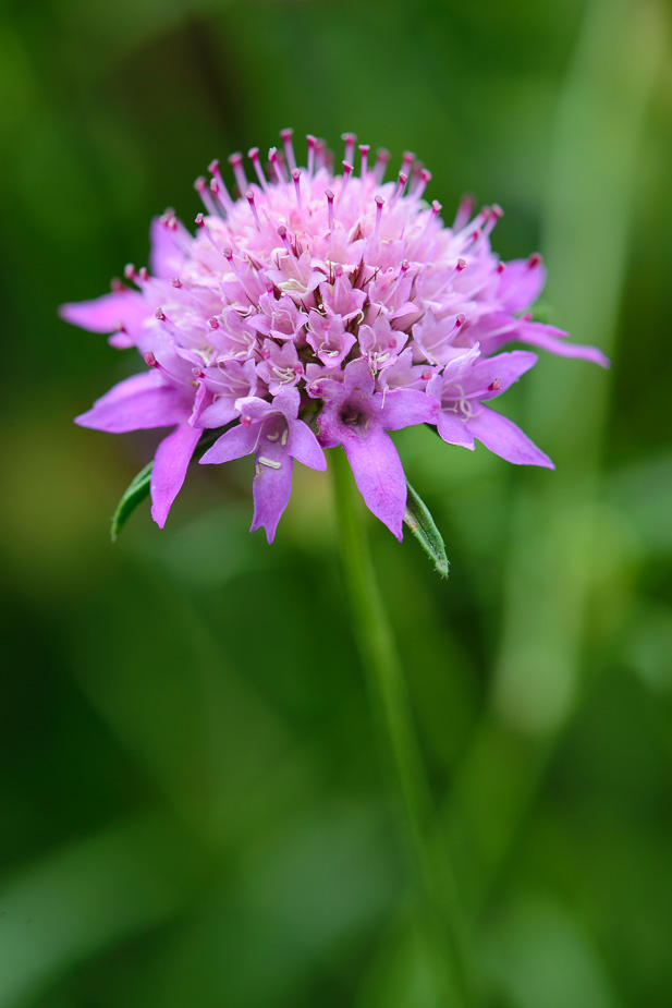
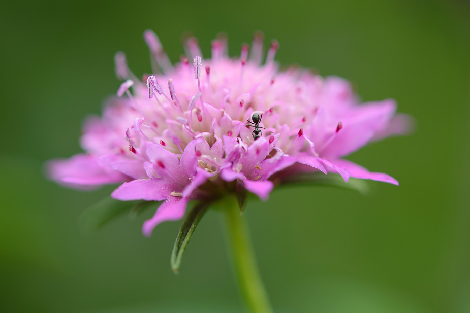
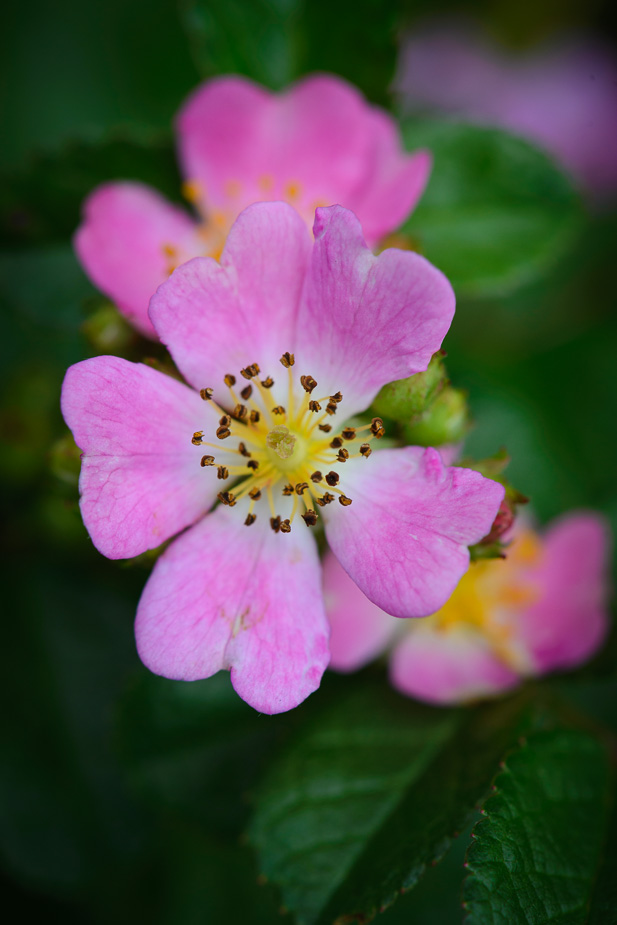
Some flowers in my dads garden with the Nikon 105VR macro - no focus stacking, no macro ring lighting, no flash, no tripod this time - just basic handheld run and gun :)

Image

Image

Image

Image

Re: Simple Floral Macro...

PostPosted: Sun Dec 30, 2012 3:49 pm
by Matt. K
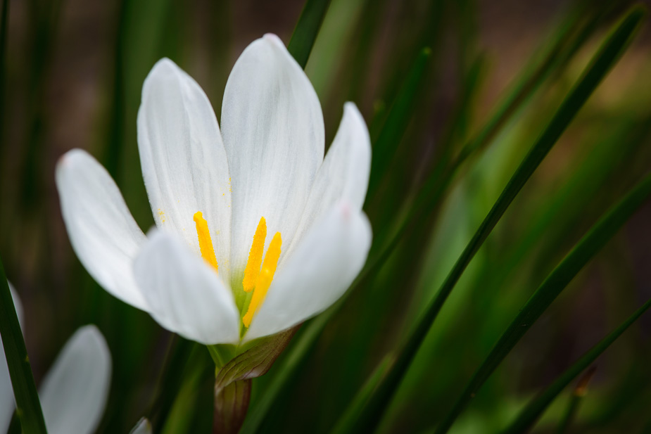
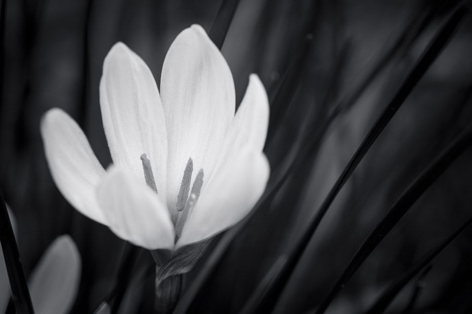
For me the last image has a grace that the others don't have. It's the sweeping lines and the simple composition that lift it a notch from just any ordinary old flower shot. The others are brash and loud and rely on rude colours that shout and scream. Convert them all to B&W and it's the last image that will hold its spot on the wall.
Re: Simple Floral Macro...

PostPosted: Sun Dec 30, 2012 5:31 pm
by Remorhaz
Matt. K wrote:For me the last image has a grace that the others don't have. It's the sweeping lines and the simple composition that lift it a notch from just any ordinary old flower shot. The others are brash and loud and rely on rude colours that shout and scream.


Thanks Matt - that reaffirms my own thoughts - looking at my star ratings in Lightroom I had the last as my own favourite with a follow on soft spot for the first. Your thoughts however on that leaf blade and partial flower in the bottom left corner?

Convert them all to B&W and it's the last image that will hold its spot on the wall.


I must admit I hadn't even thought of converting any of these to monochrome - here's a rendition I put together...

Image

Re: Simple Floral Macro...

PostPosted: Sun Dec 30, 2012 6:57 pm
by Mj
I think what Matt was getting at is that the last image had the stronger compositional elements, rather than suggesting that any would be best in b&w.
Often a good test of any image... take away the colour and see if the structural elements can stand on their own.

Oh... and I would agree that that last image is the keeper... and yes you could tweak the bottom left area without much trouble, it may well improve it overall, although I'm not too much troubled by it.