Page 1 of 1

Big Balmoral Stoppage...

PostPosted: Thu Jan 10, 2013 3:15 pm
by Remorhaz
Soon after sunrise (6:30 to 7AM) at Balmoral beach I thought I'd try some ten to twelve Stop ND time stoppage action with the new Lee BigStopper plus the Heliopan CPL.

I'm not yet totally convinced by this first shot and would be very interested to see what others think - I was drawn to the lone empty bench at the end of this concrete outcrop across the beach and out onto the ocean - plus getting the only clouds in the whole sky into the frame was karma...
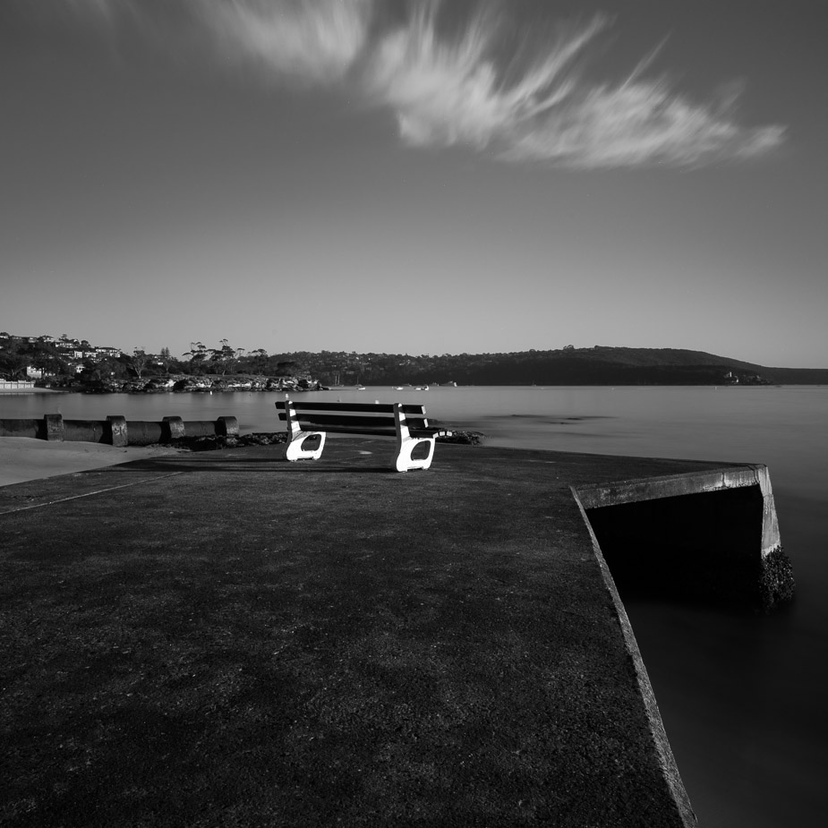
Image

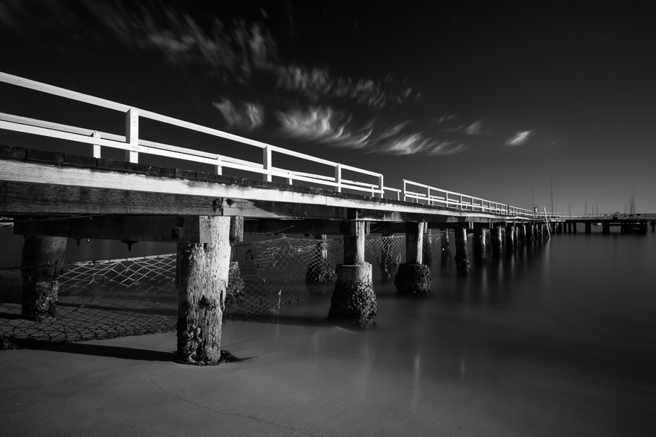
A little further down the beach we have this fully enclosed swimming area (my kids have swum here a number of times) with a walking pier right around...
Image

Re: Big Balmoral Stoppage...

PostPosted: Thu Jan 10, 2013 8:18 pm
by stubbsy
Rodney

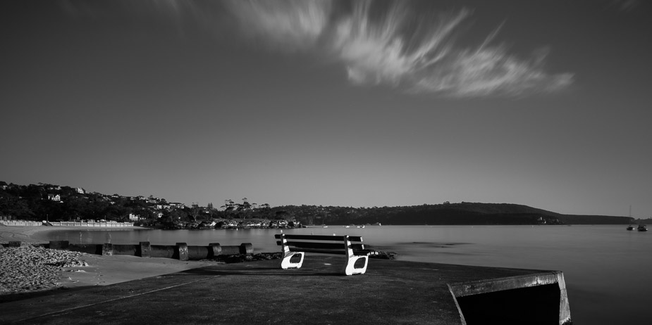
I like #1 but would crop around 1/4 off the bototm. Still leave the empty space below the seat but let the seat dominate the image rather than all that black at the bottom

#2 doesn't grab me - too dark at the top.

Re: Big Balmoral Stoppage...

PostPosted: Thu Jan 10, 2013 9:45 pm
by aim54x
I do believe that Peter has summed it up well

Re: Big Balmoral Stoppage...

PostPosted: Fri Jan 11, 2013 8:33 am
by Reschsmooth
See, I prefer number 2 as it has more drama. The first doesn't emphasise the stoppage enough and the 'legs' of the seat seem a little overexposed.

Re: Big Balmoral Stoppage...

PostPosted: Fri Jan 11, 2013 11:59 am
by zafra52
I think both of them are a bit on the dark side, or at
least that is how they show on my screen. I also happen
to agree with Peter's comments.

Re: Big Balmoral Stoppage...

PostPosted: Fri Jan 11, 2013 5:18 pm
by Remorhaz
stubbsy wrote:Rodney I like #1 but would crop around 1/4 off the bototm. Still leave the empty space below the seat but let the seat dominate the image rather than all that black at the bottom

aim54x wrote:I do believe that Peter has summed it up well

Reschsmooth wrote:The first doesn't emphasise the stoppage enough and the 'legs' of the seat seem a little overexposed.


Thankyou guys - thoughts on this crop of the first? I also tinkered with some areas of the image (dodge and burn, etc) - note that originally I drove the whites on the legs to white to make them stand out more but I've toned them back here

Image

stubbsy wrote:#2 doesn't grab me - too dark at the top.

Reschsmooth wrote:See, I prefer number 2 as it has more drama.

zafra52 wrote:I think both of them are a bit on the dark side, or at least that is how they show on my screen. I also happen to agree with Peter's comments.


For me it was the dark that drew me to this image and was something I really liked (even the colour version has really dark blue sky) with the bright white rails and clouds standing against it. I checked the original B&W conversion to see if I'd burned down the sky more but I hadn't it was as is. I added a slight dodge grad to the top to brighten it just a touch and it still looks ok for me - I tried really brightening and didn't like the result :)

Re: Big Balmoral Stoppage...

PostPosted: Sun Jan 13, 2013 2:40 pm
by stubbsy
Rodney

Remorhaz wrote:For me it was the dark that drew me to this image and was something I really liked ... I tried really brightening and didn't like the result :)


And at the end of the day what others think doesn't matter a lot since it's YOUR image. You need to like the result and the rest of us can go ...

As for #1 I think that new crop takes too much from the bottom since like you I think the dark area has value. I was thinking more like this:

Image

Re: Big Balmoral Stoppage...

PostPosted: Sun Jan 13, 2013 5:32 pm
by Remorhaz
Thanks Peter :cheers: