Page 1 of 1

First Images for Critique... On the Farm

PostPosted: Mon Jan 21, 2013 5:53 pm
by Jennaferney
Hi Everyone,
I am revisiting photography and let me tell you, it's like starting from scratch all over again. I am working with computer editing programs for the first time so it's a bit hit and miss at the moment. Thought I would share a couple of my first shots to start off with. And so here is our day on the farm yesterday...
Image

It took a bit of work getting this little guy into the crush but he made it
Image

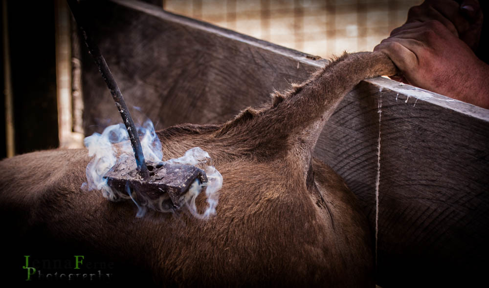
And, finally, branding before going off to the sales
Image

Thanks to my Dad, Craig (vtr) for the tips...
Re: First Images for Critique... On the Farm

PostPosted: Tue Jan 22, 2013 5:04 pm
by Geoff M
Hi Jenna

Welcome to DSLR users. If you want image critique please post larger versions, the ones shown are just too small, especially for my old eyes!

You also need to add a location to your profile before a Mod comes along and reprimands you (see the pink bit 'Forum rules' up above).

Enjoy your time here and if the old man can't help you out with any photography problems, there is always plenty of good advice around here from seasoned professionals.

Re: First Images for Critique... On the Farm

PostPosted: Tue Jan 22, 2013 5:35 pm
by aim54x
i love hte first image I am definitely looking forward to following your journey through photography

Re: First Images for Critique... On the Farm

PostPosted: Tue Jan 22, 2013 6:05 pm
by Jennaferney
Thanks!
I have now added my location. I was unsure how to add larger pictures but have been shown how now. :)

Re: First Images for Critique... On the Farm

PostPosted: Tue Jan 22, 2013 6:11 pm
by Jennaferney
Image
Image
is that a little better?

Re: First Images for Critique... On the Farm

PostPosted: Tue Jan 22, 2013 8:58 pm
by Geoff M
Jennaferney wrote:is that a little better?


Much better :D

I like the branding shot as a documentary image. Perhaps a tighter crop on the branding iron would also be another option to persue?

Re: First Images for Critique... On the Farm

PostPosted: Tue Jan 22, 2013 9:48 pm
by Matt. K
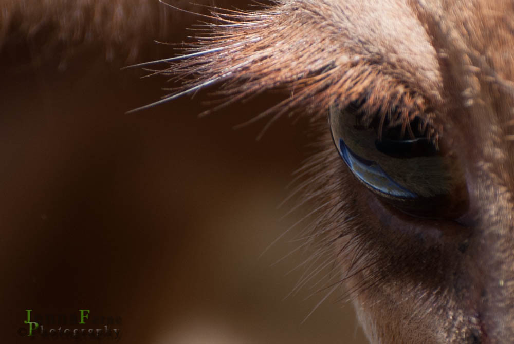
I love the horses eye!

Re: First Images for Critique... On the Farm

PostPosted: Tue Jan 22, 2013 11:32 pm
by Mj
The horse's eye is spot on.
Nothing wrong with the branding shot either... might be a little heavy on the vignette but it is providing the focus it's intended for... and it makes me cringe !!!
I might suggest making some adjustment to your watermark though as it's both distracting and illegible to my eye.

Re: First Images for Critique... On the Farm

PostPosted: Wed Jan 23, 2013 6:00 am
by CraigVTR
You forgot the larger version of the cow in the crush and we need to do some work on the watermark.

Re: First Images for Critique... On the Farm

PostPosted: Wed Jan 23, 2013 6:06 pm
by stubbsy
Welcome Jenna

I think you've nailed it with the first image - awesome

The branding shot lakcs strong focus for me. At a quick glance I don't see the smoke as smoke I just see ???? and I think a tighter crop (as already suggested) would help in that regard

Re: First Images for Critique... On the Farm

PostPosted: Thu Jan 24, 2013 9:28 am
by Jennaferney
Thanks for the feedback everyone. :D