|
Got a thin skin? Then look elsewhere. Post a link to an image that you've made, and invite others to offer their critiques. Honesty is encouraged, but please be positive in your constructive criticism. Flaming and just plain nastiness will not be tolerated. Please note that this is not an area for you to showcase your images, nor is this a place for you to show-off where you have been. This is an area for you to post images so that you may share with us a technique that you have mastered, or are trying to master. Typically, no more than about four images should be posted in any one post or thread, and the maximum size of any side of any image should not exceed 950 px.
Moderators: Greg B, Nnnnsic, Geoff, Glen, gstark, Moderators
Forum rules
Please note that image critiquing is a matter of give and take: if you post images for critique, and you then expect to receive criticism, then it is also reasonable, fair and appropriate that, in return, you post your critique of the images of other members here as a matter of courtesy. So please do offer your critique of the images of others; your opinion is important, and will help everyone here enjoy their visit to far greater extent.
Also please note that, unless you state something to the contrary, other members might attempt to repost your image with their own post processing applied. We see this as an acceptable form of critique, but should you prefer that others not modify your work, this is perfectly ok, and you should state this, either within your post, or within your signature.
Images posted here should conform with the general forum guidelines. Image sizes should not exceed 950 pixels along the largest side (height or width) and typically no more than four images per post or thread.
Please also ensure that you have a meaningful location included in your profile. Please refer to the FAQ for details of what "meaningful" is.
 by Remorhaz on Wed Feb 06, 2013 9:50 am by Remorhaz on Wed Feb 06, 2013 9:50 am
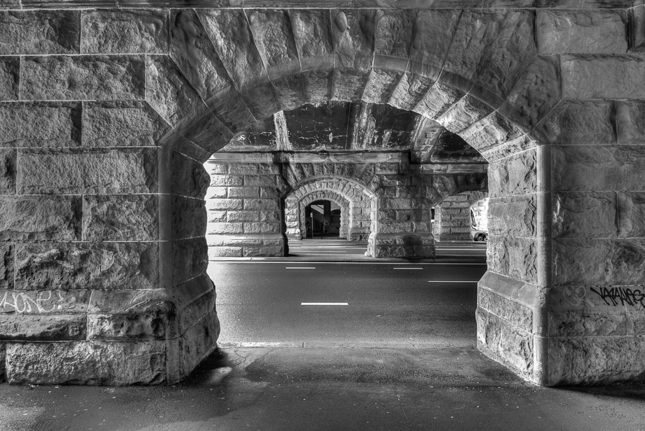
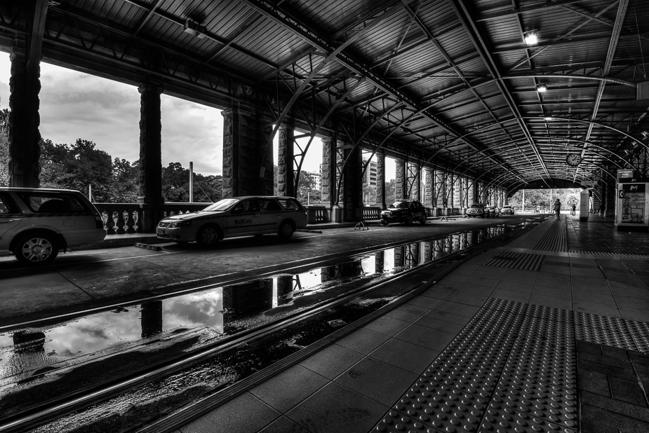
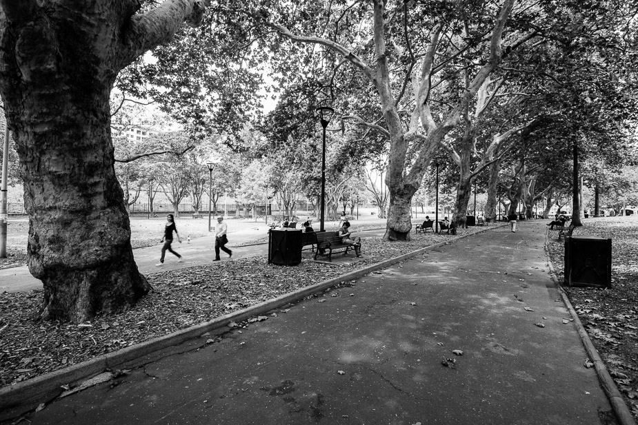
Went for a walk up to Sydney's Central Station one lunchtime and took a few images whilst there... The sun and bright sky weren't kind for this image but I liked the composition potential so I might go back in better conditions  I liked the potential of the dark reflections here - I only wish there was more water on the ground... (sorry Cam I believe I stole your idea here)  and lastly in the park outside the station  D600, D7000, Nikon/Sigma/Tamron Lenses, Nikon Flashes, Sirui/Manfrotto/Benro SticksRodney - My Photo BlogWant: Fast Wide (14|20|24)
-

Remorhaz
- Senior Member
-
- Posts: 2547
- Joined: Thu Apr 29, 2010 8:14 pm
- Location: Sydney - Lower North Shore - D600
-
 by aim54x on Wed Feb 06, 2013 8:10 pm by aim54x on Wed Feb 06, 2013 8:10 pm
I love the first image, but I am not a fan of the Tram stop (HDR too overdone for my liking). Keep it up mate!
Cameron Nikon F/Nikon 1 | Hasselblad V/XPAN| Leica M/LTM |Sony α/FE/E/Maxxum/M42Wishlist Nikkor 24/85 f/1.4| Fuji Natura BlackScout-Images | Flickr | 365Project
-

aim54x
- Senior Member
-
- Posts: 7305
- Joined: Fri Feb 01, 2008 10:13 pm
- Location: Penshurst, Sydney
-
 by sirhc55 on Wed Feb 06, 2013 9:14 pm by sirhc55 on Wed Feb 06, 2013 9:14 pm
I agree, the first shot certainly shows a different perspective on central and is very will executed.
Chris
--------------------------------
I started my life with nothing and I’ve still got most of it left
-

sirhc55
- Key Member
-
- Posts: 12930
- Joined: Fri Sep 17, 2004 6:57 pm
- Location: Port Macquarie - Olympus EM-10
 by CraigVTR on Thu Feb 07, 2013 7:53 am by CraigVTR on Thu Feb 07, 2013 7:53 am
#1 certainly brings back some memories from my younger days when I worked just around the corner. Love it.
#2 I find the top half of the shot find but the bottom, including the most dominate car, a little dark.
#3 I think the highlights need to be pulled back a little.
Craig
Lifes journey is not to arrive at our grave in a well preserved body but, rather to skid in sideways, totally worn out, shouting, "Wow what a ride."
D70s, D300, 70-300ED, 18-70 Kit Lens, Nikkor 105 Micro. Manfrotto 190Prob Ball head. SB800 x 2.
-

CraigVTR
- Senior Member
-
- Posts: 1243
- Joined: Fri Feb 03, 2006 6:09 pm
- Location: Montville, Sunshine Coast, Queensland
-
 by Remorhaz on Thu Feb 07, 2013 9:11 am by Remorhaz on Thu Feb 07, 2013 9:11 am
aim54x wrote:I love the first image, but I am not a fan of the Tram stop (HDR too overdone for my liking). Keep it up mate!
sirhc55 wrote:I agree, the first shot certainly shows a different perspective on central and is very will executed.
Thanks Cam (NB both of the first two are HDR's) - with the second I did try to tame the HDRyness (the sky was most obvious) - most of the rest of the shiny look in the dark areas (e.g. in the ceiling) was not from the HDR process but I added this later with a big push of clarity in LR  CraigVTR wrote:#1 certainly brings back some memories from my younger days when I worked just around the corner. Love it.
#2 I find the top half of the shot find but the bottom, including the most dominate car, a little dark.
#3 I think the highlights need to be pulled back a little.
Thanks Craig, I'll try some selective shadow recovery on #2 With #3 I did try (Highlights at -84) but theres no more to be recovered - this was a single frame and the open sky was just too bright when also shooting under the shade of the trees D600, D7000, Nikon/Sigma/Tamron Lenses, Nikon Flashes, Sirui/Manfrotto/Benro SticksRodney - My Photo BlogWant: Fast Wide (14|20|24)
-

Remorhaz
- Senior Member
-
- Posts: 2547
- Joined: Thu Apr 29, 2010 8:14 pm
- Location: Sydney - Lower North Shore - D600
-
 by PiroStitch on Fri Feb 08, 2013 12:15 pm by PiroStitch on Fri Feb 08, 2013 12:15 pm
Lovely stuff especially with the perspective and depth of the first image.
-

PiroStitch
- Senior Member
-
- Posts: 4669
- Joined: Sat Mar 05, 2005 1:08 am
- Location: Hong Kong
-
 by Murray Foote on Fri Feb 08, 2013 12:39 pm by Murray Foote on Fri Feb 08, 2013 12:39 pm
The first image is great. I think it would be worth going back there, set the camera up on a tripod, settle back in a chair (which you'd probably need to bring), use a remote and see what wanders into the frame. For example, maybe a bicycle going past.
-

Murray Foote
- Senior Member
-
- Posts: 1291
- Joined: Sun Feb 10, 2008 1:31 pm
- Location: Ainslie, Canberra
 by zafra52 on Fri Feb 08, 2013 3:10 pm by zafra52 on Fri Feb 08, 2013 3:10 pm
I also prefer the first photo
-

zafra52
- Senior Member
-
- Posts: 4900
- Joined: Thu Dec 01, 2005 10:22 pm
- Location: Brisbane
Return to Image Reviews and Critiques
|
