Page 1 of 1

Central...

PostPosted: Wed Feb 06, 2013 9:50 am
by Remorhaz
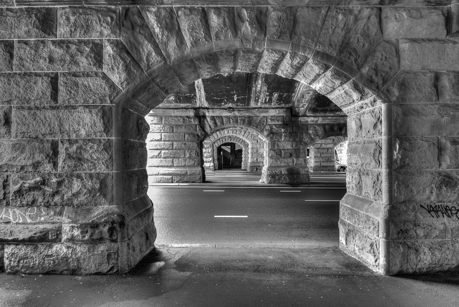
Went for a walk up to Sydney's Central Station one lunchtime and took a few images whilst there...

The sun and bright sky weren't kind for this image but I liked the composition potential so I might go back in better conditions
Image

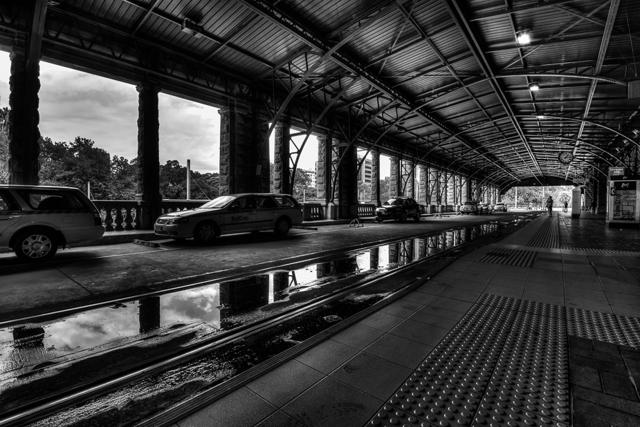
I liked the potential of the dark reflections here - I only wish there was more water on the ground... (sorry Cam I believe I stole your idea here)
Image

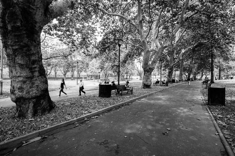
and lastly in the park outside the station
Image

Re: Central...

PostPosted: Wed Feb 06, 2013 8:10 pm
by aim54x
I love the first image, but I am not a fan of the Tram stop (HDR too overdone for my liking). Keep it up mate!

Re: Central...

PostPosted: Wed Feb 06, 2013 9:14 pm
by sirhc55
I agree, the first shot certainly shows a different perspective on central and is very will executed.

Re: Central...

PostPosted: Thu Feb 07, 2013 7:53 am
by CraigVTR
#1 certainly brings back some memories from my younger days when I worked just around the corner. Love it.
#2 I find the top half of the shot find but the bottom, including the most dominate car, a little dark.
#3 I think the highlights need to be pulled back a little.

Re: Central...

PostPosted: Thu Feb 07, 2013 9:11 am
by Remorhaz
aim54x wrote:I love the first image, but I am not a fan of the Tram stop (HDR too overdone for my liking). Keep it up mate!

sirhc55 wrote:I agree, the first shot certainly shows a different perspective on central and is very will executed.


Thanks Cam (NB both of the first two are HDR's) - with the second I did try to tame the HDRyness (the sky was most obvious) - most of the rest of the shiny look in the dark areas (e.g. in the ceiling) was not from the HDR process but I added this later with a big push of clarity in LR :)

CraigVTR wrote:#1 certainly brings back some memories from my younger days when I worked just around the corner. Love it.
#2 I find the top half of the shot find but the bottom, including the most dominate car, a little dark.
#3 I think the highlights need to be pulled back a little.


Thanks Craig, I'll try some selective shadow recovery on #2
With #3 I did try (Highlights at -84) but theres no more to be recovered - this was a single frame and the open sky was just too bright when also shooting under the shade of the trees

Re: Central...

PostPosted: Fri Feb 08, 2013 12:15 pm
by PiroStitch
Lovely stuff especially with the perspective and depth of the first image.

Re: Central...

PostPosted: Fri Feb 08, 2013 12:39 pm
by Murray Foote
The first image is great. I think it would be worth going back there, set the camera up on a tripod, settle back in a chair (which you'd probably need to bring), use a remote and see what wanders into the frame. For example, maybe a bicycle going past.

Re: Central...

PostPosted: Fri Feb 08, 2013 3:10 pm
by zafra52
I also prefer the first photo