Page 1 of 1

Parra & back

PostPosted: Mon Mar 04, 2013 12:39 pm
by Victor03
Some photos for comment; taken a couple of weeks ago on a river trip via River Cat to Parramatta and return by train to central.

First is arrival at Parra jetty.

Image

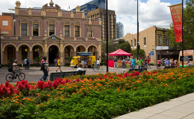
Second is of Town Hall in city square (I think it lacks a focal point)

Image

Third is inside St John's church.

Image

And finally a triple merge shot (three vertical frames) of Central - you can see by beginners attempt at some PS in foreground)

Image

Re: Parra & back

PostPosted: Mon Mar 04, 2013 6:54 pm
by zafra52
Welcome aboard! It's nice to see new members.
I prefer the 2nd and 3rd of your set. The bridge
acting a a frame for the landscape in the 1st
takes away rather than adding to the picure, in
my view. I would crop it out.

The last one could be a nice picture, but I believe
you would need to bring the perspective into shape.
The lens distortion is distracting. Consider taking
several photos and stiching them into a panorama;
it might work better.

I like your cation and I often have remind myself
that taste like beuty is subjective.

Re: Parra & back

PostPosted: Wed Mar 06, 2013 6:47 am
by ozimax
zafra52 wrote:I like your cation and I often have remind myself
that taste like beuty is subjective.


Like speling... :biglaugh: (sorry Zaffs, I couldn't help myself.)

Re: Parra & back

PostPosted: Wed Mar 06, 2013 6:53 am
by ozimax
Some very nice pictures here Victor. Parra "what's the" Matta is my old stomping ground. I went through high school there and know the place very well. I used to go fishing in the Parramatta river (in lieu of school sport) and actually caught an old boot one day. (You would never eat a fish from the river even if you caught one!) Brings back memories. Thanks for posting.

As for the focal point of the second, the yellow Kombi does very well.

Ozi.

Re: Parra & back

PostPosted: Wed Mar 06, 2013 9:31 am
by gstark
ozimax wrote:I used to go fishing in the Parramatta river (in lieu of school sport) and actually caught an old boot one day.


I can recall participating in a Parra Festival parade one year, as a member of a certain car club which needs to go unnamed at this point. I seem to recall that we had an old toilet bowl mounted on a billy cart that was towed behind a Mini (yes, a real one, not those silly, pumped up beamers that you see today) and it ended up being left being in a creek in Parra Park ...

As for the focal point of the second, the yellow Kombi does very well.


And especially so if you also crop out the vehicle on the rh side of the image.

Re: Parra & back

PostPosted: Wed Mar 06, 2013 12:38 pm
by Victor03
Thanks guys.

Zaff, the fourth image is a pano comprising three pictures in vertical mode. Must need a bit of PS lens distortion correction.
Still picking up the lingo and despite Ozimax' jest, I do not understand your last line - cation/ caption??

And thanks for suggestion from Ozimax and Gary regarding the crop for image # 2. I also accept Zaff's point about the bridge in image # 1.

:)

Re: Parra & back

PostPosted: Wed Mar 06, 2013 6:33 pm
by zafra52
I like your cation and I often have remind myself
that taste like beuty is subjective.

Sorry for the typos and bad grammar.
I like your caption:
"The trouble with the world is that the stupid are cocksure and the intelligent are full of doubt - Bertrand Russell."

I meant to say that not everybody has the same taste or preferences.
Therefore don't take my comments too seriously; they are just
an opinion.

Re: Parra & back

PostPosted: Thu Mar 07, 2013 6:43 am
by ozimax
No need to apologize Zaffs, we keep things lighthearted here and try to have fun. Keep the images coming. :D

Ozi

Re: Parra & back

PostPosted: Thu Mar 07, 2013 11:03 am
by Victor03
Zaff,

No offence taken. Thank you for your suggestions.

I too enjoy the member captions. Some are very clever.

:)

Re: Parra & back

PostPosted: Thu Mar 07, 2013 8:16 pm
by Matt. K
Hi Victor
I'm going to deconstruct your images so that you can perhaps get an idea of what I think would improve them.

#1 Good idea to use the bridge as a frame but here is too much bridge shown which makes the image appear top heavy. Also, the image has no ‘eye hook’, a main point of interest that catches the attention. This weakens the image. Technically well captured and the reflections are nice but imagine the image if there was a model sailboat in the foreground. That would unify the image beautifully.

#2 The concrete path in the foreground is distracting and has nothing to add to the image. The flower bed works well in the foreground but the building on the right adds a second subject which weakens the overall effect. The image would have been improved if you framed only the Town Hall, and waited for someone interesting walk past. The difficult act in photography is to simplify what is about to be captured.

#3 suffers from the same problem as #2 in that the right hand side of the image is superfluous. That should have been another photograph. The main point of interest is the brighter left hand side so you should have got closer to give us more detail. The empty pews in the foreground are once again, the empty foreground syndrome. Imagine a woman with an old fashioned hat sitting in the first row closest to the camera. That would have added the cherry on the cake.

#4 Is the subject the green bus or the building? The bus is very distracting but if it were to be the main point of interest then you should have got much closer. If not, then you should have waited until it went past. Foreground once again is empty and just wastes pixels. Also the image is distorted and probably would have looked better if the horizon was straight.

If you only take 2 things from my deconstruction they should be:

1…Avoid empty foregrounds. Always strive to put something into them or crop them out of your viewfinder. And,
2…get closer to your subject and simplify. Have 1 main point of interest. Here’s a tip…just before you press the shutter ask yourself, “What is my subject?” If you can’t answer within 2 seconds then maybe you should look again.
Hope this is useful.

Re: Parra & back

PostPosted: Fri Mar 08, 2013 4:01 pm
by Victor03
Thanks Matt, for your thoughtful suggestions and the time taken.

Composition is something I am really working on so your comments are welcome and helpful.

Cheers. :)

Parra & back

PostPosted: Fri Mar 08, 2013 9:14 pm
by chrisk
Sometimes the subject is the scene itself. I don't think I'm this case there is enough in the scene to hold it, but i don't necessarily agree that an image needs a defined primary subject.

Re: Parra & back

PostPosted: Sat Mar 09, 2013 6:29 pm
by Matt. K
Rooz
I agree with you but this only works if the scene has elements that delight the eye and impeccable composition that leads the eye on a journey of discovery around the image space. The elements I'm refering to are atmospheric, (fog, mist or aerial perspective), interesting shapes, (stark windswept trees, majestic clouds etc), colours that take the breath away and other elements strong enough to make the image exceptional. If the image doesn't contain any of these elements then it won't attract or hold the viewers interest. The streets of Parramatta are a hard stretch unless the lighting is exceptional, hence the need for an interesting subject. There is good reason why outstanding scenic shots are outstanding and those reasons can normally be deconstructed and verbalised.

Re: Parra & back

PostPosted: Mon Mar 11, 2013 9:45 am
by Victor03
Rooz & Matt,

Sorry just caught up with your posts. Thanks.

And especially to MAtt for the insightfull comments about what it takes for a scene itself to work rather than a subject.
Food for thought.

:)