AnotherModerators: Greg B, Nnnnsic, Geoff, Glen, gstark, Moderators
Forum rules
Please note that image critiquing is a matter of give and take: if you post images for critique, and you then expect to receive criticism, then it is also reasonable, fair and appropriate that, in return, you post your critique of the images of other members here as a matter of courtesy. So please do offer your critique of the images of others; your opinion is important, and will help everyone here enjoy their visit to far greater extent. Also please note that, unless you state something to the contrary, other members might attempt to repost your image with their own post processing applied. We see this as an acceptable form of critique, but should you prefer that others not modify your work, this is perfectly ok, and you should state this, either within your post, or within your signature. Images posted here should conform with the general forum guidelines. Image sizes should not exceed 950 pixels along the largest side (height or width) and typically no more than four images per post or thread. Please also ensure that you have a meaningful location included in your profile. Please refer to the FAQ for details of what "meaningful" is.
Previous topic • Next topic
7 posts
• Page 1 of 1
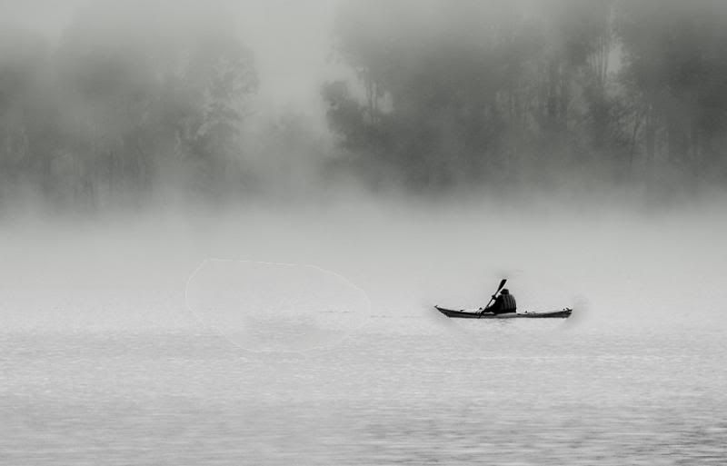
Re: AnotherI quite like this image....love the textures in the water and mist
Cameron
Nikon F/Nikon 1 | Hasselblad V/XPAN| Leica M/LTM |Sony α/FE/E/Maxxum/M42 Wishlist Nikkor 24/85 f/1.4| Fuji Natura Black Scout-Images | Flickr | 365Project
Re: AnotherIt's very nice but I'm not sure the canoeist in the middle entirely works. I'm not suggesting cropping, though. It's not just that the canoeist is in motion across the frame but there's a break in the trees directly behind him that draws you in and that doesn't really take you back to the canoeist. If you could have caught him emerging from the mists from that direction it might have been much stronger. If you'd brought a megaphone in your camera bag you could have called out to him. Otherwise, it might have been better taken a bit earlier or later with a different background and probably with him further to the right in the frame.
Others will likely disagree but for those reasons I think it's a very good image but still a near miss - almost a great image. In fact, even slightly to the right so that he was about 3/4 of a canoe length back may have helped. I suppose you could try a content aware move. And perhaps hold back a little the light patch in the trees in the background at the right.
Re: Another
 something like this. (pardon the lousy ps)  __________
Phillip **Nikon D7000**
Re: AnotherWhen I was working on it I notice I put him dead centre (I only took one shot)

Re: AnotherI like the first photo, but I quite agree it did not work
as it should. I prefer the last version with the real subject of the photo respositioned.
Re: Another
Me too Peter
Disclaimer: I know nothing about anything. *** smugmug galleries: http://www.stubbsy.smugmug.com ***
Previous topic • Next topic
7 posts
• Page 1 of 1
|

