Anzac Day Parade (Sydney)...
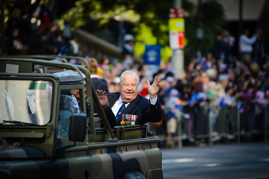
I headed into the heart of the city to photograph the Anzac Day Parade. I didn’t want to carry a lot of gear through the crowds so I just took the camera and the one lens (although it was the 2kg monster Sigma 50-500).


A discussion forum - and more - for users of Digital Single Lens Reflex cameras.
https://d70users.net/


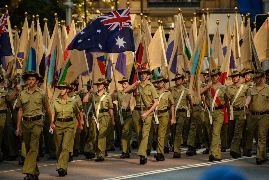
Matt. K wrote:#4 is an outstanding image....the others just merely good. #4 has something special about it...power, force, impact. A great day for photography.
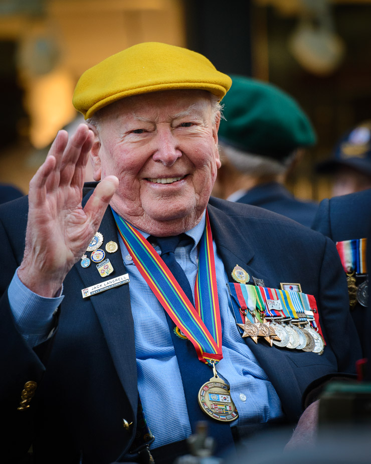
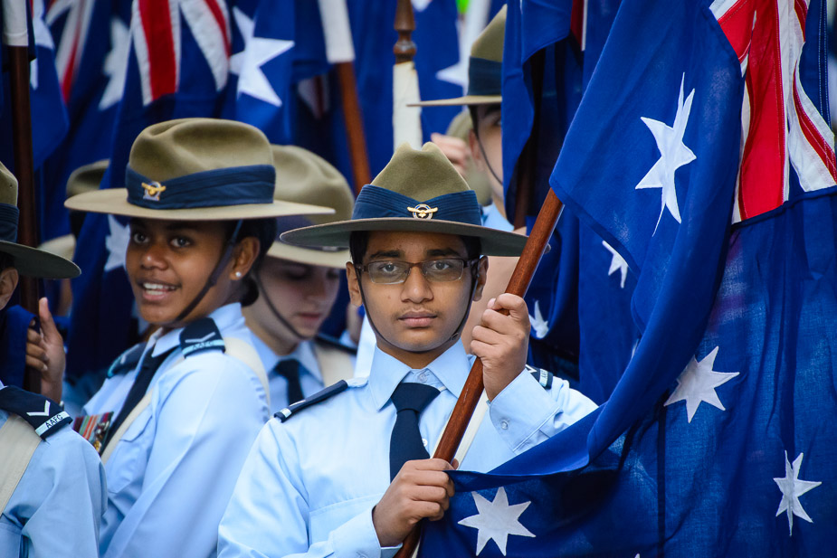
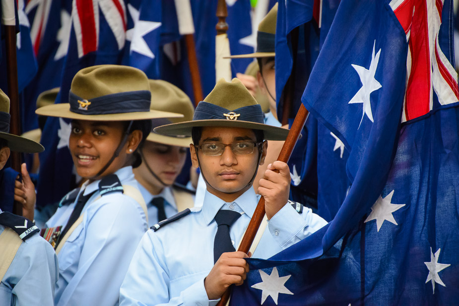
gstark wrote:Rodney, I think that #2 is great.
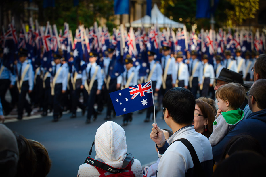
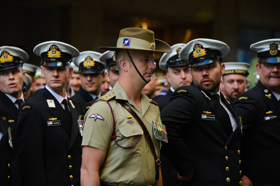
With some of the others, there seems to be quite a lot of vignetting; I'm seeing this in #s 1, 4 and 5, for instance.Have you added this, or is this coming from the lens? Regardless, there's no need for it, and I think that it's detracting from the images.
White balance seems to be out as well; there's a lot of cyan here, and I don't believe that these images should be displaying this colour shift. In #1, for instance, look at the shadow section of the back of the gentleman holding the flag (as your primary subject). I suspect that his shirt should be white, but there's a colour cast here. Likewise in the shadow section of the head covering that the lady standing camera left of him is wearing. Now look at the colour of the stars in the flag that is rightmost in the final image; they're light blue/cyan, when they should be white, I suspect. Pretty well of the images in this set are displaying a similar hue, and I suspect that if you modify your base colour temperature for these temperatures, there will be a vast change in how these all appear.
Finally, I think the first image .... looks very .... plastic. I think that you may have overcooked the post on it just a tad.
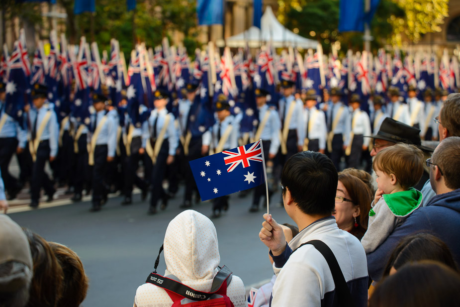

Remorhaz wrote: under the flag I think there's an unfortunate bright spot on the ground in the distance which creates that illusion but it's it's not a PP artifact.
zafra52 wrote:I like best 2nd and 4th.
ian.bertram wrote:I like all these. No1 has that tilt shift lens look, probably a mix of the short focal length and the added vignettte. Like the others, I agree that no4 has real power and is just a great capture.
Nikon boy wrote:Number 2 is a lovely pic well done
Matt. K wrote:Looking again...I think #1 is also excellent. Beautiful control of the background and a wonderful concept.
ozimax wrote:1,2 &5 for me. Wonderful images. I stood in the dark on Thursday for the sunrise service in Coffs. Thousands present, including surfies, kids, babies, in fact, a massive cross section of the community to give thanks to the diggers. I always shed a tear or two at this time. The crowd seems to get bigger every year. The photos of the old fellas here are poignant and timely. Thanks Rodney.