Fruit
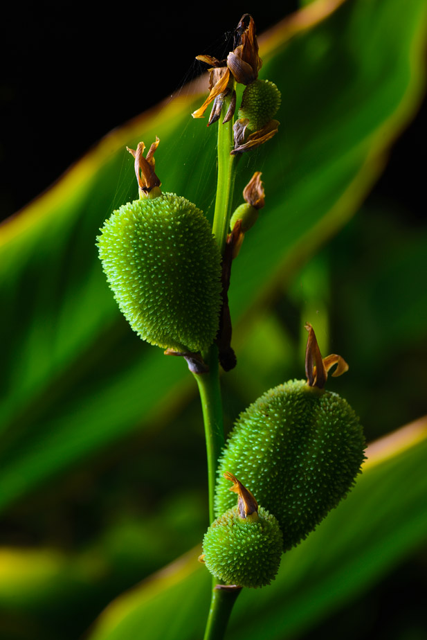
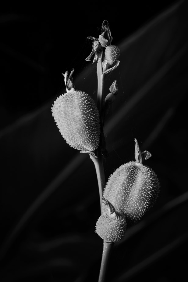
and this one which I've converted to monochrome
Forbidden Fruit
Forbidden Fruit...Moderators: Greg B, Nnnnsic, Geoff, Glen, gstark, Moderators
Forum rules
Please note that image critiquing is a matter of give and take: if you post images for critique, and you then expect to receive criticism, then it is also reasonable, fair and appropriate that, in return, you post your critique of the images of other members here as a matter of courtesy. So please do offer your critique of the images of others; your opinion is important, and will help everyone here enjoy their visit to far greater extent. Also please note that, unless you state something to the contrary, other members might attempt to repost your image with their own post processing applied. We see this as an acceptable form of critique, but should you prefer that others not modify your work, this is perfectly ok, and you should state this, either within your post, or within your signature. Images posted here should conform with the general forum guidelines. Image sizes should not exceed 950 pixels along the largest side (height or width) and typically no more than four images per post or thread. Please also ensure that you have a meaningful location included in your profile. Please refer to the FAQ for details of what "meaningful" is.
Previous topic • Next topic
6 posts
• Page 1 of 1
Forbidden Fruit...During our macro day at the Royal Botanic Gardens I found this interesting set of flower heads atop this plant and decided to use off camera light to turn day into night. I shot stopped down (f/16) at my camera's sync speed (1/200th) and used my LED macro ring light and my SB-900 flash handheld to provide the lighting
Fruit  and this one which I've converted to monochrome Forbidden Fruit  D600, D7000, Nikon/Sigma/Tamron Lenses, Nikon Flashes, Sirui/Manfrotto/Benro Sticks
Rodney - My Photo Blog Want: Fast Wide (14|20|24)
Re: Forbidden Fruit...colour.
the BW conversion has left it flat and without depth. Look at the light on the left most fruit, the colour version has depth and texture, the BW has smashed the dynamic range and left it flat. imo. suren it. gerry's photography journey
No amount of processing will fix bad composition - trust me i have tried.
Re: Forbidden Fruit...Mmm...
The colour version has nice tonal depth that you've lost with this b&w conversion. But the colour version has too much distraction in the background. You could either take the colour version and selectively adjust the background (lower exposure and contrast and maybe a little desat). Or play with the b&w... maybe blend two b&w conversions to get the right result. Photography is not a crime, but perhaps my abuse of artistic license is?
Re: Forbidden Fruit...
Thanks Gerry - actually I don't think it's the conversion but what I did when taking the shot. I was trying not to let light spill onto the leaves just behind and so the angle and closeness of the light has caused it to be flatter I expect - see original colour version here: 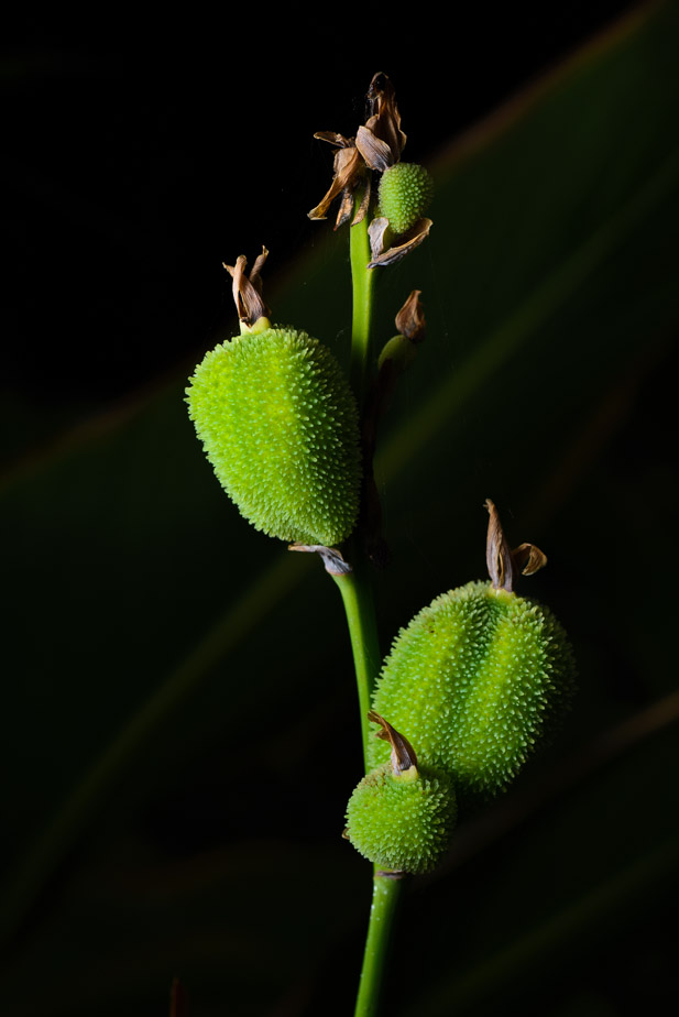 D600, D7000, Nikon/Sigma/Tamron Lenses, Nikon Flashes, Sirui/Manfrotto/Benro Sticks
Rodney - My Photo Blog Want: Fast Wide (14|20|24)
Re: Forbidden Fruit...#1 and #3 are not the same shot are they? Exposure of #3 has the same loss of range as #2.
If you combined the background of #3 with the foreground of #1 you'd have it... if you think it's worth the trouble of course. Photography is not a crime, but perhaps my abuse of artistic license is?
Re: Forbidden Fruit...
No - #2 and #3 are the same shot - they were my attempt to try and not light the leaves at the back (at capture time) but as Gerry noticed this totally flattened the lighting on the Canna Lily pods. Note that in #1 given the leaves were lit I've accentuated this a bit in post for this image D600, D7000, Nikon/Sigma/Tamron Lenses, Nikon Flashes, Sirui/Manfrotto/Benro Sticks
Rodney - My Photo Blog Want: Fast Wide (14|20|24)
Previous topic • Next topic
6 posts
• Page 1 of 1
|