Page 1 of 1

Gyrotor - a Panosphere...

PostPosted: Wed Jul 03, 2013 12:40 pm
by Remorhaz
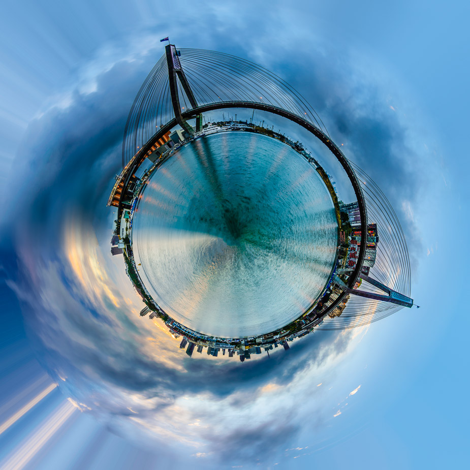
Continuing the panosphere theme - here is one I call "Gyrotor". Again this is a conversion of one of my existing panorama images...
Image

Re: Gyrotor - a Panosphere...

PostPosted: Wed Jul 03, 2013 6:21 pm
by Matt. K
Pretty interesting image. I normally don't like this sort of image but this one is rather beautiful. I could picture a series of these on a gallery wall and they would look pretty spectacular if you could get the scale right.

Re: Gyrotor - a Panosphere...

PostPosted: Wed Jul 03, 2013 6:37 pm
by chrisk
x2. somehow you've managed to make something I like out of techniques I normally don't.
you're PP skills are quite superb really. its a special talent to know how much and what to apply.

Re: Gyrotor - a Panosphere...

PostPosted: Wed Jul 03, 2013 7:21 pm
by biggerry
Rodney, you know how I feel about planetoids :)

However in the interest of critique, how about looking to remove some of the water in the original pano then rootate it, this would make the water disc a bit smaller, which I feel overpowers the bridge etc, which i think should be the main feature in the image.

The processing artifact on the lower left corner is something that I reckon you could work to your advantage, try this: rotate the planetoid 45 degrees CCW, this will make this artifact look like a pillar upon which the planetoid stands, this then also, creates a symmetry between the pylons (which look like pointy boobies btw) which imo, would look cool and a much stronger rendition of a planetoid..


Rooz wrote:its a special talent to know how much and what to apply


rodney is special :)

Re: Gyrotor - a Panosphere...

PostPosted: Wed Jul 03, 2013 8:57 pm
by chrisk
biggerry wrote:which look like pointy boobies btw


and there it is...all this time I was wondering why it appealed to me. turns out I just like a nice rack...

Re: Gyrotor - a Panosphere...

PostPosted: Wed Jul 03, 2013 10:39 pm
by biggerry
Rooz wrote: turns out I just like a nice rack...

nothing wrong with that.

Re: Gyrotor - a Panosphere...

PostPosted: Wed Jul 03, 2013 11:03 pm
by Sylvia
I do like this image Rodney.
Creative and pushing the boundaries. My only comment would be a tilt to the left would add some nice balance to the image.

Re: Gyrotor - a Panosphere...

PostPosted: Thu Jul 04, 2013 11:15 pm
by Remorhaz
Matt. K wrote:Pretty interesting image. I normally don't like this sort of image but this one is rather beautiful. I could picture a series of these on a gallery wall and they would look pretty spectacular if you could get the scale right.


Cheers Matt - I now have 4 of these and they do look interesting together (probably stronger as a set than standalone). I'm going to work on it and when I have enough right ones to put together (perhaps in a tryptych or something) I'll give it a go.

Rooz wrote:x2. somehow you've managed to make something I like out of techniques I normally don't. you're PP skills are quite superb really. its a special talent to know how much and what to apply.


Thanks Chris :)

biggerry wrote:However in the interest of critique, how about looking to remove some of the water in the original pano then rootate it, this would make the water disc a bit smaller, which I feel overpowers the bridge etc, which i think should be the main feature in the image. The processing artifact on the lower left corner is something that I reckon you could work to your advantage, try this: rotate the planetoid 45 degrees CCW, this will make this artifact look like a pillar upon which the planetoid stands, this then also, creates a symmetry between the pylons (which look like pointy boobies btw) which imo, would look cool and a much stronger rendition of a planetoid..


Cheers Gerry - really appreciate the time you took for your feedback and suggestions. The ideas sound interesting and I'll give them a go - perhaps when I'm back from Bali. Wonderng if I make the disc smaller how cramped the land/bridge will be on the smaller disc? Boobies on a stick (like a booby tree) - has merit :)
You know I left the artifacts in on purpose (and rotated the image to come in from the lower left corner) - I blended them out on the top and bottom right corners :)

rodney is special :)


Yeah but in the wrong way :)

Sylvia wrote:I do like this image Rodney. Creative and pushing the boundaries. My only comment would be a tilt to the left would add some nice balance to the image.


Thanks Sylvia

Re: Gyrotor - a Panosphere...

PostPosted: Sun Jul 07, 2013 12:39 pm
by zafra52
I must admit that it is strangely appealing.