Page 1 of 1

Horizontal or Vertical...

PostPosted: Thu Sep 05, 2013 2:56 pm
by Remorhaz
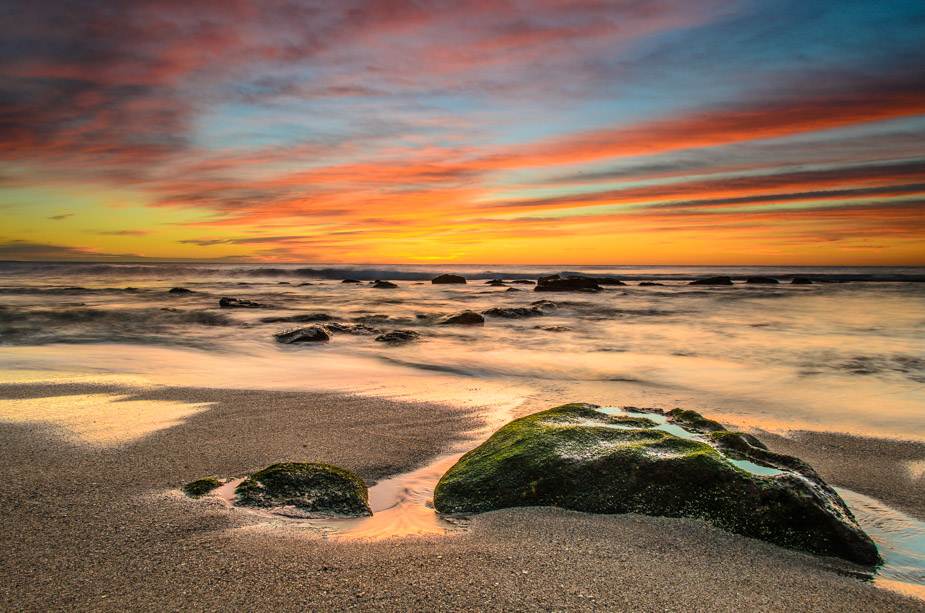
Red Ribbons @ Bronte
Image

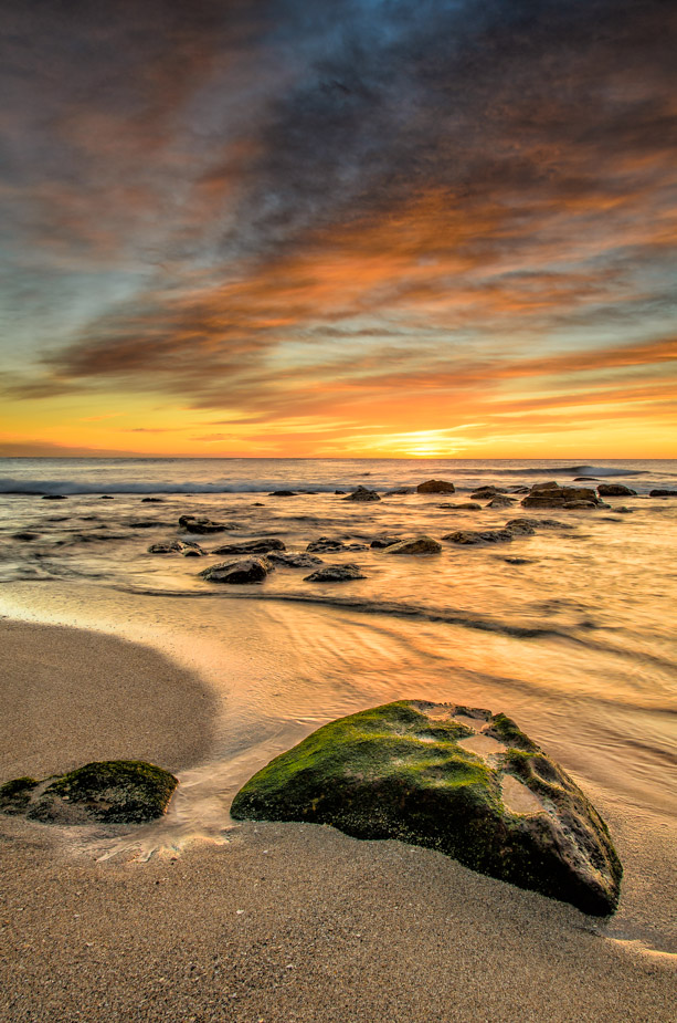
Bronte Lines
Image

Re: Horizontal or Vertical...

PostPosted: Thu Sep 05, 2013 3:40 pm
by Mr Darcy
If you hadn't chopped that rock in the foreground, I'd have said Vertical. As it is, Meh.
Maybe a square crop out if the landscape.

Re: Horizontal or Vertical...

PostPosted: Fri Sep 06, 2013 12:42 am
by surenj
Vertical all the way.

Change the blacks a little. Looks slightly over tone mapped....

Re: Horizontal or Vertical...

PostPosted: Fri Sep 06, 2013 9:00 am
by CraigVTR
Vertical

Re: Horizontal or Vertical...

PostPosted: Fri Sep 06, 2013 2:33 pm
by Remorhaz
Thanks fellas

Note no tone mapping involved - this is a single RAW. I believe I did use Color Efex to add more crunchy detail via some selective Tonal Contrast for the vertical version

Re: Horizontal or Vertical...

PostPosted: Fri Sep 06, 2013 7:07 pm
by sirhc55
Vertical

Re: Horizontal or Vertical...

PostPosted: Sat Sep 07, 2013 9:38 pm
by Matt. K
Which is which? :roll: :roll: :roll: :roll: :biglaugh:

Re: Horizontal or Vertical...

PostPosted: Tue Sep 10, 2013 3:36 pm
by biggerry
as per my vote on gplus

landscape orientation (

so what did the masses prefer on gplus?

Matt. K wrote:Which is which?


vertical when you enter the pub and horizontal is when you come out.. any further questions?

Re: Horizontal or Vertical...

PostPosted: Tue Sep 10, 2013 3:48 pm
by aim54x
I am going to vote landscape...you just get more of those beaut clouds and more leading lines

Re: Horizontal or Vertical...

PostPosted: Tue Sep 10, 2013 6:26 pm
by Matt. K
Vertical. It has more energy, more power. The landscape stretches out too far and becomes placid.

Re: Horizontal or Vertical...

PostPosted: Sat Sep 14, 2013 1:08 pm
by Remorhaz
biggerry wrote:as per my vote on gplus landscape orientation
so what did the masses prefer on gplus?


It's not exactly a scientific or fair comparison since I posted them separately - the landscape one day and the vert a couple days later but the raw stats show:

Landscape: 208 +1's, 19 Reshares, 44 Comments & 5715 Views
Vertical: 294 +1's, 28 Reshares, 60 Comments & 7782 Views

so I guess that would be a win for vertical?

Re: Horizontal or Vertical...

PostPosted: Sat Sep 14, 2013 1:14 pm
by Remorhaz
aim54x wrote:I am going to vote landscape...you just get more of those beaut clouds and more leading lines


Thanks Cam :)

Matt. K wrote:Vertical. It has more energy, more power. The landscape stretches out too far and becomes placid.


Thanks Matt

so my rough feeling is about 50/50 :)