Page 1 of 1

Bradleys Head...

PostPosted: Wed Oct 23, 2013 8:27 pm
by Remorhaz
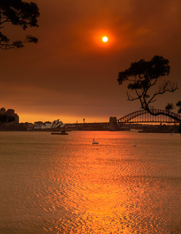
... and three from Bradleys Head - also with smokey skies...
Image

Image

Image

Re: Bradleys Head...

PostPosted: Thu Oct 24, 2013 12:33 pm
by biggerry
smelly bradleys head, its a great location, i love going there.

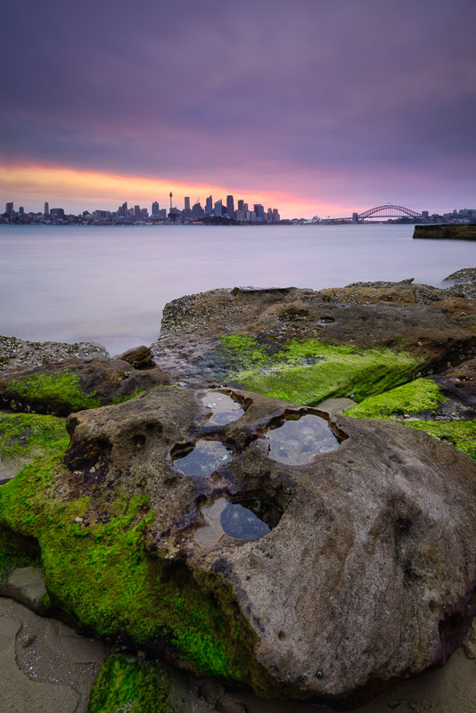
I like the second image, it has a very similiar composition to a shot i did there some months ago with Cameron, however to be honest, i reckon you could have done better (i know you well enough that i think i can just say that with out any flowerly qualifiers :) ), the foreground rock is neat, but lacks a coherent ability to transport the viewer from the base of the image to the mid range and into the sweet part of the image.

that line of teh rock on the lower left could have been used to lead teh viewer left than right, maybe composing a bit to the left and placing the puddles further on the of teh frame (even near to the bottom right third) might work better?
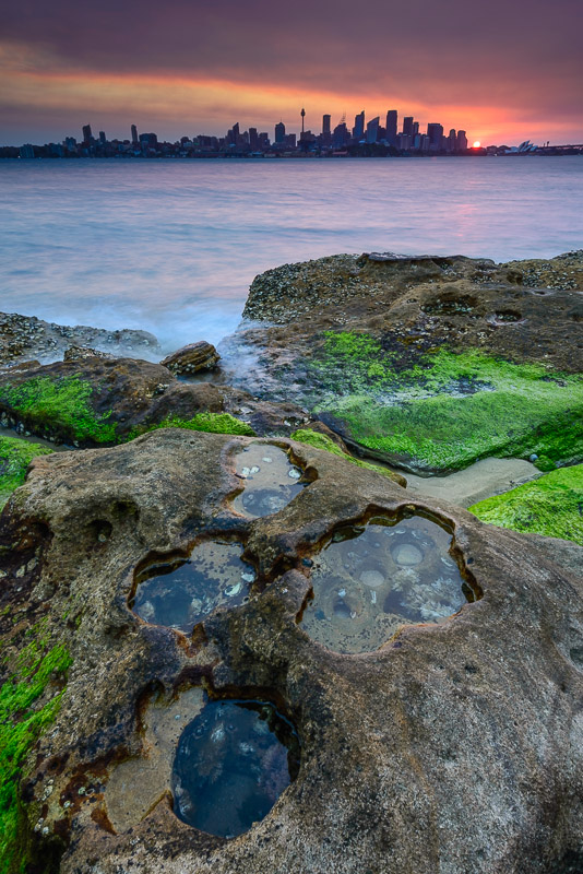
the title, lavender and lime is appropriate and whilst i suspect the colours are actually representative of the day and conditions, the tone and hue just does not sit well with me, give me a few days to come back to it and my view may change.

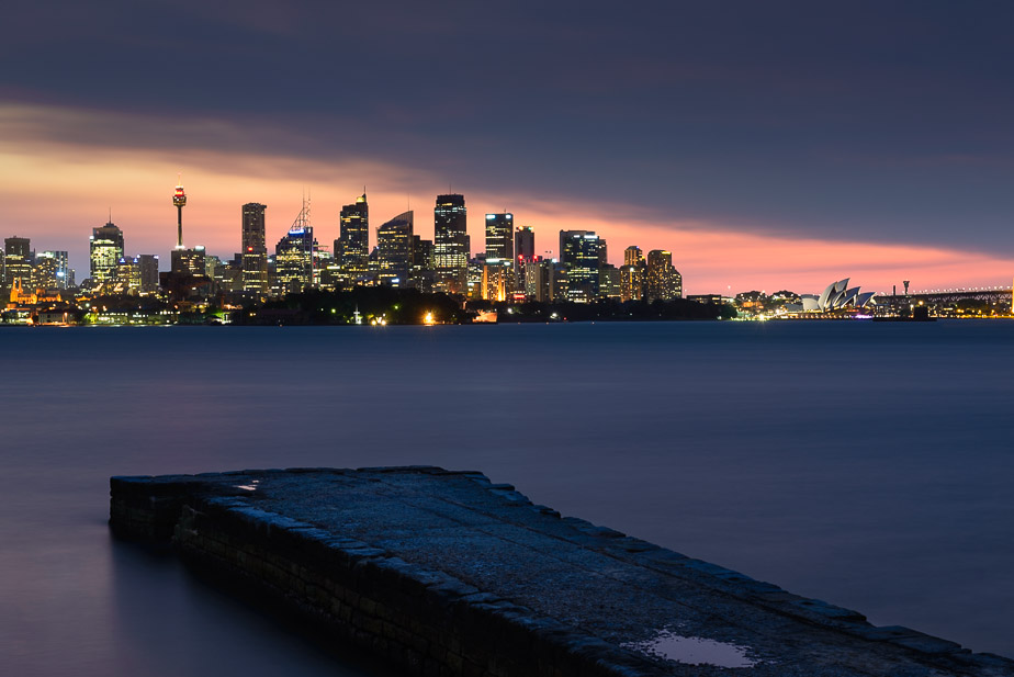
The inclusion of the old stone wharf breaks the image, imo, it would have been better to exclude it from the composition, or clone it in post. Whilst its only small in the frame, its closeness to the bridge creates a very large impact.

The last image has merit, its very hard to use that wharf as a element to compliment teh city and i would suggest for his frame, concentrating on the city and just ditching the wharf.

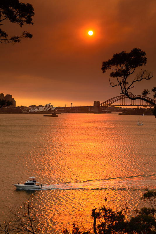
The first image, pano crop (vertical) to remove the trees - this would have been a stunner if you had captured a boat in the foreground, that little sailboat just does not cut it.
Re: Bradleys Head...

PostPosted: Thu Oct 24, 2013 3:16 pm
by Remorhaz
Cheers Gerry - thankyou for the comprehensive and awesome feedback...

biggerry wrote:i reckon you could have done better (i know you well enough that i think i can just say that with out any flowerly qualifiers :) )


:)

the foreground rock is neat, but lacks a coherent ability to transport the viewer from the base of the image to the mid range and into the sweet part of the image. that line of teh rock on the lower left could have been used to lead teh viewer left than right, maybe composing a bit to the left and placing the puddles further on the of teh frame (even near to the bottom right third) might work better?


I'm not sure I totally understood all of that - but... how about this other compo I did earlier from closer to the rock?

Image

The inclusion of the old stone wharf breaks the image, imo, it would have been better to exclude it from the composition, or clone it in post. Whilst its only small in the frame, its closeness to the bridge creates a very large impact.


:) I was thinking exactly the same myself - I'll have a go at cloning :)

The first image, pano crop (vertical) to remove the trees - this would have been a stunner if you had captured a boat in the foreground, that little sailboat just does not cut it.


First shot I actually took...

Image

Re: Bradleys Head...

PostPosted: Thu Oct 24, 2013 8:24 pm
by biggerry
Remorhaz wrote:I'm not sure I totally understood all of that - but... how about this other compo I did earlier from closer to the rock?


i can't type, got rsi from patting baby ;)

Image