Bradleys Head...Moderators: Greg B, Nnnnsic, Geoff, Glen, gstark, Moderators
Forum rules
Please note that image critiquing is a matter of give and take: if you post images for critique, and you then expect to receive criticism, then it is also reasonable, fair and appropriate that, in return, you post your critique of the images of other members here as a matter of courtesy. So please do offer your critique of the images of others; your opinion is important, and will help everyone here enjoy their visit to far greater extent. Also please note that, unless you state something to the contrary, other members might attempt to repost your image with their own post processing applied. We see this as an acceptable form of critique, but should you prefer that others not modify your work, this is perfectly ok, and you should state this, either within your post, or within your signature. Images posted here should conform with the general forum guidelines. Image sizes should not exceed 950 pixels along the largest side (height or width) and typically no more than four images per post or thread. Please also ensure that you have a meaningful location included in your profile. Please refer to the FAQ for details of what "meaningful" is.
Previous topic • Next topic
4 posts
• Page 1 of 1
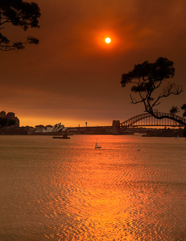
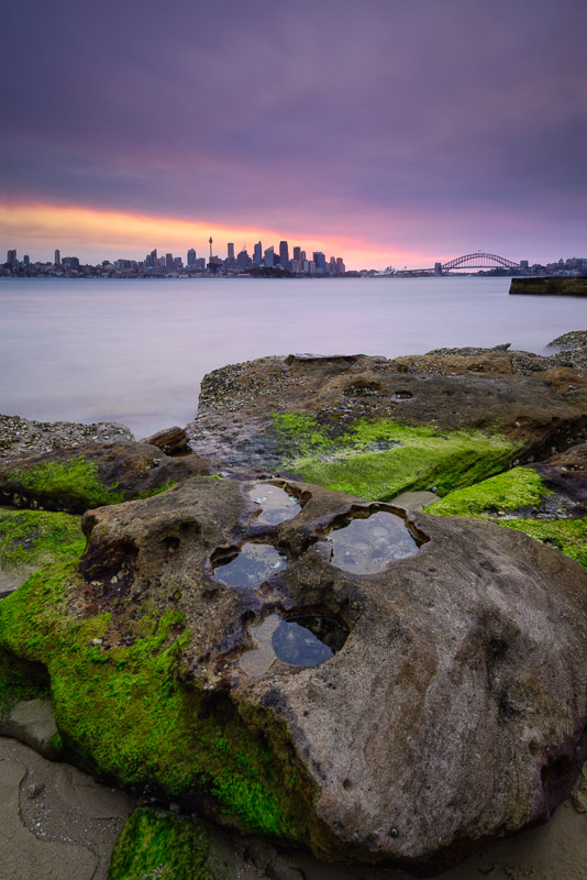
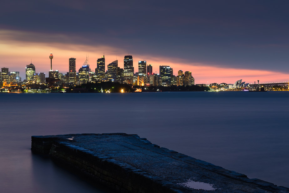
Bradleys Head...... and three from Bradleys Head - also with smokey skies...
   D600, D7000, Nikon/Sigma/Tamron Lenses, Nikon Flashes, Sirui/Manfrotto/Benro Sticks
Rodney - My Photo Blog Want: Fast Wide (14|20|24)
Re: Bradleys Head...smelly bradleys head, its a great location, i love going there.
I like the second image, it has a very similiar composition to a shot i did there some months ago with Cameron, however to be honest, i reckon you could have done better (i know you well enough that i think i can just say that with out any flowerly qualifiers that line of teh rock on the lower left could have been used to lead teh viewer left than right, maybe composing a bit to the left and placing the puddles further on the of teh frame (even near to the bottom right third) might work better? the title, lavender and lime is appropriate and whilst i suspect the colours are actually representative of the day and conditions, the tone and hue just does not sit well with me, give me a few days to come back to it and my view may change. The inclusion of the old stone wharf breaks the image, imo, it would have been better to exclude it from the composition, or clone it in post. Whilst its only small in the frame, its closeness to the bridge creates a very large impact. The last image has merit, its very hard to use that wharf as a element to compliment teh city and i would suggest for his frame, concentrating on the city and just ditching the wharf. The first image, pano crop (vertical) to remove the trees - this would have been a stunner if you had captured a boat in the foreground, that little sailboat just does not cut it. gerry's photography journey
No amount of processing will fix bad composition - trust me i have tried.
Re: Bradleys Head...Cheers Gerry - thankyou for the comprehensive and awesome feedback...
I'm not sure I totally understood all of that - but... how about this other compo I did earlier from closer to the rock? 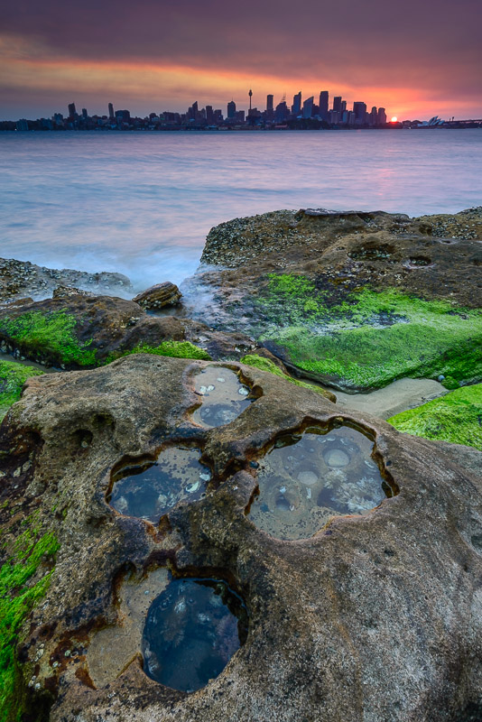
First shot I actually took... 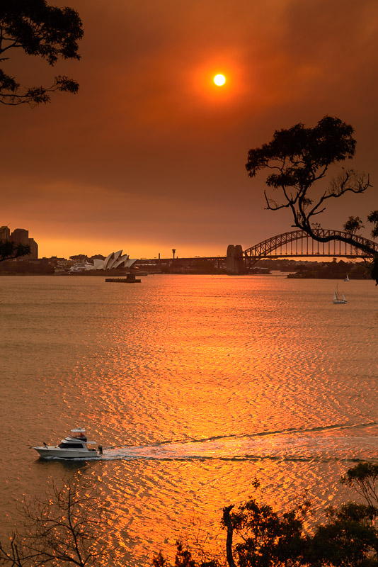 D600, D7000, Nikon/Sigma/Tamron Lenses, Nikon Flashes, Sirui/Manfrotto/Benro Sticks
Rodney - My Photo Blog Want: Fast Wide (14|20|24)
Re: Bradleys Head...
i can't type, got rsi from patting baby  gerry's photography journey
No amount of processing will fix bad composition - trust me i have tried.
Previous topic • Next topic
4 posts
• Page 1 of 1
|