Page 1 of 1
Garie Simplified...

Posted:
Fri Mar 14, 2014 9:16 amby Remorhaz
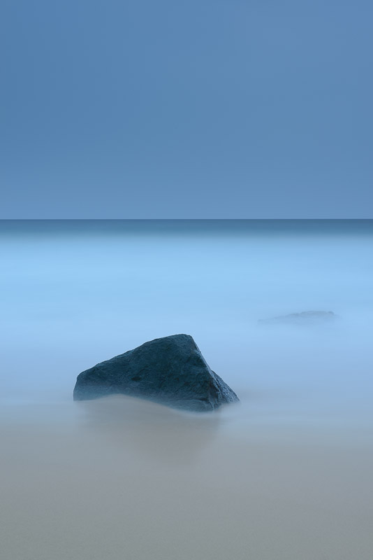
I was heading back along the coast towards Garie beach and the carpark after a very overcast and rainy morning shoot - I spied this rock in the sand out at the waters edge with the waves swishing back and forth past it and two smaller rocks behind which just peeked above the water every now and then as the waves receded.
I'd for some time wanted to shoot a super simplified seascape scene and this looked reasonably close to what I had envisioned in my mind. So it was out with my gear again and setup for the shot. ISO 50 and 247 seconds later - Lee 0.6 grad and a Lee BigStopper we have
Garie Simplified

This one is nearly straight out of camera with only some minor adjustments in post - I didn't want to mess with the very low contrast feel and the very simple subtle look
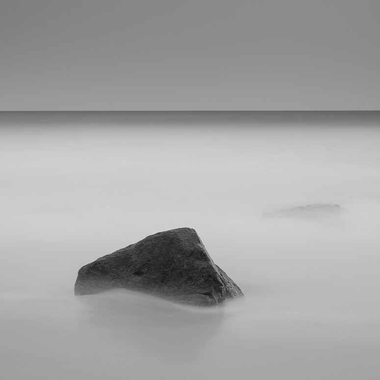
I also did a sort of fine art square monochrome rendition - I'd be interested to see which you might prefer (I have my own thoughts)

Re: Garie Simplified...

Posted:
Fri Mar 14, 2014 9:31 amby the foto fanatic
What a lovely image. Well planned, spotted and set up.
I do like #1, but I feel that #2 is far better. The conversion and the crop really finish the photograph off IMO.
Excellent work.
Re: Garie Simplified...

Posted:
Fri Mar 14, 2014 12:09 pmby bigsarg7
Well done, I personally like #1 for the moodiness and the colour. Which in my opinion make the image quite mystical to me. I've actually been after something in a similar colour tone to use as an acrylic or canvas for my new house. Will have to speak to my husband and see what he thinks but if your willing to let me get it printed (with your watermarks ) to hang in a prime location in my house i'd love it! The only thing that bothers me is that subtle rock behind the main rock, it distracts my eye but overall i love the whole thirds you've got happening colour wise. Well done again!
Re: Garie Simplified...

Posted:
Fri Mar 14, 2014 5:42 pmby Matt. K
The colour image is very interesting. I have never seen a horizon that demands so much attention from the viewer before. It's almost as if the horizon IS the main element of the image. The rock is beautiful In its own right.....but I can't help thinking a splash of dark red somewhere in the image wouldn't have lifted it to a higher plane. A rose floating in the water...or something similar.
As usual from you...beautiful work!
Re: Garie Simplified...

Posted:
Fri Mar 14, 2014 8:21 pmby zafra52
I agree with the above comments. The first photo is superb on account of the colours.
The B&W version wins because of the composition. So, why don't you create a colour
version of the B&W? It's the type of picture that exudes serenity and peace of mind.
Re: Garie Simplified...

Posted:
Fri Mar 14, 2014 8:53 pmby colin_12
I like the first image. It has something unreal about it.
Re: Garie Simplified...

Posted:
Fri Mar 14, 2014 11:24 pmby ozimax
Rodney, the first (colour) image is un-bloomin-believable. It is wonderful. I spent many youthful years travelling to Garie beach on Saturdays and indeed the RNP, but I never envisaged something like this.
Your work never ceases to amaze and inspire.
Ozi.
Garie Simplified...

Posted:
Sat Mar 15, 2014 6:46 amby Geoff M
Both have merit and I struggle to choose one over the other, I do think that Zafra is onto something in his suggestions.
Geoff
Re: Garie Simplified...

Posted:
Sat Mar 15, 2014 4:46 pmby Remorhaz
Thankyou everyone
Zafra (and others) - are you suggesting a square crop of the colour one (same framing as the B&W)?
A rose in the water would have been tricky (with a 250 second exposure)

but I hear what you're saying (the dark rock was meant to be the counterpoint tho)
bigsarg - fyi the rock behind should be trivial to clone out
