Page 1 of 1

OK Gerry - With or Without the Post...

PostPosted: Sun May 25, 2014 8:03 pm
by Remorhaz
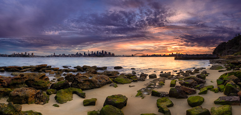
This was what you missed out on mate - sorry (Gerry was going to join me down at Bradleys for a sunset session but well - didn't have enough time)...

I barely made it in time - I arrived to Bradleys only moments before sunset - I quickly parked the car in the one spot that was left (thankfully) & dashed down to the water

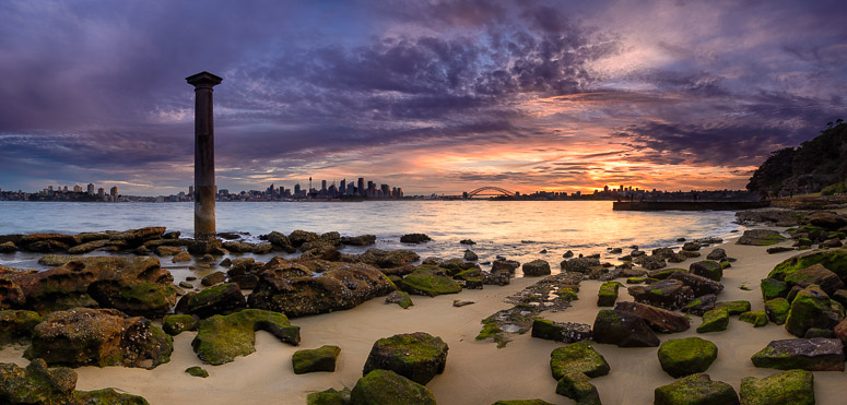
An Aside: Sitting on the rock platform off the headland is a Doric stone column. It is one of six that were taken from the demolished Sydney Post Office and placed in positions in Sydney

So leave the column in (as it really was) or clone it out - what do you think?
Image


Image

Re: OK Gerry - With or Without the Post...

PostPosted: Sun May 25, 2014 11:14 pm
by Matt. K
The base of that column is placed almost precisely at the rule of thirds point....yet it is a real PITA! It screws the balance of the image like nothing I've seen before. Your image would make an excellent training aid in demonstrating how small elements in an image can have more pulling power than they deserve. PS: I think 'almost precisely' ........in language terms is neither here nor there.

Re: OK Gerry - With or Without the Post...

PostPosted: Mon May 26, 2014 1:58 am
by biggerry
now that ya got my attention and all... :lol:

Having been to that location before I sympathise with your dilemma. I think Matt has pretty well nailed it, its either here or there :) both work in their own right but for different reasons.

I am leaning towards the pole in version.

With the pole included it provides a anchor point with impact, it jars the vision and gives the impression its holding the sky up - it does block and detract from the city skyline, however i reckon that part of the image is a backup, a secondary element, not a primary point and as such the pole coupled with the city works well in my eyes. It also speaks volumes about the location, other wise it could just be some other rocky foreground :)

The pole without version is only held together by a very nice sky and some rocks and the city skyline, whilst the city is more easily detectable than the other version now feels to..small and without enough impact to really make me go... 'hmm yeah'. The sky and foreground make this image but have no anchor point, the inclusion of a prominent rock or a 'S' curve thru the rocks may have helped (if they were even there..)

Re: OK Gerry - With or Without the Post...

PostPosted: Mon May 26, 2014 10:42 am
by sirhc55
I like it in. It’s there in reality so should be there in the photo. Change the perspective to remove it, not photoshop.

Re: OK Gerry - With or Without the Post...

PostPosted: Mon May 26, 2014 8:01 pm
by Remorhaz
What was really interesting is that when I showed the two versions to my wife she reckoned I had photoshop'd the pole IN :)

Thankyou all for taking the time to provide such excellent feedback

Re: OK Gerry - With or Without the Post...

PostPosted: Mon May 26, 2014 10:22 pm
by PiroStitch
With the post as it has historical context like you first mentioned. It does catch my eye more, but for me, that's what the subject is about unless that's not what you were aiming for.

Re: OK Gerry - With or Without the Post...

PostPosted: Mon May 26, 2014 10:46 pm
by phillipb
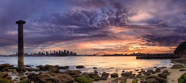
In my opinion the post is not the problem, I think the horizon smack in the middle is what needs to go.

Image

With this crop the post actually stops you going out of the photo and brings your eye back to the bridge.

Re: OK Gerry - With or Without the Post...

PostPosted: Tue May 27, 2014 1:27 pm
by Mj
I like Phillip's crop suggestion for this image.
I think removal of the column leaves the image without much of a subject.
I would probably also look to brighten the column to clarify it as the primary subject.

Re: OK Gerry - With or Without the Post...

PostPosted: Tue May 27, 2014 2:59 pm
by biggerry
I see merit in Phillips crop, however i prefer the original image with the pole. I think its perfectly OK to have a horizon in the middle, in some cases, like this one there is a nice balance between the foreground rockage and the chunky sky and as such it works (for me) - additionally that pole needs some space to breathe :)

OK Gerry - With or Without the Post...

PostPosted: Wed May 28, 2014 6:22 pm
by Geoff M
The second stands on its own merits because of that sky but I prefer the first with the pillar included.


Geoff

Re: OK Gerry - With or Without the Post...

PostPosted: Fri Jun 06, 2014 4:23 am
by Murray Foote
I see you're becoming quite skilled in post processing.

Re: OK Gerry - With or Without the Post...

PostPosted: Fri Jun 06, 2014 11:53 am
by ozimax
Pole in.

Although the opinions here are poles apart, I can only imagine that this time of year it is an icy pole. :biglaugh:

Re: OK Gerry - With or Without the Post...

PostPosted: Fri Jun 06, 2014 1:00 pm
by bigsarg7
Just adding my opinion, though it may not hold much value..... I quite like it with the pole in. I was in a dilemma trying to figure out which one I liked more, until I looked at the cropped version by Phillipb. The moment I saw it cropped the post felt like it had a role in the image as Phillip but it stopped my eye from wandering off to the left and drew my attention to the sunset, the colours, the bridge and of coarse the pole.

A very good job at editing out the pole though. Kudos for that effort!!

Re: OK Gerry - With or Without the Post...

PostPosted: Fri Jun 06, 2014 5:11 pm
by Remorhaz
Actually editing out the pole was super easy with content aware fill