Page 1 of 1
Kaleidoscope of colour

Posted:
Mon Sep 08, 2014 6:42 pmby ozimax
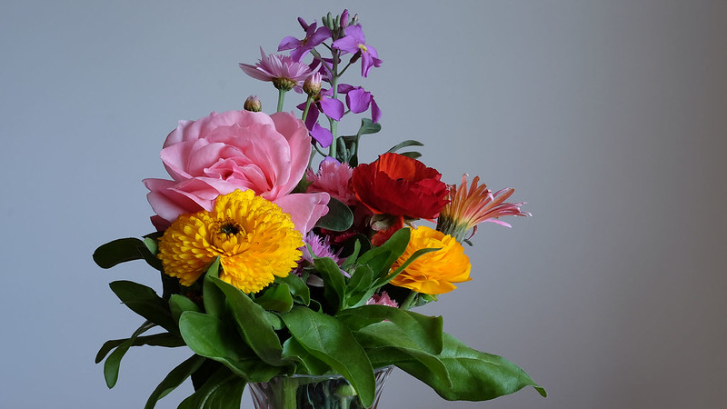
SOOC jpeg from my XT-1/56mm. Flowers straight from the garden this morning. Stuck in a vase. Colourful. Naturally diffused window light.
 Flower080914a
 by
Ozimax, on Flickr
Re: Kaleidoscope of colour

Posted:
Tue Sep 09, 2014 7:44 amby gstark
Love the lighting. Crop this square, though, I suspect.
Re: Kaleidoscope of colour

Posted:
Tue Sep 09, 2014 9:55 amby biggerry
Re: Kaleidoscope of colour

Posted:
Tue Sep 09, 2014 10:40 amby aim54x
Yes

, getting rid of some of the RHS will help
Re: Kaleidoscope of colour

Posted:
Tue Sep 09, 2014 2:24 pmby zafra52
Square with a vignette.
Re: Kaleidoscope of colour

Posted:
Tue Sep 09, 2014 5:29 pmby ozimax
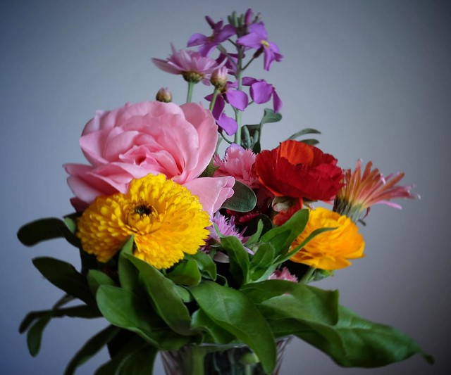
Here she be,
almost a square as I couldn't quite get all the flower into a square.
 Flower080914b
 by
Ozimax, on Flickr
Re: Kaleidoscope of colour

Posted:
Tue Sep 09, 2014 6:24 pmby zafra52
A big improvement, in my view.
Re: Kaleidoscope of colour

Posted:
Tue Sep 09, 2014 7:43 pmby Matt. K
Re: Kaleidoscope of colour

Posted:
Wed Sep 10, 2014 10:52 amby aim54x
Stop trolling!! it looks great in colour...I'm not sure about the vignette though.
Re: Kaleidoscope of colour

Posted:
Wed Sep 10, 2014 4:23 pmby zafra52
B&W would take away from the picture. I feel the triangular composition and contrasting colours is what makes the picture. Personally, I like a bit of vignetting because it draws the eyes towards the colours, but for some reason there is a bit of blur in this second picture that it is not present not in the first picture.
Re: Kaleidoscope of colour

Posted:
Thu Sep 11, 2014 10:32 pmby ozimax
zafra52 wrote:B&W would take away from the picture. I feel the triangular composition and contrasting colours is what makes the picture. Personally, I like a bit of vignetting because it draws the eyes towards the colours, but for some reason there is a bit of blur in this second picture that it is not present not in the first picture.
True. I used a Rad vignette and it's not great. Laziness.
Re: Kaleidoscope of colour

Posted:
Fri Sep 12, 2014 7:41 amby gstark
We need to understand and remember that it's the light that makes this image so nice.
Cropping has helped the eyes to focus on the subject matter, and the vignetting moreso.
But the lighting is beautiful and soft, and just helps the colours leap out of the photo.
 Flower080914a by Ozimax, on Flickr
 Flower080914a by Ozimax, on Flickr
 Flower080914a by Ozimax, on Flickr
 , getting rid of some of the RHS will help
 Flower080914b by Ozimax, on Flickr


