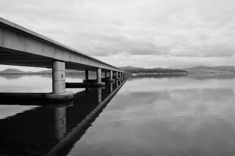
 Bridge1 by Ozimax, on Flickr
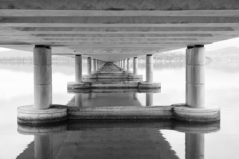 Bridge3 by Ozimax, on Flickr
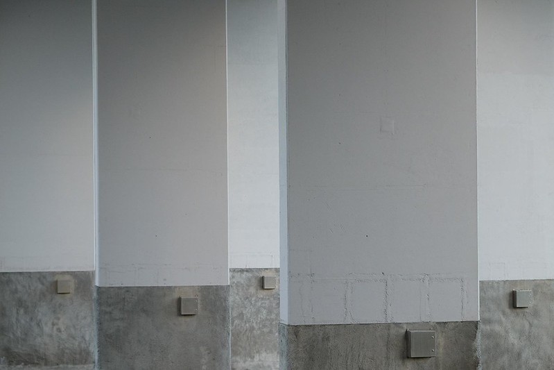 Hobart11 by Ozimax, on Flickr
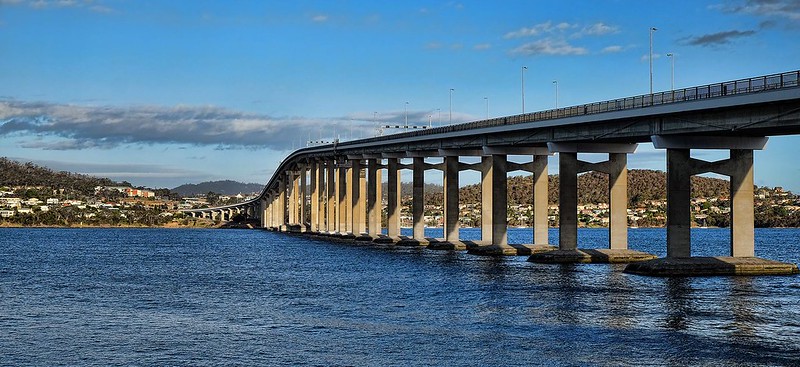 Hobart9 by Ozimax, on Flickr
Crossing bridgesModerators: Greg B, Nnnnsic, Geoff, Glen, gstark, Moderators
Forum rules
Please note that image critiquing is a matter of give and take: if you post images for critique, and you then expect to receive criticism, then it is also reasonable, fair and appropriate that, in return, you post your critique of the images of other members here as a matter of courtesy. So please do offer your critique of the images of others; your opinion is important, and will help everyone here enjoy their visit to far greater extent. Also please note that, unless you state something to the contrary, other members might attempt to repost your image with their own post processing applied. We see this as an acceptable form of critique, but should you prefer that others not modify your work, this is perfectly ok, and you should state this, either within your post, or within your signature. Images posted here should conform with the general forum guidelines. Image sizes should not exceed 950 pixels along the largest side (height or width) and typically no more than four images per post or thread. Please also ensure that you have a meaningful location included in your profile. Please refer to the FAQ for details of what "meaningful" is.
Previous topic • Next topic
7 posts
• Page 1 of 1
Crossing bridges Bridge1 by Ozimax, on Flickr Bridge1 by Ozimax, on Flickr Bridge3 by Ozimax, on Flickr Bridge3 by Ozimax, on Flickr Hobart11 by Ozimax, on Flickr Hobart11 by Ozimax, on Flickr Hobart9 by Ozimax, on Flickr Hobart9 by Ozimax, on FlickrPresident, A.A.A.A.A (Australian Association Against Acronym Abuse)
Canon EOS R6, RF 24-105 F4, RF 70-200 F4, RF 35mm F1.8, RF 16mm F2.8 "And ye shall know the truth, and the truth shall make you free." (John 8:32)
Re: Crossing bridgesGreat job, Number one i really like the contrast in the bridge, however I find the right side and the distant hill side area needing more contrast, looks a bit flat to me. Where number two and three I really like, yet the more I look into number 2 I feel like I'm leaning to the left a little and having more weight on the left side ... so hard to explain..... i like it a lot but this feeling I get I can't explain properly.... not sure if it can be fixed in an edit, I think its more of an angle of the camera as it was taken. I think if you had of stepped to the right a little further it wouldn't have had that feeling.... maybe try crop from the right side a little more?? or not. But I love the shades of whites, greys etc in number 3.
2 x Fuji xt1,vg-xt1 grip, Fujinon xf 18-55mm 2.8-4, Fujinon xf 14mm, Fujinon 56mm 1.2.
Re: Crossing bridgesYes, number two for me as well. Given this is Tassie, I'm trying to work out whether that's symmetry in this image, or cemetery.
 
I suspect that it's the shadow of the bridge causing this effect, as it falls off towards the left of the image. I suspect that it can't be easily fixed in post. Ozi may need to revisit the location and reshoot at a different time of day. g.
Gary Stark Nikon, Canon, Bronica .... stuff The people who want English to be the official language of the United States are uncomfortable with their leaders being fluent in it - US Pres. Bartlet
Re: Crossing bridgesI prefer #2, 1 & 3. Excellent pics Ozi.
Re: Crossing bridgesThanks all. I've been staring at #2 and all I have is a queasy, headachy feeling...
President, A.A.A.A.A (Australian Association Against Acronym Abuse)
Canon EOS R6, RF 24-105 F4, RF 70-200 F4, RF 35mm F1.8, RF 16mm F2.8 "And ye shall know the truth, and the truth shall make you free." (John 8:32)
Re: Crossing bridgesI like that first one Ozi man - i find the sky just a bit bright tho, pulls me away from the bridge and vanishing point.. possible crop from teh top (10-15%) or maybe selective vignetting?
gerry's photography journey
No amount of processing will fix bad composition - trust me i have tried.
Previous topic • Next topic
7 posts
• Page 1 of 1
|