Learning light
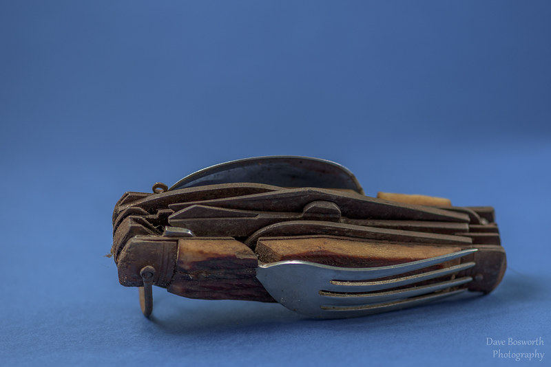
Ive mostly shot landscape but find myself interested in portraiture more and more so ive brought some cheap lighting set ups and have been playing with some still life stuff for practice as i cant find a model 


A discussion forum - and more - for users of Digital Single Lens Reflex cameras.
https://d70users.net/


 ?) might help things along.
Dave-D40 wrote:Its on black cardboard, how would one go about levetating it, im sure that would call for some fancy photoshop skills that i dont have. I have some shiny black plastic i might try that tonight just for fun.
zafra52 wrote:You could use Photoshop to extract the image and make a new background. I've done it a few time, but it might not work.
