Firstly, apologies for my delayed response

zafra52 wrote:Lovely photos Biggerry. It must be cold out there! I like the pano with the
Opera House best; it's a magic view.
Thanks Zafra, only cold when its windy

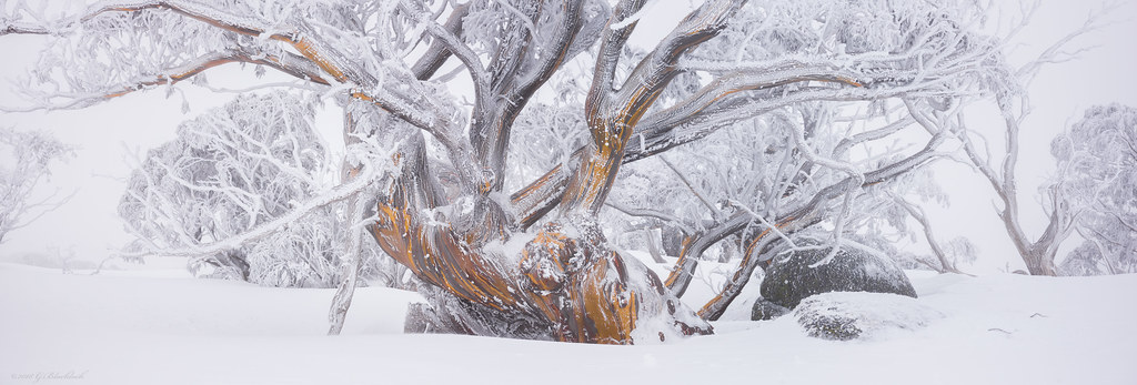
TonyT wrote:Love the last one but not sure about the first, to me it looks to tight. I be interested to know what others think.
yeah your right i think too, i have a bunch from this tree - i'll post a couple of variations when i get a minute, but that was my though too, this particular frame seems a bit unbalanced and just a little too tight, i think a version slightly wider to get those upper limbs in and keep the lines would be better.
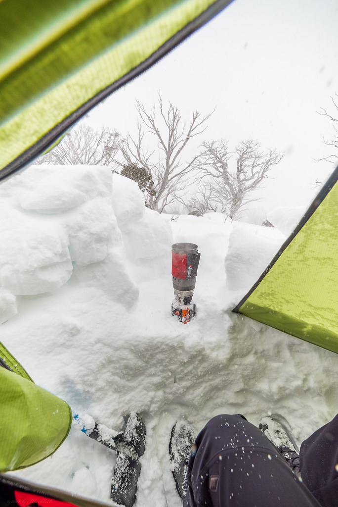
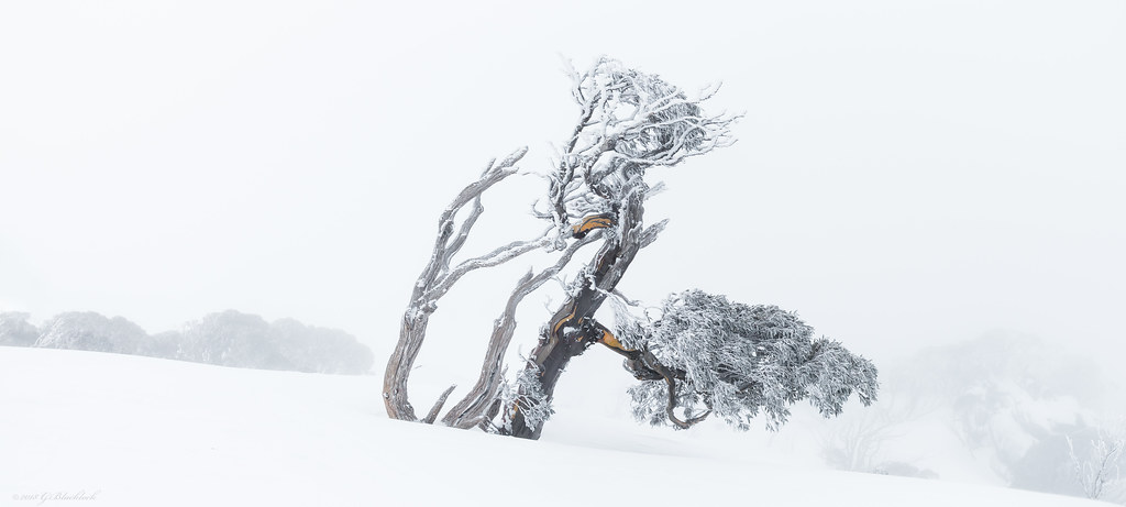
zafra52 wrote:I agree with Tony that the framing of the first is too tight, and I am not sure if further cropping and making the trunk more prominent would improve it. Of the trees, I feel the last one is the best though I would have gone for a minimalist approach and just have the tree and cloned out all other vegetation; while the second left me a bit confused, but I guessed the intention was to capture your immediate environment and the need for hot nourishment so I assumed it is a record of the hard conditions endured/enjoyed by the photographer (it takes courage). I like the waterfall picture, but found the red jacket demanding too much attention. So, I reached the conclusion that the
Opera House pano is the one I liked it best because it portraits a multi-million views and a moody weather.

I have a option with a really tight crop on teh trunk, that seems to work ok since there is plenty of colour and lines all moving in the right direction

The one with the stove is just a shot i always do, in this case there is actually a beautiful view down into the valley from this point, however the snow never let up so the view was not to be had by the camera

Thanks Zafra, always appreciate your views and comments.
Matt. K wrote:The composition of the first image is intriguing....and is difficult to to appreciate at its small, posted size. But when you enlarge the image then it opens up and gains a power and grace that befits a Japenese master work. This image would be breathtaking if printed very large. Beautiful work Gerry......But the last image is my favourite. A master work and worthy of a gallery wall.
That is its saving grace, the detail on the larger res really makes it sing

Thanks Matt

sevencolours wrote:G
you do capture beautiful images. I am tossing between the first and the last. I think the first, but it seem crowded
Philip
Great to hear from you Phil

thanks mate

ozimax wrote:Second, third and fifth are sublime. The bloke in the second adds another point of interest in an otherwise superb waterfall shot.
and what a outstanding member of the human race it is lols

thanks mate

 (C) 2018 Gerard Blacklock, all rights reserved by Gerard Blacklock, on Flickr
 (C) 2018 Gerard Blacklock, all rights reserved by Gerard Blacklock, on Flickr
 (C) 2018 Gerard Blacklock, all rights reserved by Gerard Blacklock, on Flickr
 (C) 2018 Gerard Blacklock, all rights reserved by Gerard Blacklock, on Flickr
 (C) 2018 Gerard Blacklock, all rights reserved by Gerard Blacklock, on Flickr
 (C) 2018 Gerard Blacklock, all rights reserved by Gerard Blacklock, on Flickr
 (C) 2018 Gerard Blacklock, all rights reserved by Gerard Blacklock, on Flickr
 (C) 2018 Gerard Blacklock, all rights reserved by Gerard Blacklock, on Flickr
 (C) 2018 Gerard Blacklock, all rights reserved by Gerard Blacklock, on Flickr
 (C) 2018 Gerard Blacklock, all rights reserved by Gerard Blacklock, on Flickr