|
Got a thin skin? Then look elsewhere. Post a link to an image that you've made, and invite others to offer their critiques. Honesty is encouraged, but please be positive in your constructive criticism. Flaming and just plain nastiness will not be tolerated. Please note that this is not an area for you to showcase your images, nor is this a place for you to show-off where you have been. This is an area for you to post images so that you may share with us a technique that you have mastered, or are trying to master. Typically, no more than about four images should be posted in any one post or thread, and the maximum size of any side of any image should not exceed 950 px.
Moderators: Greg B, Nnnnsic, Geoff, Glen, gstark, Moderators
Forum rules
Please note that image critiquing is a matter of give and take: if you post images for critique, and you then expect to receive criticism, then it is also reasonable, fair and appropriate that, in return, you post your critique of the images of other members here as a matter of courtesy. So please do offer your critique of the images of others; your opinion is important, and will help everyone here enjoy their visit to far greater extent.
Also please note that, unless you state something to the contrary, other members might attempt to repost your image with their own post processing applied. We see this as an acceptable form of critique, but should you prefer that others not modify your work, this is perfectly ok, and you should state this, either within your post, or within your signature.
Images posted here should conform with the general forum guidelines. Image sizes should not exceed 950 pixels along the largest side (height or width) and typically no more than four images per post or thread.
Please also ensure that you have a meaningful location included in your profile. Please refer to the FAQ for details of what "meaningful" is.
 by biggerry on Thu Sep 13, 2018 12:11 pm by biggerry on Thu Sep 13, 2018 12:11 pm
Hey Ya'all, It's definitely been too long between drinks - darn life getting in the way of photo takin'  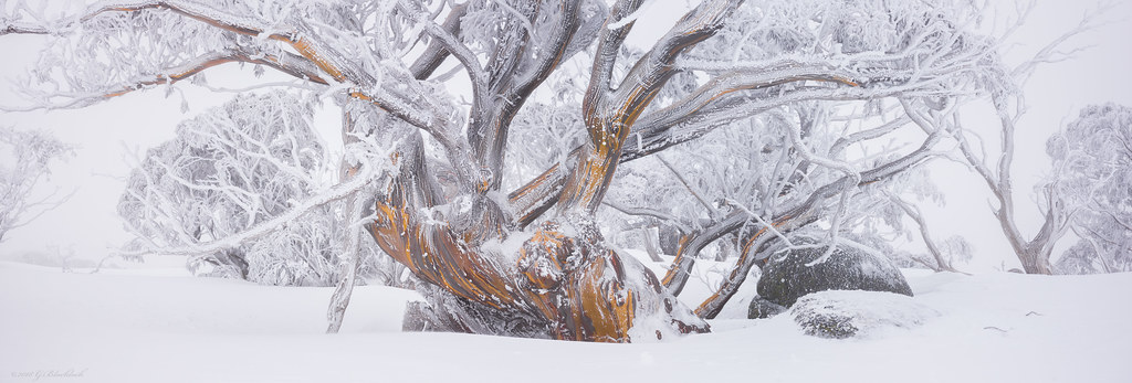 (C) 2018 Gerard Blacklock, all rights reserved (C) 2018 Gerard Blacklock, all rights reserved by Gerard Blacklock, on Flickr  (C) 2018 Gerard Blacklock, all rights reserved (C) 2018 Gerard Blacklock, all rights reserved by Gerard Blacklock, on Flickr  (C) 2018 Gerard Blacklock, all rights reserved (C) 2018 Gerard Blacklock, all rights reserved by Gerard Blacklock, on Flickr 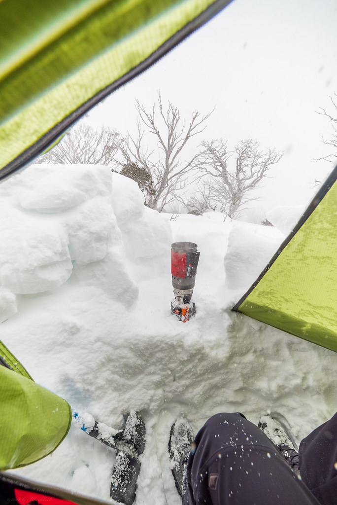 (C) 2018 Gerard Blacklock, all rights reserved (C) 2018 Gerard Blacklock, all rights reserved by Gerard Blacklock, on Flickr 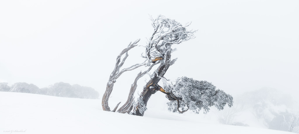 (C) 2018 Gerard Blacklock, all rights reserved (C) 2018 Gerard Blacklock, all rights reserved by Gerard Blacklock, on Flickr
-

biggerry
- Senior Member
-
- Posts: 5930
- Joined: Tue May 13, 2008 12:40 am
- Location: Under the flight path, Newtown, Sydney
-
 by zafra52 on Fri Sep 14, 2018 12:11 pm by zafra52 on Fri Sep 14, 2018 12:11 pm
Lovely photos Biggerry. It must be cold out there! I like the pano with the Opera House best; it's a magic view.
-

zafra52
- Senior Member
-
- Posts: 4901
- Joined: Thu Dec 01, 2005 10:22 pm
- Location: Brisbane
 by TonyT on Sat Sep 15, 2018 3:14 pm by TonyT on Sat Sep 15, 2018 3:14 pm
Love the last one but not sure about the first, to me it looks to tight. I be interested to know what others think.
-

TonyT
- Senior Member
-
- Posts: 854
- Joined: Sat Nov 24, 2007 10:08 am
- Location: Narrabundah Canberra ACT
 by zafra52 on Sun Sep 16, 2018 12:44 pm by zafra52 on Sun Sep 16, 2018 12:44 pm
I agree with Tony that the framing of the first is too tight, and I am not sure if further cropping and making the trunk more prominent would improve it. Of the trees, I feel the last one is the best though I would have gone for a minimalist approach and just have the tree and cloned out all other vegetation; while the second left me a bit confused, but I guessed the intention was to capture your immediate environment and the need for hot nourishment so I assumed it is a record of the hard conditions endured/enjoyed by the photographer (it takes courage). I like the waterfall picture, but found the red jacket demanding too much attention. So, I reached the conclusion that the Opera House pano is the one I liked it best because it portraits a multi-million views and a moody weather. 
-

zafra52
- Senior Member
-
- Posts: 4901
- Joined: Thu Dec 01, 2005 10:22 pm
- Location: Brisbane
 by Matt. K on Wed Sep 19, 2018 10:05 pm by Matt. K on Wed Sep 19, 2018 10:05 pm
The composition of the first image is intriguing....and is difficult to to appreciate at its small, posted size. But when you enlarge the image then it opens up and gains a power and grace that befits a Japenese master work. This image would be breathtaking if printed very large. Beautiful work Gerry......But the last image is my favourite. A master work and worthy of a gallery wall.
Regards
Matt. K
-

Matt. K
- Former Outstanding Member Of The Year and KM
-
- Posts: 9981
- Joined: Mon Sep 06, 2004 7:12 pm
- Location: North Nowra
 by sevencolours on Thu Sep 20, 2018 10:01 pm by sevencolours on Thu Sep 20, 2018 10:01 pm
G
you do capture beautiful images. I am tossing between the first and the last. I think the first, but it seem crowded
Philip
-
sevencolours
- Member
-
- Posts: 64
- Joined: Wed Feb 27, 2008 1:32 am
- Location: kareela sydney
 by ozimax on Fri Sep 21, 2018 11:06 am by ozimax on Fri Sep 21, 2018 11:06 am
Second, third and fifth are sublime. The bloke in the second adds another point of interest in an otherwise superb waterfall shot.
President, A.A.A.A.A (Australian Association Against Acronym Abuse)
Canon EOS R6, RF 24-105 F4, RF 70-200 F4, RF 35mm F1.8, RF 16mm F2.8
"And ye shall know the truth, and the truth shall make you free." (John 8:32)
-

ozimax
- Senior Member
-
- Posts: 5289
- Joined: Wed Jan 05, 2005 11:58 am
- Location: Coffs Harbour, NSW
 by biggerry on Mon Oct 15, 2018 11:21 am by biggerry on Mon Oct 15, 2018 11:21 am
Firstly, apologies for my delayed response  zafra52 wrote:Lovely photos Biggerry. It must be cold out there! I like the pano with the Opera House best; it's a magic view.
Thanks Zafra, only cold when its windy  TonyT wrote:Love the last one but not sure about the first, to me it looks to tight. I be interested to know what others think.
yeah your right i think too, i have a bunch from this tree - i'll post a couple of variations when i get a minute, but that was my though too, this particular frame seems a bit unbalanced and just a little too tight, i think a version slightly wider to get those upper limbs in and keep the lines would be better. zafra52 wrote:I agree with Tony that the framing of the first is too tight, and I am not sure if further cropping and making the trunk more prominent would improve it. Of the trees, I feel the last one is the best though I would have gone for a minimalist approach and just have the tree and cloned out all other vegetation; while the second left me a bit confused, but I guessed the intention was to capture your immediate environment and the need for hot nourishment so I assumed it is a record of the hard conditions endured/enjoyed by the photographer (it takes courage). I like the waterfall picture, but found the red jacket demanding too much attention. So, I reached the conclusion that the Opera House pano is the one I liked it best because it portraits a multi-million views and a moody weather. 
I have a option with a really tight crop on teh trunk, that seems to work ok since there is plenty of colour and lines all moving in the right direction  The one with the stove is just a shot i always do, in this case there is actually a beautiful view down into the valley from this point, however the snow never let up so the view was not to be had by the camera  Thanks Zafra, always appreciate your views and comments. Matt. K wrote:The composition of the first image is intriguing....and is difficult to to appreciate at its small, posted size. But when you enlarge the image then it opens up and gains a power and grace that befits a Japenese master work. This image would be breathtaking if printed very large. Beautiful work Gerry......But the last image is my favourite. A master work and worthy of a gallery wall.
That is its saving grace, the detail on the larger res really makes it sing  Thanks Matt  sevencolours wrote:G
you do capture beautiful images. I am tossing between the first and the last. I think the first, but it seem crowded
Philip
Great to hear from you Phil  thanks mate  ozimax wrote:Second, third and fifth are sublime. The bloke in the second adds another point of interest in an otherwise superb waterfall shot.
and what a outstanding member of the human race it is lols  thanks mate
-

biggerry
- Senior Member
-
- Posts: 5930
- Joined: Tue May 13, 2008 12:40 am
- Location: Under the flight path, Newtown, Sydney
-
Return to Image Reviews and Critiques
|
 (C) 2018 Gerard Blacklock, all rights reserved by Gerard Blacklock, on Flickr
 (C) 2018 Gerard Blacklock, all rights reserved by Gerard Blacklock, on Flickr
 (C) 2018 Gerard Blacklock, all rights reserved by Gerard Blacklock, on Flickr
 (C) 2018 Gerard Blacklock, all rights reserved by Gerard Blacklock, on Flickr
 (C) 2018 Gerard Blacklock, all rights reserved by Gerard Blacklock, on Flickr

