Page 1 of 1
Top Deck

Posted:
Wed May 18, 2005 10:51 pmby phillipb
Any comments appreciated.


Posted:
Wed May 18, 2005 11:01 pmby redline
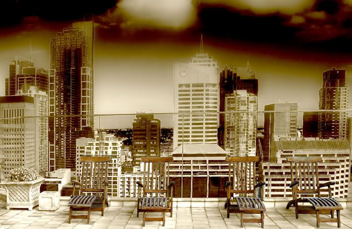
its interesting what your done with the image itself.
i am just not sure weather to call this a building shot or something like still life.
maybe if your cropped away the pot plant on the left along with the railing which seems to be tilting lower cos you didn't shoot it straight i guess.
theres a bit of uneven space under the first and last chair to support this theory.

Posted:
Wed May 18, 2005 11:07 pmby phillipb
I thought about cropping the pot, but then I would have half a building on the left, it lookd a bit out of balance.
I think the rail is showing lens distortion. The buildings are fairly straight.

Posted:
Wed May 18, 2005 11:08 pmby JordanP
I really enjoy the contrast between the lower portion of the image and the upper part of the image. I find it almost spooking and mysterious. I'm curious to know if you were just playing around or had something in mind when you created this?
Surreal - to - real ......... or something like that.
So many vertical and horizontal lines too. I'm trying to find something round or curved in the image.

Posted:
Wed May 18, 2005 11:13 pmby phillipb
JordanP wrote:I really enjoy the contrast between the lower portion of the image and the upper part of the image. I find it almost spooking and mysterious. I'm curious to know if you were just playing around or had something in mind when you created this?
Surreal - to - real ......... or something like that.
Well, it kind of evolved.
Basically in the original colour version I found that there was not enough separation between the deck and the background so I started manipulating things until I got to this stage. I didn't intend to make it spooky but I liked the effect I got when I varied the red channel.

Posted:
Wed May 18, 2005 11:15 pmby redline
phillipb wrote:I thought about cropping the pot, but then I would have half a building on the left, it lookd a bit out of balance.
I think the rail is showing lens distortion. The buildings are fairly straight.
i don't think the railing is distorted as the you said the buliding are quite straight, the distrotion should apply to an area. it kinda looks like the railing actually extends away from the camera.
i guess you shot this handheld

Posted:
Wed May 18, 2005 11:22 pmby phillipb
Yes, hand held, it was also heavily cropped as you can see from the original.


Posted:
Wed May 18, 2005 11:44 pmby PiroStitch
IMHO having a colour tone for the entire image is a bit much. It's artistic I'll give you that, but I'm not sure what the main subject matter in the photo is supposed to be

If it's the chairs, maybe try desaturating the bkg and leaving the chairs in the original timber colour.

Posted:
Wed May 18, 2005 11:47 pmby phillipb
If it's the chairs, maybe try desaturating the bkg and leaving the chairs in the original timber colour.
They are.

Posted:
Wed May 18, 2005 11:48 pmby PiroStitch
Oops sorry I meant desaturating as in having all the other elements in b&w


Posted:
Thu May 19, 2005 12:38 amby MCWB
I thought this was going to be another chocolate photo.

That having been said, I like it. Love the bottom half of the image, and the buildings. I don't like the almost black bits in the sky, waaay too dark IMO. The rest is awesome though, top job!


Posted:
Thu May 19, 2005 12:57 amby Matt. K
What would have lifted this image from being very different to being a masterpiece is a beautiful female in a red skirt lounging in one of those chairs. You got the background...now work it.

Posted:
Thu May 19, 2005 2:32 amby sirhc55
Interesting image but I feel that the banding and heavy sky is a bit to much and detracts from the lovely image below.


