|
Got a thin skin? Then look elsewhere. Post a link to an image that you've made, and invite others to offer their critiques. Honesty is encouraged, but please be positive in your constructive criticism. Flaming and just plain nastiness will not be tolerated. Please note that this is not an area for you to showcase your images, nor is this a place for you to show-off where you have been. This is an area for you to post images so that you may share with us a technique that you have mastered, or are trying to master. Typically, no more than about four images should be posted in any one post or thread, and the maximum size of any side of any image should not exceed 950 px.
Moderators: Greg B, Nnnnsic, Geoff, Glen, gstark, Moderators
Forum rules
Please note that image critiquing is a matter of give and take: if you post images for critique, and you then expect to receive criticism, then it is also reasonable, fair and appropriate that, in return, you post your critique of the images of other members here as a matter of courtesy. So please do offer your critique of the images of others; your opinion is important, and will help everyone here enjoy their visit to far greater extent.
Also please note that, unless you state something to the contrary, other members might attempt to repost your image with their own post processing applied. We see this as an acceptable form of critique, but should you prefer that others not modify your work, this is perfectly ok, and you should state this, either within your post, or within your signature.
Images posted here should conform with the general forum guidelines. Image sizes should not exceed 950 pixels along the largest side (height or width) and typically no more than four images per post or thread.
Please also ensure that you have a meaningful location included in your profile. Please refer to the FAQ for details of what "meaningful" is.
 by yeocsa on Thu May 26, 2005 7:40 pm by yeocsa on Thu May 26, 2005 7:40 pm
regards,
Arthur
-
yeocsa
- Senior Member
-
- Posts: 966
- Joined: Fri Oct 15, 2004 12:04 pm
- Location: Melbourne
by Marvin on Thu May 26, 2005 8:47 pm
Ooh, I like it a lot Arthur!
-

Marvin
- Senior Member
-
- Posts: 1486
- Joined: Tue Aug 10, 2004 9:33 pm
- Location: Back in the hot Riverland, SA.
by yeocsa on Thu May 26, 2005 10:57 pm
Thanks Marvin.
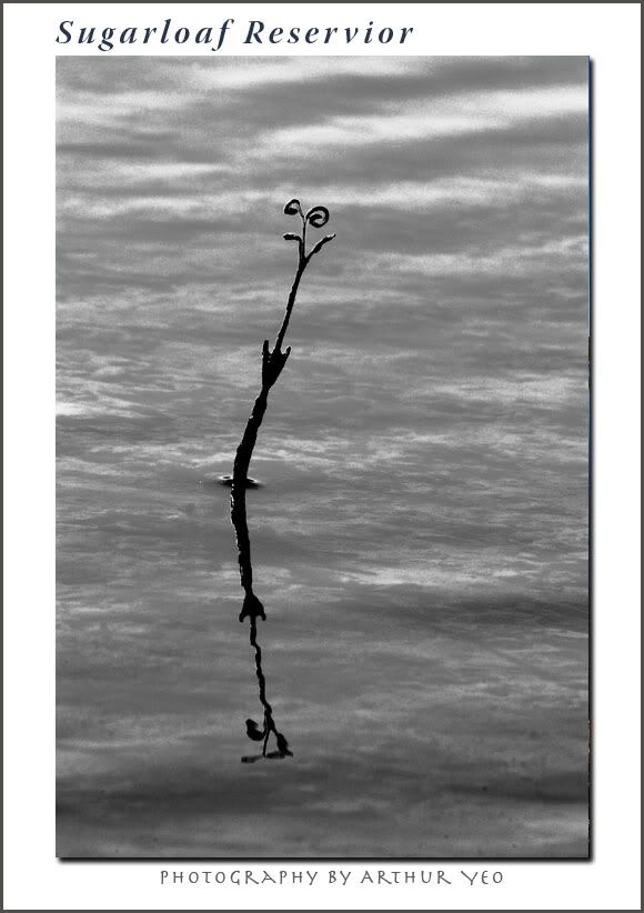
I like the reflection. B&W version looked better than the colour one.
regards,
Arthur
-
yeocsa
- Senior Member
-
- Posts: 966
- Joined: Fri Oct 15, 2004 12:04 pm
- Location: Melbourne
by jethro on Thu May 26, 2005 11:08 pm
arthur the colour one does it more justice
shoot it real.
look! and see. Shoot and feel
-

jethro
- Senior Member
-
- Posts: 1006
- Joined: Tue Oct 26, 2004 10:03 pm
- Location: down south, sydney
by mic on Thu May 26, 2005 11:58 pm
Love it Arthur,
Simple & nice, not to everybody's taste.
Mic. 
-

mic
- Retired Egg Flipper
-
- Posts: 2167
- Joined: Thu Oct 28, 2004 2:33 pm
- Location: Glen Waverly VIC
by yeocsa on Fri May 27, 2005 10:23 am
Thanks.
Well, imho, the photographer should first please himself then others.
regards,
Arthur
-
yeocsa
- Senior Member
-
- Posts: 966
- Joined: Fri Oct 15, 2004 12:04 pm
- Location: Melbourne
by mudder on Fri May 27, 2005 8:01 pm
I like this, it's almost an abstract, the simplicity really seems to work for me...
Aka Andrew
-

mudder
- Senior Member
-
- Posts: 3020
- Joined: Fri Oct 29, 2004 5:58 pm
- Location: Melbourne - Burwood East
-
Return to Image Reviews and Critiques
|
