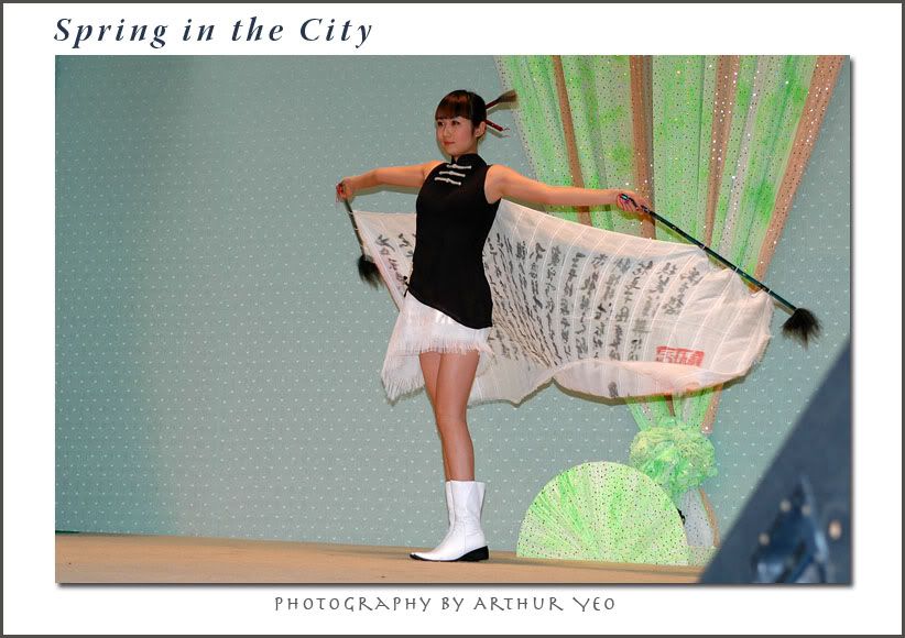
D70 + Tokina 28 - 80 f2.6 + TC1.4 + SB 800.
Did not bring my Nikon 80 - 200 f2.8. Very hard to get good angle and close up. There were too many other fellow photographers and crowd.
regards,
Arthur
FashionModerators: Greg B, Nnnnsic, Geoff, Glen, gstark, Moderators
Forum rules
Please note that image critiquing is a matter of give and take: if you post images for critique, and you then expect to receive criticism, then it is also reasonable, fair and appropriate that, in return, you post your critique of the images of other members here as a matter of courtesy. So please do offer your critique of the images of others; your opinion is important, and will help everyone here enjoy their visit to far greater extent. Also please note that, unless you state something to the contrary, other members might attempt to repost your image with their own post processing applied. We see this as an acceptable form of critique, but should you prefer that others not modify your work, this is perfectly ok, and you should state this, either within your post, or within your signature. Images posted here should conform with the general forum guidelines. Image sizes should not exceed 950 pixels along the largest side (height or width) and typically no more than four images per post or thread. Please also ensure that you have a meaningful location included in your profile. Please refer to the FAQ for details of what "meaningful" is.
Previous topic • Next topic
5 posts
• Page 1 of 1
yes i afree with alex.... looks good .... the photo's i've seen at fashion shows showing the photogs jammed together like sardines.... is it really dog eat dog ...or if you've got a longer lens you can away from them ?
cheers rob
Great capture of the moment however I'm curious to know why you shot this as a landscape? I'd crop the sides as there is far too much wasted and distracting space on either side of your subject. And correct me if I'm wrong - Is that a foldback speaker in the bottom right of the image?
Nikon D70, Nikon F80, Rollei 6008 Pro, Plaubel 5x4, Elinchrom 4K floorpacks and heads.
Hi
Hi Hutchy, I was using a Tokina 28 - 80. I did not have any longer lens with me. I had no choice but to make the best of the situation. With the stage so far away from me, with a TC1.4 attached, zoomed to 80, i still get the foldback speaker. I simply could not get any closer. Worst, the good spots were already taken up. Lighting was bad on the catwalk as the organiser had unwisely chose to put coloured disco spot lights which play havoc on the white balance. I had chosen to shoot at the entrace where the models appear as natural light from the glass rooftop provide good lighting. Due to the distance, i can only use my flash to fill shadows. Unfortunately, you also get the model's shadow in the background. regards, Arthur
Previous topic • Next topic
5 posts
• Page 1 of 1
|