Got a thin skin? Then look elsewhere. Post a link to an image that you've made, and invite others to offer their critiques. Honesty is encouraged, but please be positive in your constructive criticism. Flaming and just plain nastiness will not be tolerated. Please note that this is not an area for you to showcase your images, nor is this a place for you to show-off where you have been. This is an area for you to post images so that you may share with us a technique that you have mastered, or are trying to master. Typically, no more than about four images should be posted in any one post or thread, and the maximum size of any side of any image should not exceed 950 px.
Moderators: Greg B, Nnnnsic, Geoff, Glen, gstark, Moderators
Forum rules
Please note that image critiquing is a matter of give and take: if you post images for critique, and you then expect to receive criticism, then it is also reasonable, fair and appropriate that, in return, you post your critique of the images of other members here as a matter of courtesy. So please do offer your critique of the images of others; your opinion is important, and will help everyone here enjoy their visit to far greater extent.
Also please note that, unless you state something to the contrary, other members might attempt to repost your image with their own post processing applied. We see this as an acceptable form of critique, but should you prefer that others not modify your work, this is perfectly ok, and you should state this, either within your post, or within your signature.
Images posted here should conform with the general forum guidelines. Image sizes should not exceed 950 pixels along the largest side (height or width) and typically no more than four images per post or thread.
Please also ensure that you have a meaningful location included in your profile. Please refer to the FAQ for details of what "meaningful" is.
by yeocsa on Sun Jun 05, 2005 6:47 pm
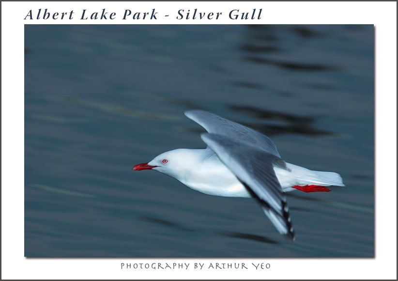
Managed to capture it in flight after many unsuccessful attempts.
D70 + AFS 300F4 + TC1.4X + SB800 + Flash Extender. Handheld. Manual focus, Aperture Preferred.
regards,
Arthur
-
yeocsa
- Senior Member
-
- Posts: 966
- Joined: Fri Oct 15, 2004 12:04 pm
- Location: Melbourne
by Nicole on Sun Jun 05, 2005 8:18 pm
You know we hardly saw any gulls at WTP. This shot looks nice and sharp. It's not easy to catch birds in flight. I might be tempted to warm this up a bit.
-
Nicole
- Senior Member
-
- Posts: 569
- Joined: Wed Nov 03, 2004 9:54 pm
- Location: Melbourne
-
by kipper on Sun Jun 05, 2005 8:27 pm
Nice in flight shot. As Nicole said, this is very cold and has blue tints. The WB needs to be shifter to a higher K.
Darryl (aka Kipper) Nikon D200
-
kipper
- Senior Member
-
- Posts: 3738
- Joined: Thu Nov 04, 2004 9:23 pm
- Location: Hampshire, UK
by stubbsy on Sun Jun 05, 2005 10:22 pm
Nicole & Darryl are spot on re: WB, but that's an easy fix Arthur.
This is one great shot. The beautiful symmetry of the wings and the lovely colours of the feet and head round out an image anyone would be proud to have taken. Well done and thanks for sharing this quality image.
-
stubbsy
- Moderator
-
- Posts: 10748
- Joined: Wed Dec 08, 2004 7:44 pm
- Location: Newcastle NSW - D700
-
by Greg B on Sun Jun 05, 2005 11:16 pm
I can only endorse the comments above Arthur, quality all the way.
Greg - - - - D200 etc
Talent hits a target no one else can hit; Genius hits a target no one else can see. - Arthur Schopenhauer
-
Greg B
- Moderator
-
- Posts: 5938
- Joined: Fri Sep 03, 2004 7:14 pm
- Location: Surrey Hills, Melbourne
-
by PiroStitch on Mon Jun 06, 2005 12:25 am
I concur! Great shot Arthur
-
PiroStitch
- Senior Member
-
- Posts: 4669
- Joined: Sat Mar 05, 2005 1:08 am
- Location: Hong Kong
-
by yeocsa on Mon Jun 06, 2005 12:29 am
Thanks everyone for the kind comments. I could change the white balance but had to apply -20 amount of red to reduce the intensity.
regards,
Arthur
-
yeocsa
- Senior Member
-
- Posts: 966
- Joined: Fri Oct 15, 2004 12:04 pm
- Location: Melbourne
by PiroStitch on Mon Jun 06, 2005 12:34 am
Reduce the green a bit Arthur Now the seagull looks like it's sick
-
PiroStitch
- Senior Member
-
- Posts: 4669
- Joined: Sat Mar 05, 2005 1:08 am
- Location: Hong Kong
-
by KerryPierce on Mon Jun 06, 2005 2:55 am
WB issues aside, that's a very good shot, Arthur. Those types of panning shots aren't easy to do...
-
KerryPierce
- Senior Member
-
- Posts: 1233
- Joined: Wed Mar 16, 2005 5:20 pm
- Location: Detroit, MI
-
by yeocsa on Mon Jun 06, 2005 10:27 am
Hi
Thanks. Now that I am looking at using a PC, the picture looks different on my PowerBook though. Maybe I would need to change the PowerBook's settings.
regards,
Arthur
-
yeocsa
- Senior Member
-
- Posts: 966
- Joined: Fri Oct 15, 2004 12:04 pm
- Location: Melbourne
Return to Image Reviews and Critiques
|