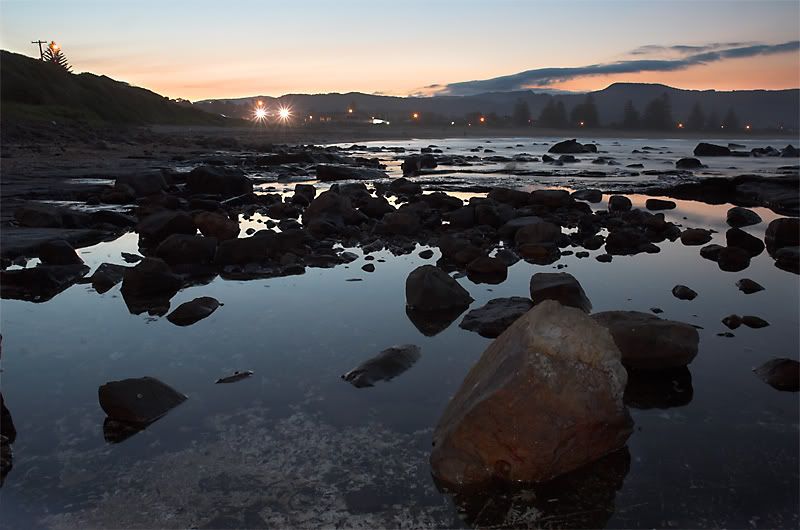
Comments welcome.
Landscape shot... opinions please.Moderators: Greg B, Nnnnsic, Geoff, Glen, gstark, Moderators
Forum rules
Please note that image critiquing is a matter of give and take: if you post images for critique, and you then expect to receive criticism, then it is also reasonable, fair and appropriate that, in return, you post your critique of the images of other members here as a matter of courtesy. So please do offer your critique of the images of others; your opinion is important, and will help everyone here enjoy their visit to far greater extent. Also please note that, unless you state something to the contrary, other members might attempt to repost your image with their own post processing applied. We see this as an acceptable form of critique, but should you prefer that others not modify your work, this is perfectly ok, and you should state this, either within your post, or within your signature. Images posted here should conform with the general forum guidelines. Image sizes should not exceed 950 pixels along the largest side (height or width) and typically no more than four images per post or thread. Please also ensure that you have a meaningful location included in your profile. Please refer to the FAQ for details of what "meaningful" is.
Previous topic • Next topic
4 posts
• Page 1 of 1
Landscape shot... opinions please.
Comments welcome.
Clone out all of those lights on the horizon they burt the eyes.
I can see what you were doing in terms of the foreground but it looks a little bit cluttered. I think that something a little more simple in terms of shape would be easier to digest. The only other thing that I would suggest is taking the picture with more light on the scene. It is all shady and lacks the golden glow of the sun. I like that you are including foreground interest though.
G'day,
I like the framing and the foreground and agree with Dooda, there seems as there's almost too many items in the middleground, I'd clone out the top left traffic light and post, maybe a play with levels for the sky area in PP a bit? Good interesting viewpoint and nicely framed... Aka Andrew
Previous topic • Next topic
4 posts
• Page 1 of 1
|