I've got these shots and I just don't think they're that great. I am after some advice on how they might have been improved.
Cheers,
Owen.
How could I have improved these shots?Moderators: Greg B, Nnnnsic, Geoff, Glen, gstark, Moderators
Forum rules
Please note that image critiquing is a matter of give and take: if you post images for critique, and you then expect to receive criticism, then it is also reasonable, fair and appropriate that, in return, you post your critique of the images of other members here as a matter of courtesy. So please do offer your critique of the images of others; your opinion is important, and will help everyone here enjoy their visit to far greater extent. Also please note that, unless you state something to the contrary, other members might attempt to repost your image with their own post processing applied. We see this as an acceptable form of critique, but should you prefer that others not modify your work, this is perfectly ok, and you should state this, either within your post, or within your signature. Images posted here should conform with the general forum guidelines. Image sizes should not exceed 950 pixels along the largest side (height or width) and typically no more than four images per post or thread. Please also ensure that you have a meaningful location included in your profile. Please refer to the FAQ for details of what "meaningful" is.
Previous topic • Next topic
29 posts
• Page 1 of 1
How could I have improved these shots?Hey guys.
I've got these shots and I just don't think they're that great. I am after some advice on how they might have been improved. Cheers, Owen. 


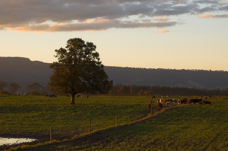
I like the first but cannot see how to save the other two. The first however might benefit from some PP to reduce haze in the background, but I would leave it as is. Others have much more photoshop experience and might be able to suggest specific actions.
In the end we know Nothing, but in the meantime Learn like crazy.
Your Camera Does Matter Nikon D70 D200 D300 PPOK
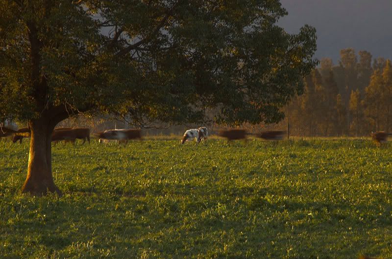
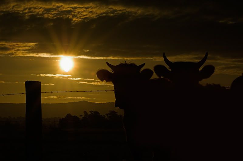
Owen. The first one is pretty close. I'd try a graduated orange filter in the sky to empasise the sunset. Second one I'd forget about because of the movement blur on the cattle. Last one is too dark, I'd try to lighten the fireground a little using layers (so you keep the sun startburst area as is). HTH
Peter
Disclaimer: I know nothing about anything. *** smugmug galleries: http://www.stubbsy.smugmug.com ***
Owen, we each see images differently so our perception of what is a good or bad photo is different. This is especially so between Stubbsy and me as I quite like the last image.
The first image has me wondering what is on either side of the image that you can't see. It is just screaming to be turned into a panorama. One way you could enhance the image is to play around with the contrast and colours as i reckon this will make the image much better. It has potential. The second one i would not worry about. I can see what you were trying to get but it is missing a bit in composition. It just doesn't feel balanced. It may be the big tree on the left. The cows are very fast too. The last image i like as it evokes the country feel, the end of a long day mustering filthy cows and i can feel a XXXX coming on. Keep that shutter clicking.... Steve.
|D700| D2H | F5 | 70-200VR | 85 1.4 | 50 1.4 | 28-70 | 10.5 | 12-24 | SB800 | Website-> http://www.stevekilburn.com Leeds United for promotion in 2014 - Hurrah!!!
Owen
You could have improved these images by leaving your lens cap on! Regards
Matt. K
I like both the first and the second.
Perhaps on the second, try to sharpen up the lone horse and leave the others blurry? Or just don't touch it at all, I think it's fine. The third... I'm not really sure it is save-able... unless of course you shot it in RAW, to which you might be able to pull some detail out of the heavy shadows and then overlay the images. Producer & Editor @ GadgetGuy.com.au
Contributor for fine magazines such as PC Authority and Popular Science.
I hope that's a beer your referring to there Killa!... us Kiwis know what you Ozzies are like! Back onto the subject of the photos though... the first image is a very conventional image that most photographers should manange with their eyes shut, The second image though is actually an interesing image and you were rather close to getting it right ... all you needed to do was get a little lower so that you could see the continuation of the distant trees beneath the canopy of that foreground tree and you would have improved the image quite a lot... next time. Finally that last image ... I like it and it is because you have two cattle in te image, not one .... repeating ideas within the one image are always good. Keep at it! Antsl!
Owen
beautiful colours the first one is framed right, the fence meets up with the bottom left corner The composition of the 2nd image works on many levels, there is movement, asymetrical alignment of the foreground subject offset by a stationary background one. You could possibly do a tighter crop so the edges of the tree define the frame of the image, that would make the scene look more cosey. The last image would have looked better if you aligned the sun so it would backlight the bulls heads, that way you block out the full intensity of the sun and get a nice halo around the cows heads.
I have to admit that second photo is my favorite
Mikhail
Hasselblad 501CM, XPAN, Wista DX 4x5, Pentax 67, Nikon D70, FED-2
It's interesting to see how the first few comments suggest that the second one is the worst, but the latter comments tend to the reverse view.
I'm firmly in the second camp, and think that the second of these images is indeed the best of 'em. The lighting on the big tree on the left gives this image quite a bit of depth, to the point where the image has a true almost 3-D feel. I think it's a great shot and would simply print and frame it. Well done. g.
Gary Stark Nikon, Canon, Bronica .... stuff The people who want English to be the official language of the United States are uncomfortable with their leaders being fluent in it - US Pres. Bartlet
Own
Here's a good example of why art is discussed and why it's important (and other people's viewpoints notwithstanding I'm a very technical person (that's the mathematician in me) and the first thing that grabbed me in your second image was the blurry cows. So for me the image, on first blush, was a poor one. I've followed the commentary and have to say I'd now like to recant my view on that shot. After repeated viewings the image has really grown on me - more so because I'm influenced by the comments of others I guess. But this is now my favourite of the shots (go figure And just to be clear - if I don't like something I don't just change my mind because someone else says it fantastic - cas ein point is I still don't like Leigh's POTW (sorry Leigh). I hope, Owen, that this process has given you sufficient input to make these pics better and your future ones great. Peter
Disclaimer: I know nothing about anything. *** smugmug galleries: http://www.stubbsy.smugmug.com ***
Owen - IMO the last image is superb as it conveys a story that is unusual. Most sunset shots are just that, a sunset. Yours has the added interest of the horns.
Last edited by sirhc55 on Thu Jul 28, 2005 11:18 am, edited 1 time in total.
Chris
-------------------------------- I started my life with nothing and I’ve still got most of it left
Peter,
I'm truly interested in this. Do you feel that it's because of the comments of the others, or more, perhaps, because those comments have drawn you to re-examine how you were viewing the image. There's a very subtle difference there. I think. I hope. Again, you're saying "after repeated viewings", and so I would like to hope that it's the constant reviewing and revisiting of the image that's actually a major part of the process, rather than the opinions of the others around here. My first impression of this image was the tree on the left, the lighting, and how the image had the 3D quality that I referred to earlier. Then I saw the cows, and the whole thing just came together very nicely for me. Owen, Regarding the third pic, which not too many have, btw, if you shot this in raw, can you bring up some more shadow detail into the vast darkish foreground regions on the RH side and lower half of the images? I think that bringing up some more detail there might help this one enormously. g.
Gary Stark Nikon, Canon, Bronica .... stuff The people who want English to be the official language of the United States are uncomfortable with their leaders being fluent in it - US Pres. Bartlet
Gary I think, having met me, you'd realise I'm not the sort of person who is easily influenced by others and plays that me too game Bottom line is that if you don't like something straight off doesn't mean you won't later, since perceptions are influenced by HOW you look as well as what you look at. That's partly why I take published reviews with a few grains of salt Peter
Disclaimer: I know nothing about anything. *** smugmug galleries: http://www.stubbsy.smugmug.com ***
Correct.
That's what I was looking for in your comments; thanx. g.
Gary Stark Nikon, Canon, Bronica .... stuff The people who want English to be the official language of the United States are uncomfortable with their leaders being fluent in it - US Pres. Bartlet
Well, Im a bit late into this one, but here's my take.
1. Nicely composed, but there's nothing in there that reaches out and grabs me. This is a common problem I have with my photos as well, nothing visceral. 2. Like Stubbsy, the first thing I saw was the blurry cows and pretty much scrolled past it. After reading a few of the comments I went back for another couple of harder looks and agree with Gary's comments regards the 3d feel. Also the light is very nice and I like the contrasting colours between the foreground and background trees. But I just cant get past the blurry cows 3. I REALLY like this one! I think if you can lighten the background a bit behind the second cow on the right, this will be a stunner! WendellT's idea of doing a rimlight shot is definitely worth a few frames. Smile; it makes people wonder what you have been up to.
Hi guys. Gary I did shoot in RAW and have made some adjustments to the last image of the cows, and I think it results in a much more moody image.
I gave it +1.61 exposure compensation but this resulted in a lot more noise, so I made another version of the file that had noise reduction and I merged the low-noise version of the sky into the image with the lightened foreground. What do you think? I am very happy with it, thanks so much for all the comments. 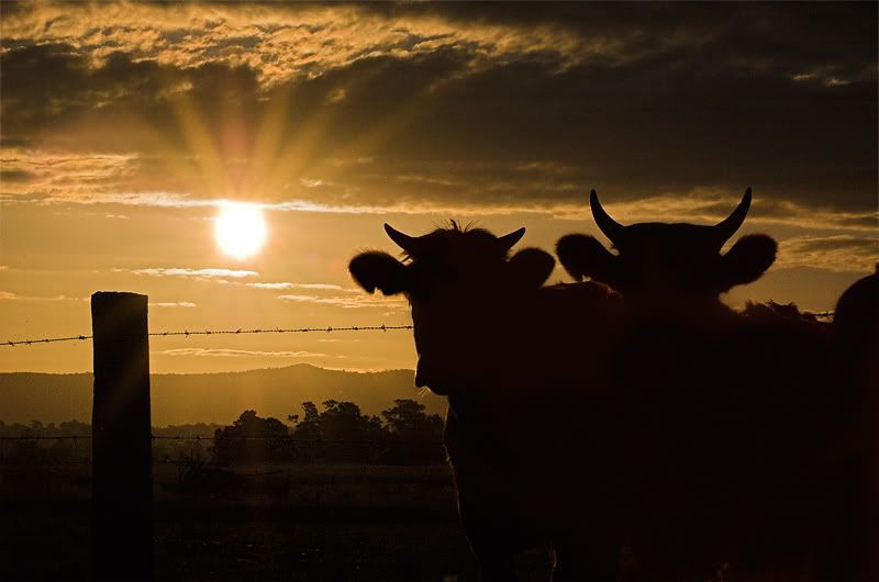
(PS. the dots in the sky are actually flies and not dust on my sensor)
Owen,
This is almost exactly what I was thinking could be done, pulling the second cow out of the shadows. Looks stunning (to me) and now you can see some rimlighting across the ear / snoz / shoulder of the first cow. Cheers Rob Smile; it makes people wonder what you have been up to.
Thanks Rob. I'm really happy with how it turned out, however it would have been great to get a shot like this straight out of the camera without PP so heavily. I'm keen to give it another go though so I'll see if I can improve my technique.
Cheers mate.
Owen
The cows work well now. Congrats on your PP skills as well as your photog ones. Peter
Disclaimer: I know nothing about anything. *** smugmug galleries: http://www.stubbsy.smugmug.com ***
While that's a hell of a lot better, I'm still wanting to see some detail come up in those cows.
The problem, I suspect, is that that region of the image is going to be quite underexposed, and thus anything that area will be heavily soiled by noise artifacts. g.
Gary Stark Nikon, Canon, Bronica .... stuff The people who want English to be the official language of the United States are uncomfortable with their leaders being fluent in it - US Pres. Bartlet
Thanks Gary. Unforunately I had a terrible spot of lens flare right where the silhouette of the cows is, so unfortunately the only detail I'll be able to get out of it is a big blotchy spot. Now some people are keen on big blotchy spots, but not me so I'll have to leave it as a silhouette.
Thanks for all your help everyone
No worries, Owen, and yes, I too had noticed the flare.
Such is life. g.
Gary Stark Nikon, Canon, Bronica .... stuff The people who want English to be the official language of the United States are uncomfortable with their leaders being fluent in it - US Pres. Bartlet
I love the 'new' last image, with the exception of the rays coming off the top of the sun. If the sun looked like it did in the original version you posted, you have a deadset winner IMO. The cow silhouettes work well.
I did try that Willy, but the distance that they were away combined with the small aperture I had the camera set on, it didn't have any effect. In hindsight I should have experimented a bit more and when I go back I will do that.
Thanks for taking the time. Owen.
This PP increases the appeal of the third photo to me. However, have you tried to enhance lighting through PP in the first picture to say, bring out detail of the cows gathered around the fence in that shot. Do you think there might be more to work with in that first picture given the exposure limitations in the third? The reason I like (and still like) the first spicture is the composition of that photo, also having lived in the country for many years this scene strikes a chord in me.
In the end we know Nothing, but in the meantime Learn like crazy.
Your Camera Does Matter Nikon D70 D200 D300 PPOK
Previous topic • Next topic
29 posts
• Page 1 of 1
|