Page 1 of 1

Too Much Saturation?

PostPosted: Tue Oct 04, 2005 6:51 pm
by NikonUser
Hi there,

Didn't have a very good day with shooting insects today so I thought I'd go and edit some of my older RAW images for something to do...

I recently got Fred Miranda's 'Digital Velvia' action for photoshop... Do you think this is overdone?
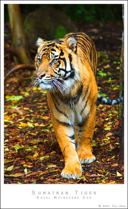
Image

My original image:

Image

Paul

PostPosted: Tue Oct 04, 2005 6:53 pm
by Nnnnsic
I'd say half and half.

I like the saturation in the ground / background, but the tiger looks more like a fuzzy tiger toy and less like a tiger.

PostPosted: Tue Oct 04, 2005 6:59 pm
by Geoff
I prefer the original :)

PostPosted: Tue Oct 04, 2005 7:00 pm
by mitedo
Just a little my settings are

Intensity 14%
Contrast 2
Smart Col none
No Neutralize
No Warm Col
Dynamic Range level 2

PostPosted: Tue Oct 04, 2005 7:20 pm
by MCWB
Nnnnsic wrote:I'd say half and half.

I like the saturation in the ground / background, but the tiger looks more like a fuzzy tiger toy and less like a tiger.

Haha wow, I'm the opposite! I actually like the tiger more now, but find the increased saturation in the background more of a distraction. YMMV. :)

PostPosted: Tue Oct 04, 2005 7:30 pm
by MattC
I find it a little too much. Maybe somewhere in between.

PostPosted: Tue Oct 04, 2005 7:55 pm
by Alpha_7
I like the first one, I like the tiger and the background (just to be different).

PostPosted: Tue Oct 04, 2005 7:58 pm
by Willy wombat
A little too saturated but i think it has a lot of potential. Can you tone it down a little bit? Especially on the two front paws.

PostPosted: Tue Oct 04, 2005 8:06 pm
by mudder
G'day Paul,
The extra sat might be a touch strong for me, especially as the whiskers seem to be going purple and the background is a smidge distracting for me... Hmm I think his tail must be cold too, I think it's going a bit blue :lol: There seems a hint of these colours in the original though.

Maybe if the extra sat was just on the tiger, and perhaps darken the background stuff a smidge so the focus is more centred on the pussy-cat? Might also consider cropping out the tree trunk (if that's what it is?) that's protruding into the right of frame maybe?

Great shot by the way!

PostPosted: Tue Oct 04, 2005 8:09 pm
by NikonUser
Seems like most think it's a little overdone :)

Thanks for the suggestions... will give them a go when I get a chance

Paul

PostPosted: Tue Oct 04, 2005 8:12 pm
by marcotrov
I'm with mattC paul somewhere in between would have been more effective for me. It's always such a subjective thing though. Nice capture maybe having the tiger look straight down the barrel could have produced more impact. I am also thinking that the original with just a little tweak of the curves to get that gentle 's' bend just to get a little 'pop' in contrast and bring it to life.
But hell what do I know!
marco

PostPosted: Tue Oct 04, 2005 8:58 pm
by PiroStitch
Too saturated for me. I prefer the original because the less saturated look suits the border more.

PostPosted: Tue Oct 04, 2005 9:00 pm
by jethro
Half and half dont mind both
J

PostPosted: Tue Oct 04, 2005 9:07 pm
by Matt. K
I find even the original a liitle too over-saturated. This image might look better B&W?

PostPosted: Tue Oct 04, 2005 9:32 pm
by nito
I have a bias towards saturation and colour. But, the PP version is a bit too saturated. If I was to give a figure, maybe a 20% reduction would be cool. :D

PostPosted: Tue Oct 04, 2005 10:16 pm
by Potatis
Paul I use that plug-in all the time. I find it does funny things to yellow and greens, they come up too bright. So after making my images saturated like yours, I go into photoshop>image>adjustments>selective color and choose "yellow" and play around with things there. Especially the magenta slidy thing, I move it to the right, and adjust the others a little too. That seems to correct the yellows and bright greens. Adding the dynamic range and a little contrast with that plugin usually improves the image a lot, you can see when you go back and look how it was in the history pane. Try playing with the yellow channel in images>adjustments>selective color and see what you can learn there.

Can I suggest Cyan +21, Magenta +6, Yellow - 48, and black +5, in the yellow channel? :D

Then choose the "Neutrals" channel, set cyan to -9, magenta -9, yellow -10 and black +10. You should then have an image of vivid colours, but not garish. You can try reducing shadows and adding a bit of contrast.

Or adjust the levels how you like, just experiment. But Fred's plugin is a good start to get a better dynamic range.