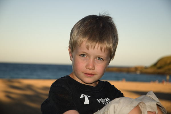
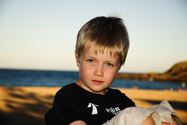
Here is an image I took recently of my son on holidays.
the original

and what I have done to date.

Your take on the effort, good or bad. And if really hopeless, where in your opinion did I go wrong.
thanks
Deb
Working on Photoshop skillsModerators: Greg B, Nnnnsic, Geoff, Glen, gstark, Moderators
Forum rules
Please ensure that you have a meaningful location included in your profile. Please refer to the FAQ for details of what "meaningful" is. Please also check the portal page for more information on this.
Previous topic • Next topic
10 posts
• Page 1 of 1
Working on Photoshop skillsI feel I always over analyse my images and the post processing I do.
Here is an image I took recently of my son on holidays. the original 
and what I have done to date. 
Your take on the effort, good or bad. And if really hopeless, where in your opinion did I go wrong. thanks Deb "Sometimes when you are sad Poko, it's good to hug the monkey."
nice work....... a small crop to straighten the horizion would also help and maybe darken the sky just a little as this would make your subject stand out bit more........
Cheers ....bp....
Difference between a good street photographer and a great street photographer.... Removing objects that do not belong... happy for the comments, but .....Please DO NOT edit my image..... http://bigpix.smugmug.com Forever changing
Yep straighten the horizon and maybe clone out the top corner dark spots which become more pronounced as you increase the contrast in the picture but lovely shot with great eye contact Deb.
cheers marco
Aaaah, the horizon....I always seem to miss that.
Is the contrast too much Maeco? Will play with it later...typing one handed right now as I have a spotty babe in the other arm. Thank you for your comment Marco. If you knew this child you would certainly understand how difficult it is to get him to maintain eye contact....it is something he struggles with. Cheers Deb "Sometimes when you are sad Poko, it's good to hug the monkey."
Hi Deb
really nice capture, well done. I feel that your PP version looks a little too Photoshopped (in the background). The brightness of the sand distracts my eye, but in the original it doesn't. Perhaps try masking out your son's head, then doing a 'levels adjustment', which will brighten his face up and fix up the slight lack of contrast. From there, you can do a number of things, change the b/ground to B&W, or desaturate to really enhance your son in the shot......or simply leave the background how it is. Just a few suggestions Dave
Nikon D7000 | 18-105 VR Lens | Nikon 50 1.8G | Sigma 70-300 APO II Super Macro | Tokina 11-16 AT-X | Nikon SB-800 | Lowepro Mini Trekker AWII Photography = Compromise
In my opinion this is spot on PP. The horizon rule is not an important one in this style of picture. I believe that when things like this are ignored more time can be spent on more critical things, like the correct moment, interacting better with the model to better put them at ease... It depends of course what you place greater emphasis on. For portraiture, photography is more about art and communication than an exacting science.
HB
I like the colour/contrast tweaks on the young bloke, agree that the backgound could be a subdued a bit, and the horizon straightened.
However, this is minor stuff, it is a good shot well processed in my view. Greg - - - - D200 etc
Talent hits a target no one else can hit; Genius hits a target no one else can see. - Arthur Schopenhauer
Hmmm, I tend to think the horizon could be touched up, and the general background maybe dulled a smidge (levels or curves etc), but as mentioned, clone out the vignetting in the corners before you darken the sky in the background otherwise the corners may become more pronounced and noticable.
Aka Andrew
I agree with this comment, which is why I did not make comment on the horizon. Although, I would hope that as we get better at our art, we could make our model feel more at ease, choose the correct moments to press the shutter AND obtain a straight horizon (unless you are specifically aiming for a slanted horizon). Those photos that have everything working as they should, are the ones that we all strive for. They are often few and far between, some more or less than for others, but there is no harm in striving for excellence. That's what keeps most of us coming back. I think I have said this is a previous post, but for me, the difference between a good photographer and a great one is that a good photographer will see what they should have done when they look back on their photos, a great photographer will see what they need to do before they take the photo ! Dave
Nikon D7000 | 18-105 VR Lens | Nikon 50 1.8G | Sigma 70-300 APO II Super Macro | Tokina 11-16 AT-X | Nikon SB-800 | Lowepro Mini Trekker AWII Photography = Compromise
True A_dave - perfection is something that is worth striving for.
BUT, I think there is such thing as being to pedantic. Many people won't notice flaws that seem obvious to us photographers. I went and read a few old surfing magazines the other day (dated well before my increased interest in photog.), and the pics that I thought were perfect before my knowlegde had increased had so many issues. Pixelation from images being printed too large, non-sharp images, images with stacks of uncorrected coma and chromatic ab., back focusing. Even a pic poster sequence were in one of the shots the focus was terrible - full blur. These are pros in the mid to late 90's. I am quite sure that pros aren't any better now than then. Point being I never noticed an issue from my untrained eye, and these photographers were paid for what they shot. And I absolutely had stared at these pictures for days. Surfing is something though, that is a little less concerned about technical perfection than, for instance, architectural photography or food photography... So I guess what I am saying is that it depends on your target market. Surfers won't really care, but precise architect types will get out the microscope. If photography is a hobby where the main person you satisfy is yourself, then be as critical as you like, and become a perfectionist. My point about the original picture is I think for what it is, it is great post processing. To be honest when I first saw the pic I wasn't fussed with the brighter background, the main focal point was still the face. Still, I appreciate the image was posted for suggestions to improve, and all suggestions are entirely valid. Just don't begin an obsessive compulsive disorder, they are not cool, unless you are into that kind of thing. I rant and I talk in circles. Good fun through when waiting for rain to stop to get back outside and paint a wall. HB
Previous topic • Next topic
10 posts
• Page 1 of 1
|