|
Got a thin skin? Then look elsewhere. Post a link to an image that you've made, and invite others to offer their critiques. Honesty is encouraged, but please be positive in your constructive criticism. Flaming and just plain nastiness will not be tolerated. Please note that this is not an area for you to showcase your images, nor is this a place for you to show-off where you have been. This is an area for you to post images so that you may share with us a technique that you have mastered, or are trying to master. Typically, no more than about four images should be posted in any one post or thread, and the maximum size of any side of any image should not exceed 950 px.
Moderators: Greg B, Nnnnsic, Geoff, Glen, gstark, Moderators
Forum rules
Please note that image critiquing is a matter of give and take: if you post images for critique, and you then expect to receive criticism, then it is also reasonable, fair and appropriate that, in return, you post your critique of the images of other members here as a matter of courtesy. So please do offer your critique of the images of others; your opinion is important, and will help everyone here enjoy their visit to far greater extent.
Also please note that, unless you state something to the contrary, other members might attempt to repost your image with their own post processing applied. We see this as an acceptable form of critique, but should you prefer that others not modify your work, this is perfectly ok, and you should state this, either within your post, or within your signature.
Images posted here should conform with the general forum guidelines. Image sizes should not exceed 950 pixels along the largest side (height or width) and typically no more than four images per post or thread.
Please also ensure that you have a meaningful location included in your profile. Please refer to the FAQ for details of what "meaningful" is.
 by NikonUser on Tue Oct 04, 2005 6:51 pm by NikonUser on Tue Oct 04, 2005 6:51 pm
Hi there,
Didn't have a very good day with shooting insects today so I thought I'd go and edit some of my older RAW images for something to do...
I recently got Fred Miranda's 'Digital Velvia' action for photoshop... Do you think this is overdone?
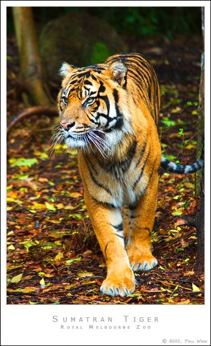
My original image:

Paul
-

NikonUser
- Senior Member
-
- Posts: 1064
- Joined: Tue Jul 12, 2005 6:18 pm
- Location: Canberra - **D2X**
-
by Nnnnsic on Tue Oct 04, 2005 6:53 pm
I'd say half and half.
I like the saturation in the ground / background, but the tiger looks more like a fuzzy tiger toy and less like a tiger.
Last edited by Nnnnsic on Tue Oct 04, 2005 7:00 pm, edited 1 time in total.
-

Nnnnsic
- I'm a jazz singer... so I know what I'm doing
-
- Posts: 7771
- Joined: Sun Aug 08, 2004 12:29 am
- Location: Cubicle No. 42... somewhere in Bondi, NSW
-
by Geoff on Tue Oct 04, 2005 6:59 pm
I prefer the original 
-

Geoff
- Moderator
-
- Posts: 7791
- Joined: Sat Aug 07, 2004 12:08 am
- Location: Freshwater - Northern Beaches, Sydney.
-
by mitedo on Tue Oct 04, 2005 7:00 pm
Just a little my settings are
Intensity 14%
Contrast 2
Smart Col none
No Neutralize
No Warm Col
Dynamic Range level 2
Kevin
-

mitedo
- Member
-
- Posts: 465
- Joined: Sat Jun 18, 2005 11:02 pm
- Location: Noosaville .
by MCWB on Tue Oct 04, 2005 7:20 pm
Nnnnsic wrote:I'd say half and half.
I like the saturation in the ground / background, but the tiger looks more like a fuzzy tiger toy and less like a tiger.
Haha wow, I'm the opposite! I actually like the tiger more now, but find the increased saturation in the background more of a distraction. YMMV.
-

MCWB
- Senior Member
-
- Posts: 2121
- Joined: Mon Oct 11, 2004 10:55 pm
- Location: Epping/CBD, Sydney-D200, D70
by MattC on Tue Oct 04, 2005 7:30 pm
I find it a little too much. Maybe somewhere in between.
-
MattC
- Senior Member
-
- Posts: 1061
- Joined: Thu Oct 28, 2004 6:59 pm
- Location: Pilbara WA
by Alpha_7 on Tue Oct 04, 2005 7:55 pm
I like the first one, I like the tiger and the background (just to be different).
-

Alpha_7
- Senior Member
-
- Posts: 7259
- Joined: Sun Aug 14, 2005 6:19 pm
- Location: Mortdale - Sydney - Nikon D700, x-D200, Leica, G9
-
by Willy wombat on Tue Oct 04, 2005 7:58 pm
A little too saturated but i think it has a lot of potential. Can you tone it down a little bit? Especially on the two front paws.
-

Willy wombat
- Senior Member
-
- Posts: 2284
- Joined: Mon Jun 20, 2005 10:47 pm
- Location: Bentleigh, VIC Australia
by mudder on Tue Oct 04, 2005 8:06 pm
G'day Paul,
The extra sat might be a touch strong for me, especially as the whiskers seem to be going purple and the background is a smidge distracting for me... Hmm I think his tail must be cold too, I think it's going a bit blue  There seems a hint of these colours in the original though.
Maybe if the extra sat was just on the tiger, and perhaps darken the background stuff a smidge so the focus is more centred on the pussy-cat? Might also consider cropping out the tree trunk (if that's what it is?) that's protruding into the right of frame maybe?
Great shot by the way! Aka Andrew
-

mudder
- Senior Member
-
- Posts: 3020
- Joined: Fri Oct 29, 2004 5:58 pm
- Location: Melbourne - Burwood East
-
by NikonUser on Tue Oct 04, 2005 8:09 pm
Seems like most think it's a little overdone
Thanks for the suggestions... will give them a go when I get a chance
Paul
-
NikonUser
- Senior Member
-
- Posts: 1064
- Joined: Tue Jul 12, 2005 6:18 pm
- Location: Canberra - **D2X**
-
by marcotrov on Tue Oct 04, 2005 8:12 pm
I'm with mattC paul somewhere in between would have been more effective for me. It's always such a subjective thing though. Nice capture maybe having the tiger look straight down the barrel could have produced more impact. I am also thinking that the original with just a little tweak of the curves to get that gentle 's' bend just to get a little 'pop' in contrast and bring it to life.
But hell what do I know!
marco
-
marcotrov
- Senior Member
-
- Posts: 2577
- Joined: Mon Feb 28, 2005 2:21 pm
- Location: Cairns, Queensland, Australia
by PiroStitch on Tue Oct 04, 2005 8:58 pm
Too saturated for me. I prefer the original because the less saturated look suits the border more.
-

PiroStitch
- Senior Member
-
- Posts: 4669
- Joined: Sat Mar 05, 2005 1:08 am
- Location: Hong Kong
-
by jethro on Tue Oct 04, 2005 9:00 pm
Half and half dont mind both
J
shoot it real.
look! and see. Shoot and feel
-

jethro
- Senior Member
-
- Posts: 1006
- Joined: Tue Oct 26, 2004 10:03 pm
- Location: down south, sydney
by Matt. K on Tue Oct 04, 2005 9:07 pm
I find even the original a liitle too over-saturated. This image might look better B&W?
Regards
Matt. K
-

Matt. K
- Former Outstanding Member Of The Year and KM
-
- Posts: 9981
- Joined: Mon Sep 06, 2004 7:12 pm
- Location: North Nowra
by nito on Tue Oct 04, 2005 9:32 pm
I have a bias towards saturation and colour. But, the PP version is a bit too saturated. If I was to give a figure, maybe a 20% reduction would be cool. 
-
nito
- Senior Member
-
- Posts: 1109
- Joined: Sat May 14, 2005 11:24 am
- Location: Gladesville, NSW
by Potatis on Tue Oct 04, 2005 10:16 pm
Paul I use that plug-in all the time. I find it does funny things to yellow and greens, they come up too bright. So after making my images saturated like yours, I go into photoshop>image>adjustments>selective color and choose "yellow" and play around with things there. Especially the magenta slidy thing, I move it to the right, and adjust the others a little too. That seems to correct the yellows and bright greens. Adding the dynamic range and a little contrast with that plugin usually improves the image a lot, you can see when you go back and look how it was in the history pane. Try playing with the yellow channel in images>adjustments>selective color and see what you can learn there.
Can I suggest Cyan +21, Magenta +6, Yellow - 48, and black +5, in the yellow channel?
Then choose the "Neutrals" channel, set cyan to -9, magenta -9, yellow -10 and black +10. You should then have an image of vivid colours, but not garish. You can try reducing shadows and adding a bit of contrast.
Or adjust the levels how you like, just experiment. But Fred's plugin is a good start to get a better dynamic range. Doug C.
-
Potatis
- Senior Member
-
- Posts: 512
- Joined: Fri Sep 09, 2005 11:04 am
- Location: Mosman
-
Return to Image Reviews and Critiques
|
