coming from vancouver canada.....
here are a few shots i have taken since i got my d70 in december...
comments critique welcome of course...


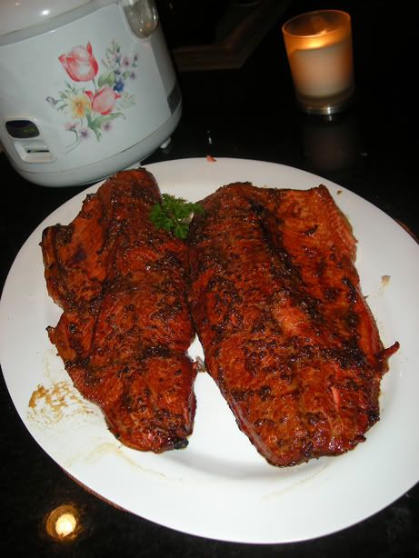
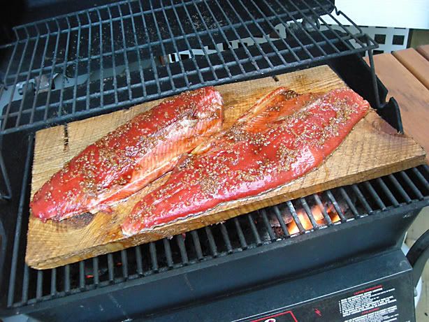
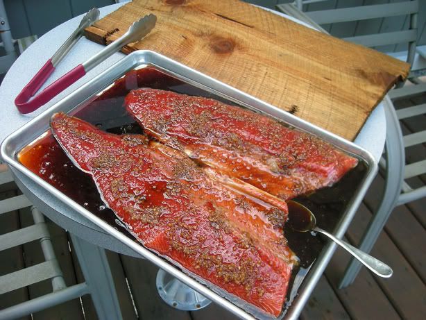
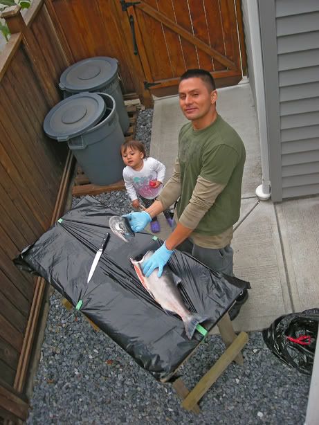
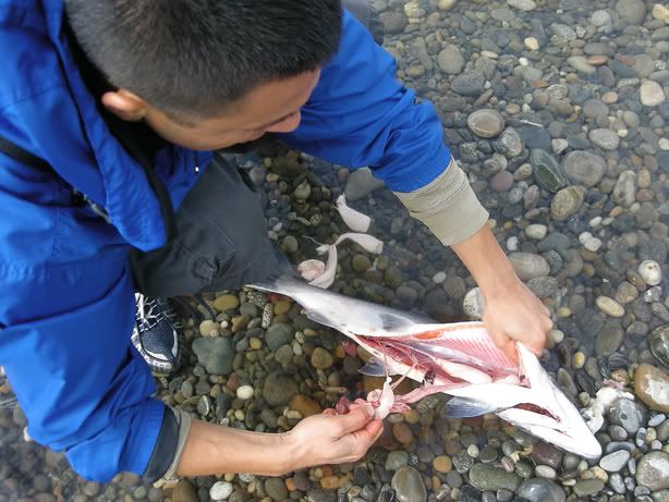
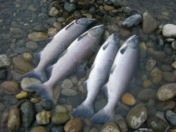
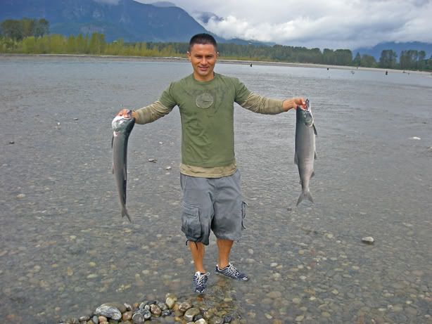
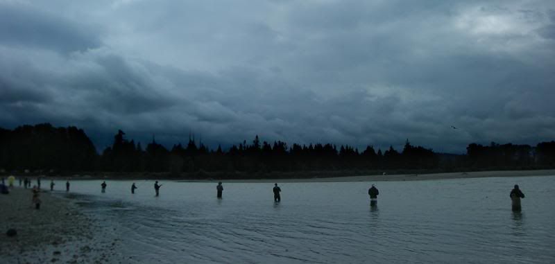
...a few sample shots with my new D70...Moderators: Greg B, Nnnnsic, Geoff, Glen, gstark, Moderators
Forum rules
Please note that image critiquing is a matter of give and take: if you post images for critique, and you then expect to receive criticism, then it is also reasonable, fair and appropriate that, in return, you post your critique of the images of other members here as a matter of courtesy. So please do offer your critique of the images of others; your opinion is important, and will help everyone here enjoy their visit to far greater extent. Also please note that, unless you state something to the contrary, other members might attempt to repost your image with their own post processing applied. We see this as an acceptable form of critique, but should you prefer that others not modify your work, this is perfectly ok, and you should state this, either within your post, or within your signature. Images posted here should conform with the general forum guidelines. Image sizes should not exceed 950 pixels along the largest side (height or width) and typically no more than four images per post or thread. Please also ensure that you have a meaningful location included in your profile. Please refer to the FAQ for details of what "meaningful" is.
Previous topic • Next topic
16 posts
• Page 1 of 1
...a few sample shots with my new D70...hi!
coming from vancouver canada..... here are a few shots i have taken since i got my d70 in december... comments critique welcome of course... 


Firstly flipfrog welcome the forum and hopefully you will be around for some time.
Wow - quite a few pics to critique: 1 Was this a B&W shot? I personally would like to see more contrast or colour 2 This is the kind of shot I take in my business. IMO a cocoon would be the way to go and would have preferred to see a 3/4 angle on this shot 3 Love it 4 The background needs less contrast so the bird is more prominent 5 Love it 6 Contrast needs fixing IMO 7 Love it coz it has a message too 8 Beautiful positioning but lacking a little in oomph 9 Love it you have captured the little girl beautifully 10 Lighting too front on 11 I like this shot the yellow square lifts the pic for me 12 Um 13 A great photo IMO - I think the glare adds to this pic and you have obviously used a reflector or flash to beautifully expose the face. Well I think that is it Dee - I hope that I have not scared you off Post some more soon Chris Chris
-------------------------------- I started my life with nothing and I’ve still got most of it left
Flipfrog, firstly welcome to our forums. I think you're our #3 Canadian, joining Dooda and Neeper our non-US north american cousins.
While I'm not a huge fan of black and white, I think there are a number here that captured well artistically. The first for instance - simple shapes, nothing as depicted objects, but become a work of art when viewed gestalt and in contrast with the black background. Kevinsroad has some stunning colours. I find it hard to hate even through my dislike of 'rule of thirds' composition.
I should respond to my copatriates postings for sure. Excited to not only have another Canadian, but a Vancouverite as well.
The reason the road pic works is that the lines are really well placed, and the foreground interest on the road is great as well. Rule of thirds is a funny animal. If I find that if it looks like the person has bent Heaven and Hell to get it, maybe the pic missed out on some creative opportunities. However, many an impressive photo uses it, but uses it subtly. This road (out by Tswassen, or Wreck Beach area?). Many of these photos are nice because they take something typical and make it look pleasing. The basketball hoop doesn't do it for me though for some reason. Also, you're going to be on the outside looking in when these guys start talking about all of their wicked meets and workshops. I get regularly jealous.
Hi
First of all, there are far better people round here far more qualified to offer criticism on photography than me, but here goes... Road picture and Ice picture are by far my favourites; love the sky on both shots too. What method are you using for your B&W shots? The contrast reminds me of when I first tried B&W and did it by hitting 'desaturate' and nothing more. Not so sure about the kitchen tools pic, didn't like the shadows either side of the tools. Has the basket ball hoop pic had a lot of PP done to it? The trees (and sky) in the background are burnt out quite a bit (this may be just due to the snow, please excuse my ignorance if it is) and the dark areas of the tree on the left seem blotchy and a little blue on this monitor. Spiderman hat pic is great pic too, s'pose a purist wouldn't like the shadow towards the bottom, but it captures the moment wonderfully (I quite like the whole fill in flash thing too). CC
thanks to everyone for their critiques on these pics...
yeah, the ball hoop was played out hard with PS wasnt a great pic to start with imo... Charlie Chalk: i have used both grayscaling and desaruating to B&W pics can u offer any tips?
Only when I'm not eating - yech! - Vegebloodymite! Seriously, yes. The server is strategically located just a mile or soe from the world famous and beautiful Bondi Beach, which you will k=no doubt know of as the venue for the beach volleyball during the Y2K olympics. Well, that's about as serious as I get. g.
Gary Stark Nikon, Canon, Bronica .... stuff The people who want English to be the official language of the United States are uncomfortable with their leaders being fluent in it - US Pres. Bartlet
Welcome to the forum and thanks for showing us your work.
There are some great photos in that lot and i am glad to se you are willing to break with conventions and experiment with something a bit different. I like the breakwater and the two child portraits the best. They do follow conventions but i think they are very well shot. Well done and i hope you find your time on this forum productive and educational too. Steve.
|D700| D2H | F5 | 70-200VR | 85 1.4 | 50 1.4 | 28-70 | 10.5 | 12-24 | SB800 | Website-> http://www.stevekilburn.com Leeds United for promotion in 2014 - Hurrah!!!
G'day,
I find it hard to critique such artistic impressions as I very much doubt my level of creativity, but I love the converging road shot and the portraits are terrific! The last one is really, really nice... Love the lighting in that! Cheers, Mudder Aka Andrew
Flipfrog
The pic of the young girl in pink is an outstanding image with strong, unconventional composition. I'm betting you have done quite a bit of photography as your composition in most of the pics is fairly advanced. Welcome to the forum...when you get to know us all then we...as a bunch....are coming over to your place for a 6 week holiday. Get ready to chuck another shrimp on the BBQ!!! Regards
Matt. K
haha... sure!
as long as im invited to the land down under too!!! it IS on my list of places to visit for sure! as for Vancouver, Dooda and i will post more local shots to entice you all a bit more to come see this pocket of the world!
I like the whole lot of them
im curious how much post-processing went into these images. They all really seem to 'pop', whereas so many of mine in similar composure look dull (at least str8 out of the cam anyway)
two of the pics that seem to get the best reviews wre the ones that basically nothing was done to:
the portrait of the girl in pink, and the boy with the spiderman hat... good lighting was the key i guess!
Previous topic • Next topic
16 posts
• Page 1 of 1
|