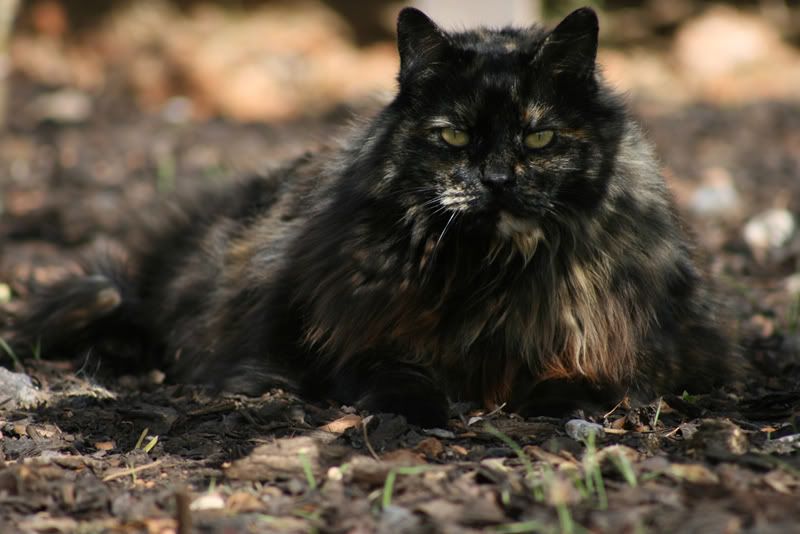
To most people its not much of photo.
But for some reason i like it..
Any ideas from you guys that actually know what you are doin on how to improve it at all?
Its straight off the camera just resized to post it...

Advice please ;)Moderators: Greg B, Nnnnsic, Geoff, Glen, gstark, Moderators
Forum rules
Please note that image critiquing is a matter of give and take: if you post images for critique, and you then expect to receive criticism, then it is also reasonable, fair and appropriate that, in return, you post your critique of the images of other members here as a matter of courtesy. So please do offer your critique of the images of others; your opinion is important, and will help everyone here enjoy their visit to far greater extent. Also please note that, unless you state something to the contrary, other members might attempt to repost your image with their own post processing applied. We see this as an acceptable form of critique, but should you prefer that others not modify your work, this is perfectly ok, and you should state this, either within your post, or within your signature. Images posted here should conform with the general forum guidelines. Image sizes should not exceed 950 pixels along the largest side (height or width) and typically no more than four images per post or thread. Please also ensure that you have a meaningful location included in your profile. Please refer to the FAQ for details of what "meaningful" is.
Previous topic • Next topic
14 posts
• Page 1 of 1
Advice please ;)Hi guys.
To most people its not much of photo. But for some reason i like it.. Any ideas from you guys that actually know what you are doin on how to improve it at all? Its straight off the camera just resized to post it...  Last edited by Travy on Sun Sep 30, 2007 1:15 am, edited 2 times in total.
You have caught a lovely expression on the cat's face, and the eyebrows are full of character.
I feel I would like to see more light on some parts of the face. I also have a cat with a very dark coloured face and find it difficult to get an image which shows facial detail the way I would like. Nikon D700 D300
Yeah i agree about the facial expression, i think thats what makes it appealing to me..
She was laying in the shadow of a bush so it is a little dark on her face and was a bit hard for me to get more light on it. might have to mess around a little in PS with it.
One suggestion, and one request.
The request: please, read what I have written on the front page of this site about image sizes. I am getting rather tired of those who do not observe our simple guidelines. Especially as this is my third comment about this exact problem within the last few days. Then, please resize your image. The suggestion: Perhaps crop this image more tightly, so that there's less background? I'm thinking a square crop. g.
Gary Stark Nikon, Canon, Bronica .... stuff The people who want English to be the official language of the United States are uncomfortable with their leaders being fluent in it - US Pres. Bartlet
Travy - I can see why you like the shot, but it really does need more light on the face, and especially the eyes. I had a quick play in PS - curves adjustment, basic dodging of highlights and midtones - especially around the eyes, and finally, a quick slight sharpen - as I say, a quick play, but it brings out the detail in the face a lot more, which to me at least, is what the shot needed.
What do you think?  Dodging and burning are steps to take care of mistakes God made in establishing tonal relationships! -Ansel Adams
http://www.redbubble.com/people/blacknstormy
Cats Cats! Eat Shit and Sleep! What do you do with a CAT?
???????????? http://www.skipmorrow.com/html/gallerie ... meset.html Jethro shoot it real.
look! and see. Shoot and feel
For me the narrow depth of field and the similarity between the hues and texture of the cats body and the background makes it look like an evil monster with a cats head and an ill defined body extending backward!
(not a criticism - I find the shot intriguing!)
resized.. i had made it 1000 wide instead of 800
personally i think maybe half way between the original and what you have done would be about spot on.. Thanks for taking some time with it
i totally understand what you mean
Thank you. It is appreciated. g.
Gary Stark Nikon, Canon, Bronica .... stuff The people who want English to be the official language of the United States are uncomfortable with their leaders being fluent in it - US Pres. Bartlet
I think the best things have been done with this pic, short of trying to white out the background in the high-key style? Although the furry cat edges would be impossible to outline well.
I have this problem as well, with a long haired Belgian Shepherd, made worse by the fact the carpet we have downstairs is all brown or dark psychadelic 70's stuff..... and every photo inside lacks that contrast, compared to on say grey concrete.
Previous topic • Next topic
14 posts
• Page 1 of 1
|