|
Got a thin skin? Then look elsewhere. Post a link to an image that you've made, and invite others to offer their critiques. Honesty is encouraged, but please be positive in your constructive criticism. Flaming and just plain nastiness will not be tolerated. Please note that this is not an area for you to showcase your images, nor is this a place for you to show-off where you have been. This is an area for you to post images so that you may share with us a technique that you have mastered, or are trying to master. Typically, no more than about four images should be posted in any one post or thread, and the maximum size of any side of any image should not exceed 950 px.
Moderators: Greg B, Nnnnsic, Geoff, Glen, gstark, Moderators
Forum rules
Please note that image critiquing is a matter of give and take: if you post images for critique, and you then expect to receive criticism, then it is also reasonable, fair and appropriate that, in return, you post your critique of the images of other members here as a matter of courtesy. So please do offer your critique of the images of others; your opinion is important, and will help everyone here enjoy their visit to far greater extent.
Also please note that, unless you state something to the contrary, other members might attempt to repost your image with their own post processing applied. We see this as an acceptable form of critique, but should you prefer that others not modify your work, this is perfectly ok, and you should state this, either within your post, or within your signature.
Images posted here should conform with the general forum guidelines. Image sizes should not exceed 950 pixels along the largest side (height or width) and typically no more than four images per post or thread.
Please also ensure that you have a meaningful location included in your profile. Please refer to the FAQ for details of what "meaningful" is.
 by jamesw on Sun Oct 14, 2007 8:16 pm by jamesw on Sun Oct 14, 2007 8:16 pm

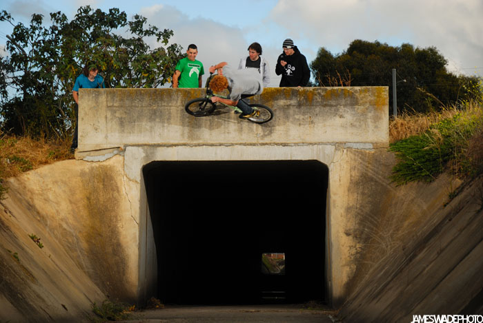
hopefully some of you will say WOW!
self crit
in two minds about the lurkers. i like the sense of scale they bring, as well as the 'life'.
the exposure is good on the rider but i couldnt manage to balance it out with the sky. would have loved to have the D70 there to get that extra stop or two. Last edited by jamesw on Sun Oct 14, 2007 8:28 pm, edited 1 time in total.
body: nikon d200, d70s, f4s, f601. lens:nikon 35-70mm f2.8, 70-300mm f4-5.6, 10.5mm f2.8, 20mm f2.8, 28mm f2.8, 50mm f1.8. flash: nikon sb600, sunpak 383 (x1), sunpak 555 (x4), pocketwizard plus II (x4) jamesdwade.comdishonourclothing.com
-

jamesw
- Senior Member
-
- Posts: 771
- Joined: Mon Jan 01, 2007 10:36 pm
- Location: norwood, adelaide
-
 by bago100 on Sun Oct 14, 2007 8:19 pm by bago100 on Sun Oct 14, 2007 8:19 pm
Wow!
Scary stuff!
-

bago100
- Senior Member
-
- Posts: 862
- Joined: Mon Sep 06, 2004 6:42 pm
- Location: Shanghai China until Feb 2010
 by gstark on Sun Oct 14, 2007 8:26 pm by gstark on Sun Oct 14, 2007 8:26 pm
James,
I would crop it into a landscape format, cutting out everything just above the top of the subway. Then use curves to bring in some of the detail from within the subway.  g.
Gary Stark
Nikon, Canon, Bronica .... stuff
The people who want English to be the official language of the United States are uncomfortable with their leaders being fluent in it - US Pres. Bartlet
-

gstark
- Site Admin
-
- Posts: 22926
- Joined: Thu Aug 05, 2004 11:41 pm
- Location: Bondi, NSW
 by mickb on Sun Oct 14, 2007 8:26 pm by mickb on Sun Oct 14, 2007 8:26 pm
Not too bad, next time get in closer and lower (if you trust him lol)
And get rid of the peanut gallery looking on and you would have a winner. Possibly try a bit of off camera flash to fill the shadows when you are under him.
Mick Brown
P.S. I would even try the fish eye 
-
mickb
- Newbie
-
- Posts: 13
- Joined: Thu Oct 04, 2007 11:48 pm
- Location: Roxburgh Park, Melbourne
 by jamesw on Sun Oct 14, 2007 8:32 pm by jamesw on Sun Oct 14, 2007 8:32 pm
gstark wrote:James, I would crop it into a landscape format, cutting out everything just above the top of the subway. Then use curves to bring in some of the detail from within the subway. 
ah gary body: nikon d200, d70s, f4s, f601. lens:nikon 35-70mm f2.8, 70-300mm f4-5.6, 10.5mm f2.8, 20mm f2.8, 28mm f2.8, 50mm f1.8. flash: nikon sb600, sunpak 383 (x1), sunpak 555 (x4), pocketwizard plus II (x4) jamesdwade.comdishonourclothing.com
-

jamesw
- Senior Member
-
- Posts: 771
- Joined: Mon Jan 01, 2007 10:36 pm
- Location: norwood, adelaide
-
 by jamesw on Sun Oct 14, 2007 8:35 pm by jamesw on Sun Oct 14, 2007 8:35 pm
mickb wrote:Not too bad, next time get in closer and lower (if you trust him lol) And get rid of the peanut gallery looking on and you would have a winner. Possibly try a bit of off camera flash to fill the shadows when you are under him. Mick Brown P.S. I would even try the fish eye 
im tempted to reshoot with fisheye. i wouldnt want to go in closer with a wide lens, it makes the banks look much mellower. but the fisheye will make the gap look intense.
and yeah, i trust him... ya always have to trust them, otherwise you'll never get the shots! body: nikon d200, d70s, f4s, f601. lens:nikon 35-70mm f2.8, 70-300mm f4-5.6, 10.5mm f2.8, 20mm f2.8, 28mm f2.8, 50mm f1.8. flash: nikon sb600, sunpak 383 (x1), sunpak 555 (x4), pocketwizard plus II (x4) jamesdwade.comdishonourclothing.com
-

jamesw
- Senior Member
-
- Posts: 771
- Joined: Mon Jan 01, 2007 10:36 pm
- Location: norwood, adelaide
-
 by Cre8tivepixels on Sun Oct 14, 2007 8:36 pm by Cre8tivepixels on Sun Oct 14, 2007 8:36 pm
James i really try to be objective when i see a post of urs, but seriously nothing ever grabs me, i just dont get this type of photography....i think you need to get in closer to your subjects and try using natural light and not get so technical with some of your setups....just my HO
Dan
-

Cre8tivepixels
- Senior Member
-
- Posts: 999
- Joined: Sat Feb 03, 2007 4:21 pm
- Location: Malabar - Sydney
 by Raskill on Sun Oct 14, 2007 9:52 pm by Raskill on Sun Oct 14, 2007 9:52 pm
I agree that this shot would benefit from being a portrait crop, cutting out the sides of the image, but leave the observers in. I'll disagree with Dan, I like the lighting you get in your images. I know the 'style' of image you are chasing, to suit the market you are in, and the images suit it to a tee.
Nice, I like it.
2x D700, 2x D2h, lenses, speedlights, studio, pelican cases, tripods, monopods, patridges, pear trees etc etc http://www.awbphotos.com.au
-

Raskill
- Senior Member
-
- Posts: 2161
- Joined: Fri Jun 17, 2005 12:26 pm
- Location: Rockley, near Bathurst, Home of Aussie Motorsport!
-
 by Steffen on Sun Oct 14, 2007 10:51 pm by Steffen on Sun Oct 14, 2007 10:51 pm
Cool shot, well captured. MC Escher would be proud...
Cheers
Steffen.
lust for comfort suffocates the soul
-

Steffen
- Senior Member
-
- Posts: 1931
- Joined: Mon Oct 31, 2005 4:52 pm
- Location: Toongabbie, NSW
 by jamesw on Mon Oct 15, 2007 9:51 am by jamesw on Mon Oct 15, 2007 9:51 am
Raskill wrote: I like the lighting you get in your images. I know the 'style' of image you are chasing, to suit the market you are in, and the images suit it to a tee.
thanks body: nikon d200, d70s, f4s, f601. lens:nikon 35-70mm f2.8, 70-300mm f4-5.6, 10.5mm f2.8, 20mm f2.8, 28mm f2.8, 50mm f1.8. flash: nikon sb600, sunpak 383 (x1), sunpak 555 (x4), pocketwizard plus II (x4) jamesdwade.comdishonourclothing.com
-

jamesw
- Senior Member
-
- Posts: 771
- Joined: Mon Jan 01, 2007 10:36 pm
- Location: norwood, adelaide
-
 by jamesw on Mon Oct 15, 2007 11:36 am by jamesw on Mon Oct 15, 2007 11:36 am
just got a call from an editor this morning, said he's running it in the end of year photo issue.
might go back & try and reeshoot...
body: nikon d200, d70s, f4s, f601. lens:nikon 35-70mm f2.8, 70-300mm f4-5.6, 10.5mm f2.8, 20mm f2.8, 28mm f2.8, 50mm f1.8. flash: nikon sb600, sunpak 383 (x1), sunpak 555 (x4), pocketwizard plus II (x4) jamesdwade.comdishonourclothing.com
-

jamesw
- Senior Member
-
- Posts: 771
- Joined: Mon Jan 01, 2007 10:36 pm
- Location: norwood, adelaide
-
 by Antsl on Mon Oct 15, 2007 11:58 am by Antsl on Mon Oct 15, 2007 11:58 am
Hi James,
I like the idea although I think it is a little passive, considering how dynamic the situation is. If you are going back to do a reshoot then add tension to the photograph. Start by shooting vertical but be sure to keep the walls and the foreground leading into the tunnel within the frame. Next I would be putting on a wide lens and getting to within a third of the distance you are at the moment.... the aim is to be able to silhouette the guy on the bike against the sky. Next... have a couple of your friends walking through the tunnel.... in about 6 - 10 metres. Finally... light the image like you mean it! Put the lights where they are going to add the most drama without making them 100% obvious ..... ie see the effect of the lights but not the lights.
Have a go and see how you get on ... would love to be there to assist!
-

Antsl
- Senior Member
-
- Posts: 678
- Joined: Sun Jun 19, 2005 1:22 am
- Location: North Melbourne, Victoria!
-
Return to Image Reviews and Critiques
|


