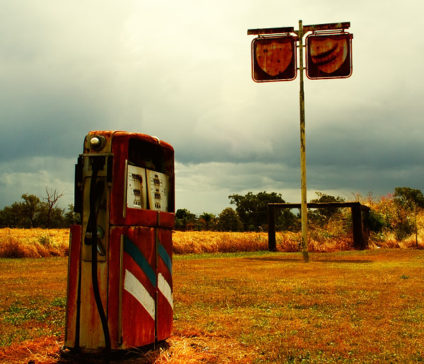
Feel free to PP to your hearts content... I cropped this and played with saturation, highlights, contrast etc Raw file here... http://turnbullfamily.net/images/IMG_6134.CR2 7.2MB
Cheers
Craig
PP - Fill Er UpModerator: Moderators
Forum rules
Please ensure that you have a meaningful location included in your profile. Please refer to the FAQ for details of what "meaningful" is.
Previous topic • Next topic
10 posts
• Page 1 of 1
PP - Fill Er UpWould like some advice on what I have done wrong here... just doesn't look any good. Is it the composition, exposure or ???
 Feel free to PP to your hearts content... I cropped this and played with saturation, highlights, contrast etc Raw file here... http://turnbullfamily.net/images/IMG_6134.CR2 7.2MB Cheers Craig
Re: PP - Fill Er UpI just copied the posted JPEG
The exposure is certainly off for the bowser and sign and possibly also the White balance. This is a quick and nasty exposure adjustment selectively to the bowser and sign, plus added some saturation to the sky and another smal play with overall exposure and highlights/shadows  Bob
"Wake up and smell the pixels!"
Re: PP - Fill Er UpI think that, from a compositional PoV, it might be better to have been shot from a lower angle. It looks to me that this was shot from a standing, eye-level PoV. I think with a lower angle, a bit closer to the bowser perhaps ... exposing for either the bowser or the sign (spot metering is your friend).
Bob, while I'm not entirely comfortable with the wb as it is in the original; I think your's is a bit too much towards the warm end of the spectrum. Let's look at the whites in the shadow side of the bowser: that's the side of the bowser, and it's the side that's facing us. Look at the lower section, to the left of the hose. Ignore the rust. In your version, to me they're tending towards a pinkish hue; in the original, they seem, to my tired little eye, purer, with the issue being more just one of exposure rather than massive wb shift. g.
Gary Stark Nikon, Canon, Bronica .... stuff The people who want English to be the official language of the United States are uncomfortable with their leaders being fluent in it - US Pres. Bartlet
Re: PP - Fill Er UpThanks guys... I was actually crouching down to take this photo. Don't think I took long enough to setup and compose the shot properly. Have to learn to take my time. I drove away having that thought in my head.
Re: PP - Fill Er Up
I think the exposure looks a little dark, although I haven't checked a histogram. I think it also need a lot more saturation.
I also just grabbed the jpg. I moved the pump  Daniel Nikon D4, D2Xs, D70, Nikkors and Sigmas lenses from 10 to 400mm
www.DSAimages.com
Re: PP - Fill Er Up It was very intuitive process and probably I will not be able to repeat it again. 1. Recovered highlights and pushed blacks in RAW converted 2. Increased overall saturation in Lab 3. Changed hue for blue to be more "cyanish" 4. Changed hue for cyan to be even more "cyanish" 5. Increased saturation for red, yellow and magenta 6. Made yellow overlay Did everything via layers and played with layers opacity. It's an old rusty petrol station and road signs so everything should look like in old movie or be "old stylish".
Re: PP - Fill Er Up
Or light. Photography is about light. There was poor light and therefore the image looks "flat". You need to add something that pops off the photo. Dramatic contrast, colours or some kind of photographic style.
Re: PP - Fill Er UpA few quick ideas:
   Nikon D70
12-24 DX, 18-70 DX, 70-200 VR 20" iMac Intel C2D Aperture 2.1 PS CS3 http://www.jamesrobertphotography.com
Re: PP - Fill Er UpHi Craig,
wow isn't it interesting the different 'versions' people are coming up with and all good. For me irrespective of all he PS work, I still find the angle or positioning uncomfortable to look at. It' almost as if the horizontal lines on the pump (ie top, center join, and base) present leading lines which keep drawing my eyes off to the far right of the picture to no focal point or to the right hand fence post. So while there is lots of detail to look at on both the pump and the sign I have to force my eyes to linger there as they naturally want to drift . Have you though about cloning out the fence post and rail ? or just presenting the pump in isolation ? Either way great find as a subject can't be many of them left - be interetsed in the price on the tank if it was visible ? Just one girls thoughts Deb T DebT
"so many dreams - so little time "
Re: PP - Fill Er UpThanks Pehpsi and Deb and everyone else, who have advised on this. I played around with PP myself for a while and came up with the following.. still not sure I'll keep it. But the process has been a really good learning experience, and thankfully the location is not too far away so could always head back out there, take my time and have another bash at it.
 Thanks again Craig
Previous topic • Next topic
10 posts
• Page 1 of 1
|